
A lot of businesses will opt for a cheap website design or redesign service, but there is a saying that a poor man always pays twice. If you try to save a few dollars by buying cheaper tools, you’ll be reducing quality and you’ll probably wind up having to pay double, or more, to fix the mess the cheapness created.
In most cases, business owners and marketing managers will outsource their website design, or perhaps ask an outside company to spruce up their site to bring it up-to-date and improve engagement.
Unfortunately, not all website re-design ‘professionals’ have the skills and ability to deliver a quality result, leaving you with a website that is ugly and outdated, with low-resolution, crappy stock images, pages and pages of unnecessary copywriting and a confusing site structure.
See How Chillybin Web Design Can Drive Massive Amounts of Traffic to Your Website
- SEO – drive people who are ready to buy directly to your website.
- Content Marketing – our team of native-English speaking writers will craft articles that position you as THE authority in your niche.
- Paid Media – pour fuel on the fire with paid ads that produce a steady stream of leads for your business.

How Analytics Can Help Refine Your Website Redesign
Something we see often, with both internal and external website redesign work, is there are too many cooks in the kitchen looking after the aesthetics and getting everything to “look right”. The important aspect of analytics is completely overlooked – something you’ll soon discover when you go to live and see your site numbers tumble.
This is exactly what happened to a client of ours, Expat Living, who used a company that didn’t have a strong understanding of WordPress, site speed, or SEO optimisation. When the company migrated their website to WordPress it completely cratered the search engine optimisation and the site quickly fell out of the rankings, with traffic and revenue suffering. The site was riddled with redirects as the theme that was used off-the-shelf was not fit for purpose. In a panic, they asked if we were able to quickly re-design and re-develop the site, with a focus on speed and SEO. We accepted the challenge and their website recovered quickly. They’re still using our core WordPress theme development for the latest version of their website in 2022.
Rather than ignore your analytics or switch them off while revamping your website, we suggest you leave everything going and pay close attention to the numbers as you work. Some exciting information and patterns might just turn up and you can be sure you are doing the work along the way for a strong re-entry.
Overall what you are aiming for is a return on investment, so a bigger outlay in getting the quality service your site needs will result in better returns.
Once you decide to redesign your website the next step is to partner with a quality web designer who can handle the workload. To know what’s required you’ll need to create a detailed website redesign strategy and work closely with your designer to evaluate the areas that need work and how you want to succeed going forward.
Make sure you put in the groundwork to identify the problem areas your current website is facing, analytics here will be essential. These analytics will also give you a solid platform to know if you have succeeded in reaching your goals.
Before you jump in and start messing with the site you have, it pays to consider the big picture, as many businesses get too caught up in the details and miss the point of a redesign, wasting time and diluting their marketing impact.
To help out we’ve outlined the biggest mistakes companies make during a web re-design as well as some website redesign tips to avoid the big traps and focus on the areas that need your attention.
Let us steer you in the right direction and offer some solutions that will make a positive difference to your website engagement and numbers going forward. If you want even more detail, you can check out our website design process guide.
Common Mistakes Made During a Website Redesign
#1 Failing to Support SEO
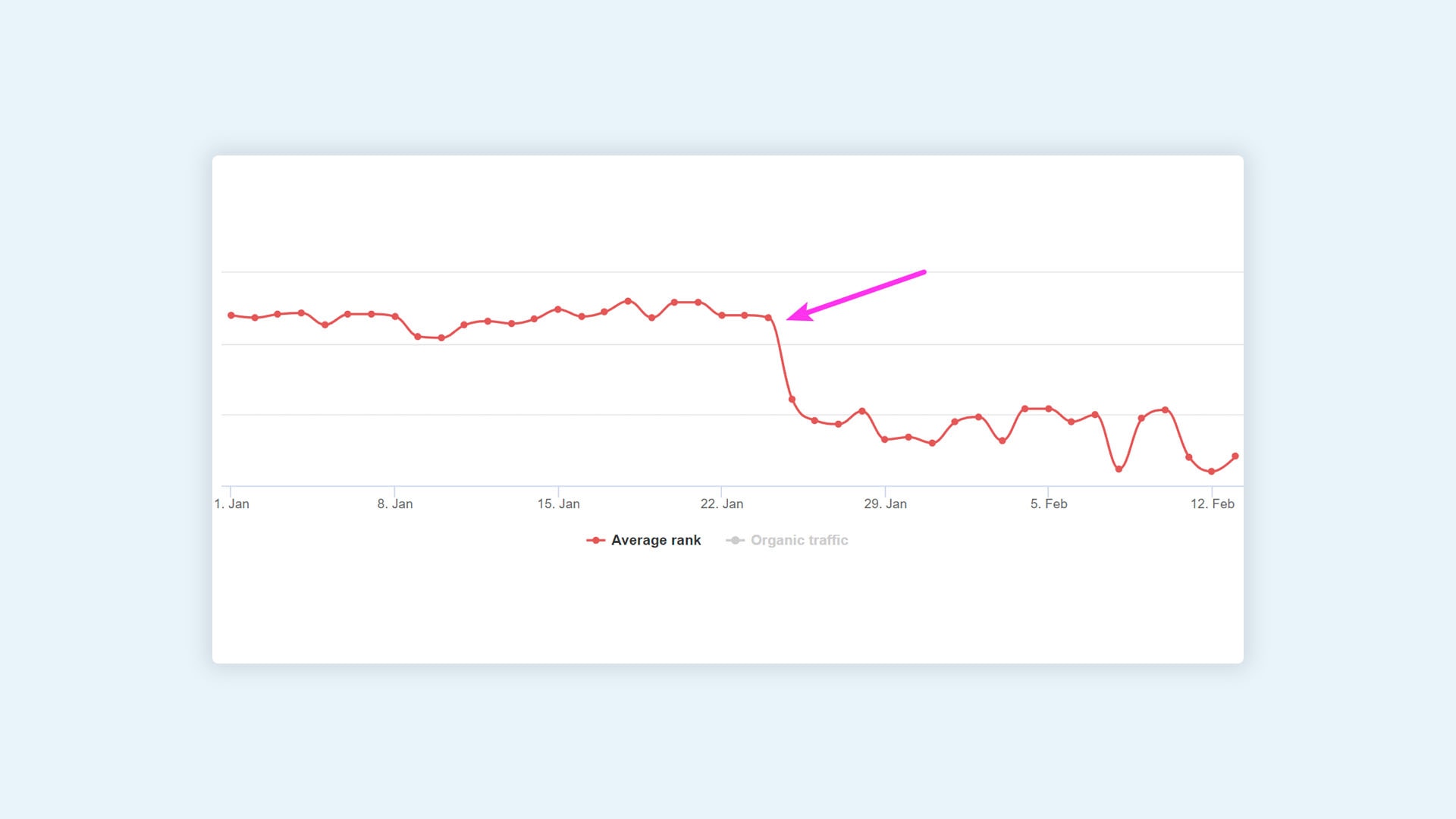
Neglecting search engine optimisation is one of the biggest mistakes of a website re-design. You need people to see your website in order to find your services.
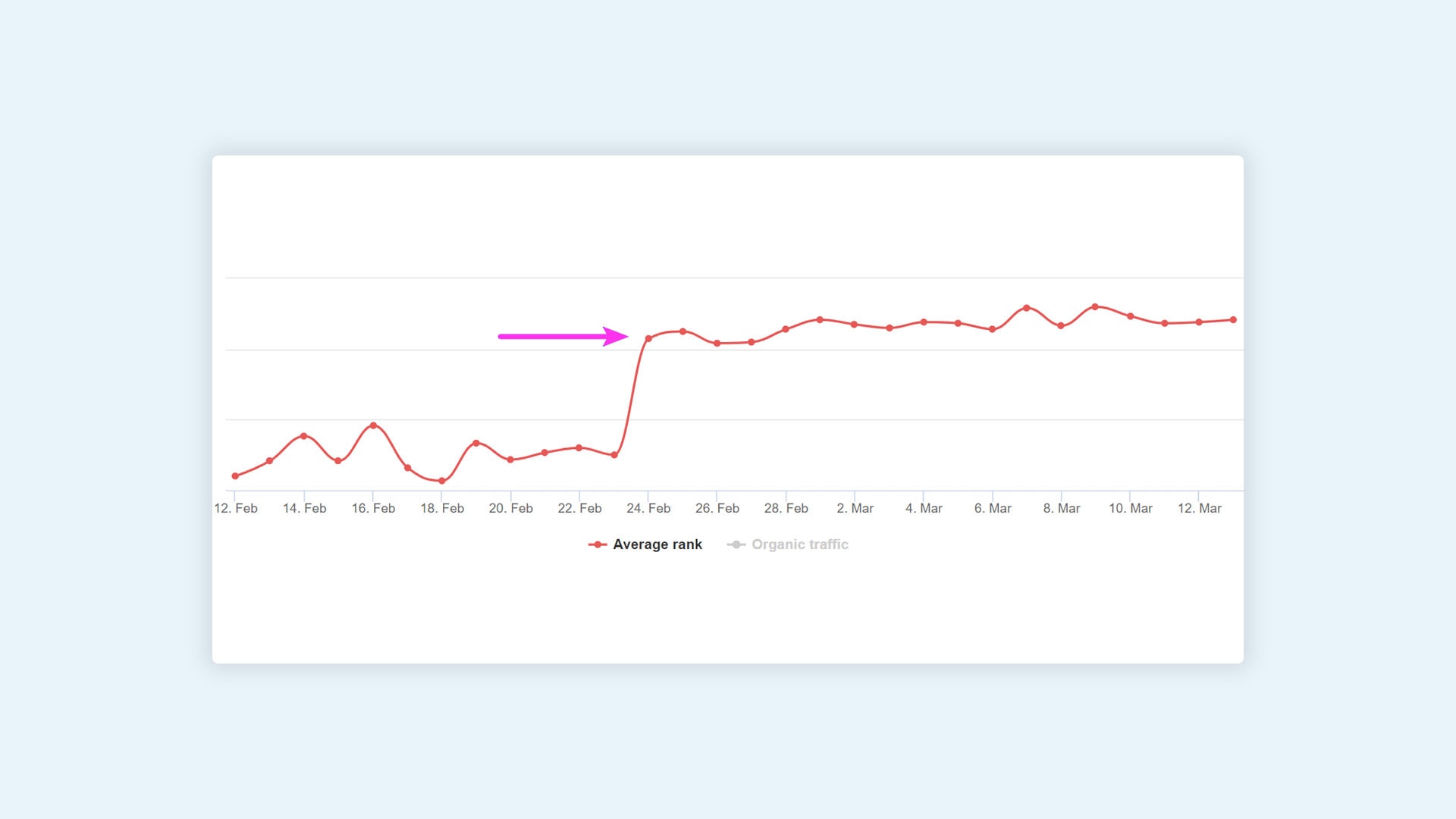
Yes, it’s normal to see some traffic drop from search engines a month or two after a website redesign, however, your traffic should recover if the redesign is done well, if not, businesses can lose as much as 60 to 70 per cent of their organic traffic if a website design or migration has been poorly executed.
To avoid this, choose a website design company that knows SEO, over a graphic designer that makes a beautiful website.
When your focus is on enhancing SEO the website redesign services will include:
- Submitting your sitemap
- Reusing your existing URLs wherever possible
- Redirecting URLs using 301 redirects
- Helping to secure an SSL certificate with your web provider
#2 No Plan to Meet Goals and Address Issues
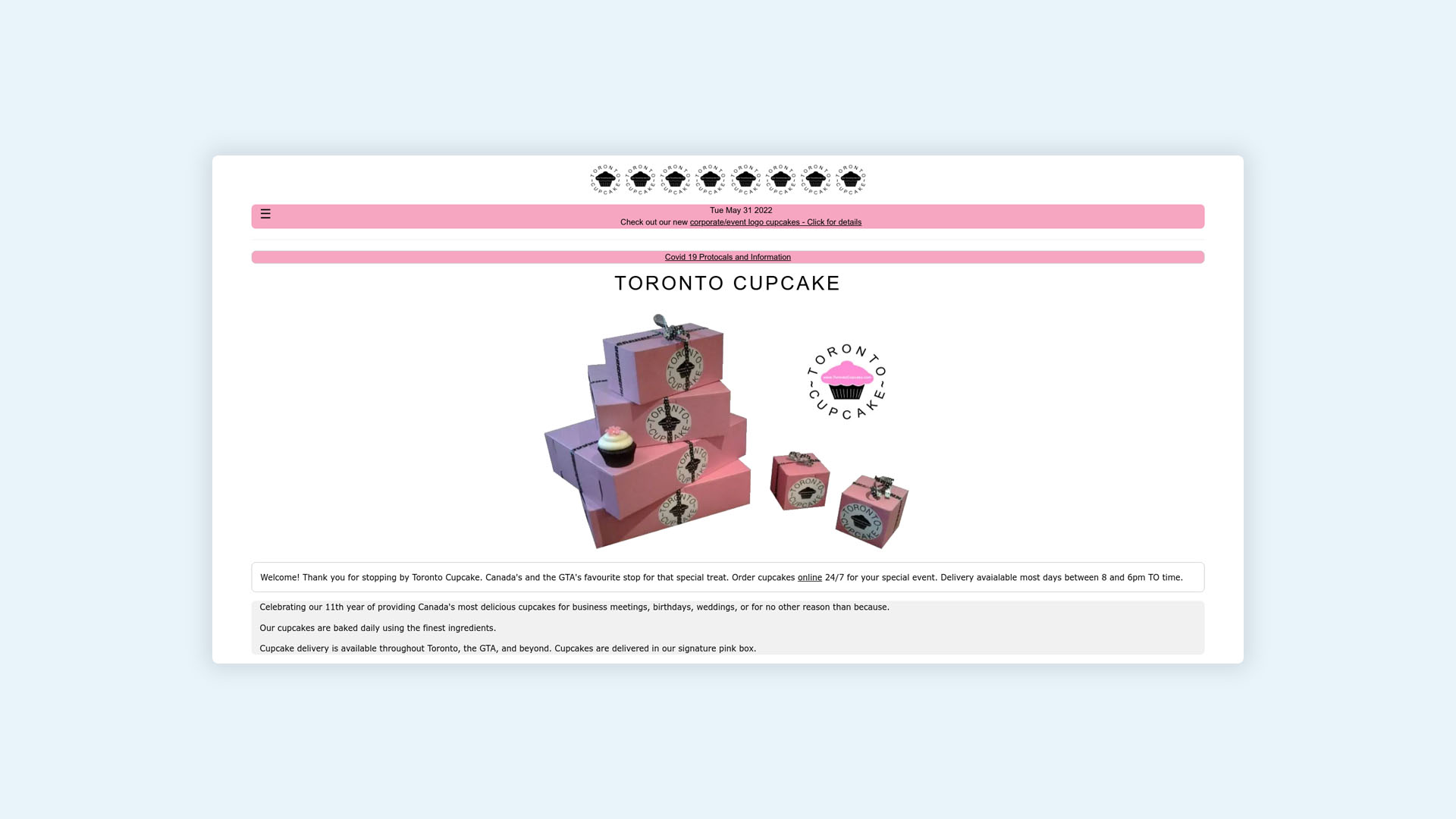
If you are going to be redesigning your website, it’s got to be for a reason. You need to include a website redesign proposal that resolves your current website issues. This will give your designer concrete direction that is actionable and measurable.
Rather than just knowing what you don’t want, you need to have a clear idea of what works and what you do want.
Rather than go in blind, you can use your current website analytics and audits to help understand:
- Your target audience
- Who your competitors are
- Your buyer journey/prospect experience
- Favoured pages and content
- What content works best (and what is not working)
- What your main assets are (including content and images, graphics and video)
- What a successful content strategy looks like for you
If you don’t currently audit your website regularly then a redesign will get rid of a number of nagging bugs and issues that have been holding you back, but it’s important that you complete regular website audits going forward.
#3 Not Understanding the Size of the Job

Your website redesign it’s a big job. A lot of companies get caught out by just how big, time-consuming and expensive it really is. Before you start, get an accurate quote on your website redesign cost and keep in mind that your overall aim is to see a good ROI, not to save money on your website work.
Some points to discuss with your design team
- How you want your new website to look
- What your new website functionality will be
- What website features will you have
- How the site changes interact with existing systems
#4 Setting Tight Deadlines
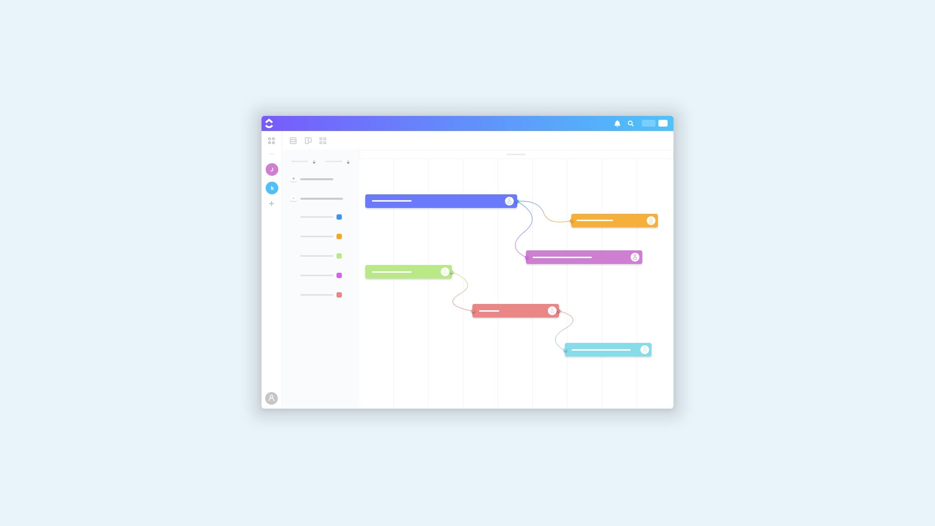
Another fallout from not understanding the scope of the work is putting in unrealistic expectations of the time it will take. This is not going to be a fast project.
Many businesses set a launch date and get frustrated when this fails, or rush so fast that the launch is a disaster.
In terms of external factors, you need to leave enough time for:
- Analysis
- Planning
- Testing
- Integration
There is also the internal time factor to consider, which is where we see the majority of hold-ups and frustrations.
You need to factor in time to check your design over, pass it around to your stakeholders and go back and forth with changes. This takes time. As fast as your developer can be with creating your ultimate website, usually, hold-ups are internal ones as sign-offs and corrections internally take time and coordinating everyone can seem impossible.
As well as planning ahead to come up with a realistic timeframe with your website re-design partner, you can also be ready to cut through the feedback stage by forewarning anyone on your team of what’s to come and what their input needs to be. Make sure you only provide the absolute essential number of people in the feedback so you don’t have too many conflicting views.
Rather than drop the new link in their inbox for their assessment, set up a meeting to discuss what they like and any changes they want so you can keep things on schedule.
We build stunning, user-focused websites that will wow your customers.
Are you a business owner in Singapore, Australia or worldwide? We work with clients across the globe to deliver beautiful yet functional website designs.
#5 Doing a Surprise Launch of the New Site Without Testing
It can be a mistake to turn off your analytics during your website development and hold off for a big reveal. Rather than catching your audience out, invite them in.
Before a new website is launched it’s essential that it’s tested extensively and double-checked including on mobile devices.
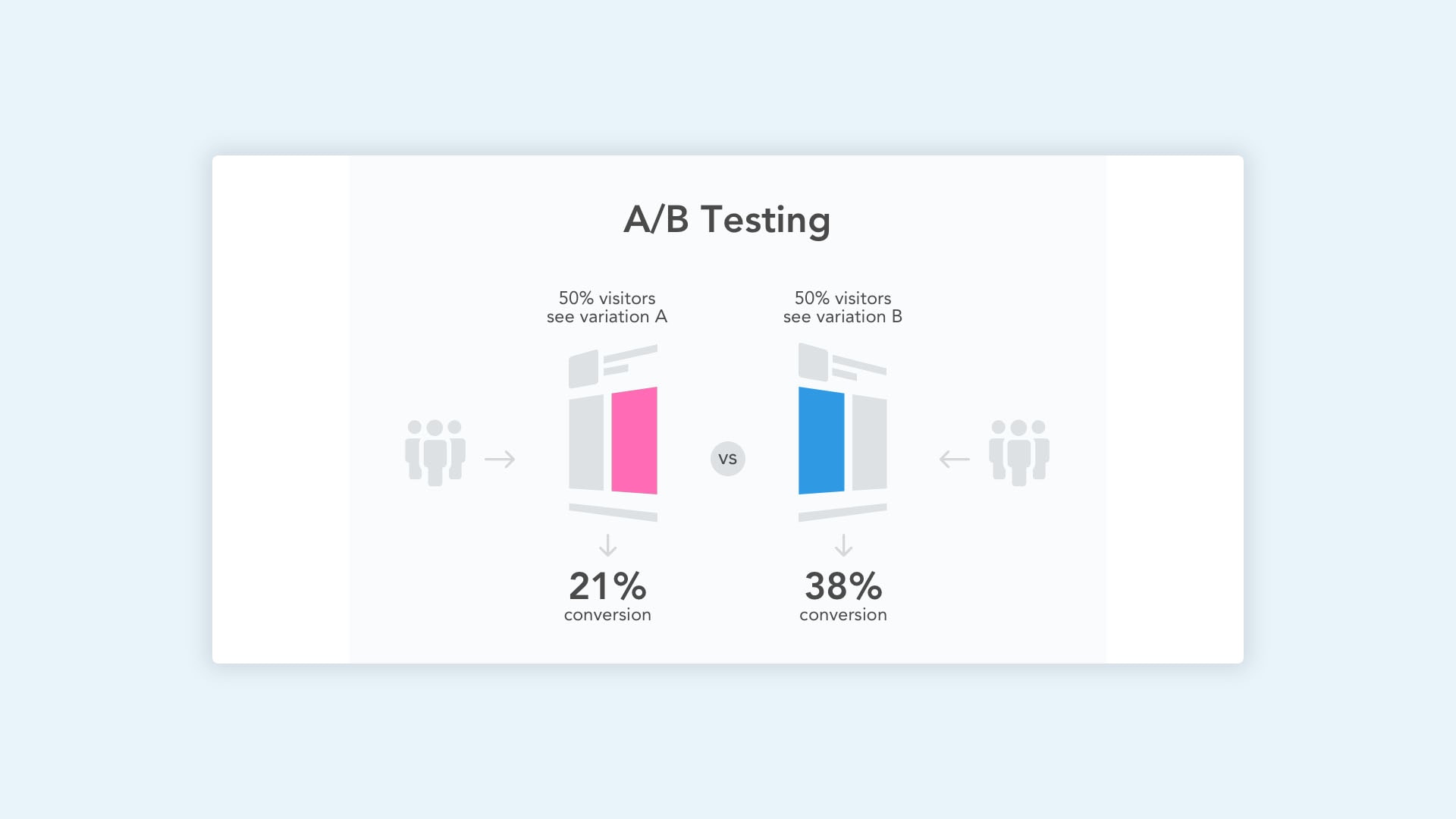
Split testing is a great way to get a feel for your changes before they go live to the masses, giving you feedback on your choices and how well the changes are being received. With split testing, you divide traffic so some hit your new site as it’s being worked on, while others go to your existing site.
There are plenty of great features you can tap into to get real-time information including heat maps that read what the big attractions are as well as where people are opting out.
The usual key metrics are the same ones that will help you monitor your split testing including user engagement and conversion rates. Keep on it across your changes to see what is working and where some tweaks need to be made as you go.
N.B. It’s usual for conversion rates to drop immediately after a redesign. A quality redesign will have these numbers rising steadily over the next few months.
#6 Reduced Page Loading Speed
Fast loading speed is part of Google’s core web vitals so it needs to be perfect, especially as your audience isn’t going to hang around waiting for your page to load. A quality website redesign will naturally improve your speed, if this doesn’t happen, you need to take action.
40% of website visitors will leave a page if it doesn’t load within three seconds.
To rectify a slow loading time, have your page speed tested using a professional tool to really know where you stand. This will give you more detailed feedback and let you know when you’ve reached your goal.
Look for what might be slowing your page down, the usual culprits are:
- Images
- Banners
- Scripts
- Animations
Optimise any large content using a compressing tool and test the speed again to see how you are progressing. Some tools will allow you to compress all the images on your site with a few easy clicks.
As well as the site itself you can help reduce your load time through your service provider or server by enabling browser, template and server catching. This means that some of the information for your site is stored at the server level, speeding up time as less data needs to be retrieved for each user. For even better speeds you can look for a server that provides a content delivery network (CDN) where information on your site is stored on multiple servers and can be delivered locally to a user.
#7 Neglecting Lead Generation
Your website is part of your business, and therefore needs to contribute to profits in order to be useful. A beautiful website isn’t much use to you if it’s not generating leads and those leads aren’t converting to sales.
In order to get leads, your website needs to be geared towards achieving that, it’s not going to magically happen on its own.
There are a few items you need to have covered in order to make leads a reality for your website:
- Know your target audience – what they like, what they are looking for, what they need to feel safe, and how you can solve their problem.
- Provide quality (useful) content – getting your website visitors to know you and trust you is as easy as providing useful, helpful, free advice that shows you as the expert in your field and someone who can assist.
- Look at Keywords – Use favoured keywords to create blogs and articles targeted at answering the most pressing questions users have within your industry.
- Create a nurturing sequence – Gated quality content and subscriptions will give you access to user names and emails you can then nurture through emails and newsletters, product testing, feedback and freebies.
- Create a user journey that supports their path to purchase – providing shortcuts with action steps enhances your prospect experience and gets users to where they want to be quickly by delivering the information they need most upfront. This way they don’t have to move backwards to get to the next step, you have provided them with useful links, action buttons and a proactive assessment of the buyer’s journey. This will significantly increase your conversion rates.
#8 It’s Aesthetically Pleasing but Not Functional

Would your business function if you worked out of a 5-Star building with city views but had no systems in place for employment, work process, safety protocols or employee engagement? Nope. You can’t expect an aesthetically pleasing website to manage everything for you. In order to be able to get any work done, it needs to be built to function well.
When you get your business website functioning to the highest capacity, then it’s time to build in aesthetics.
The big-ticket items to cover in website functionality are:
- Easy navigation
- No unnecessary pages
- Well placed action steps
- Visible and helpful sidebars
- Breadcrumbs for direct navigation
#9 The Changes Are Not User Friendly – For You!
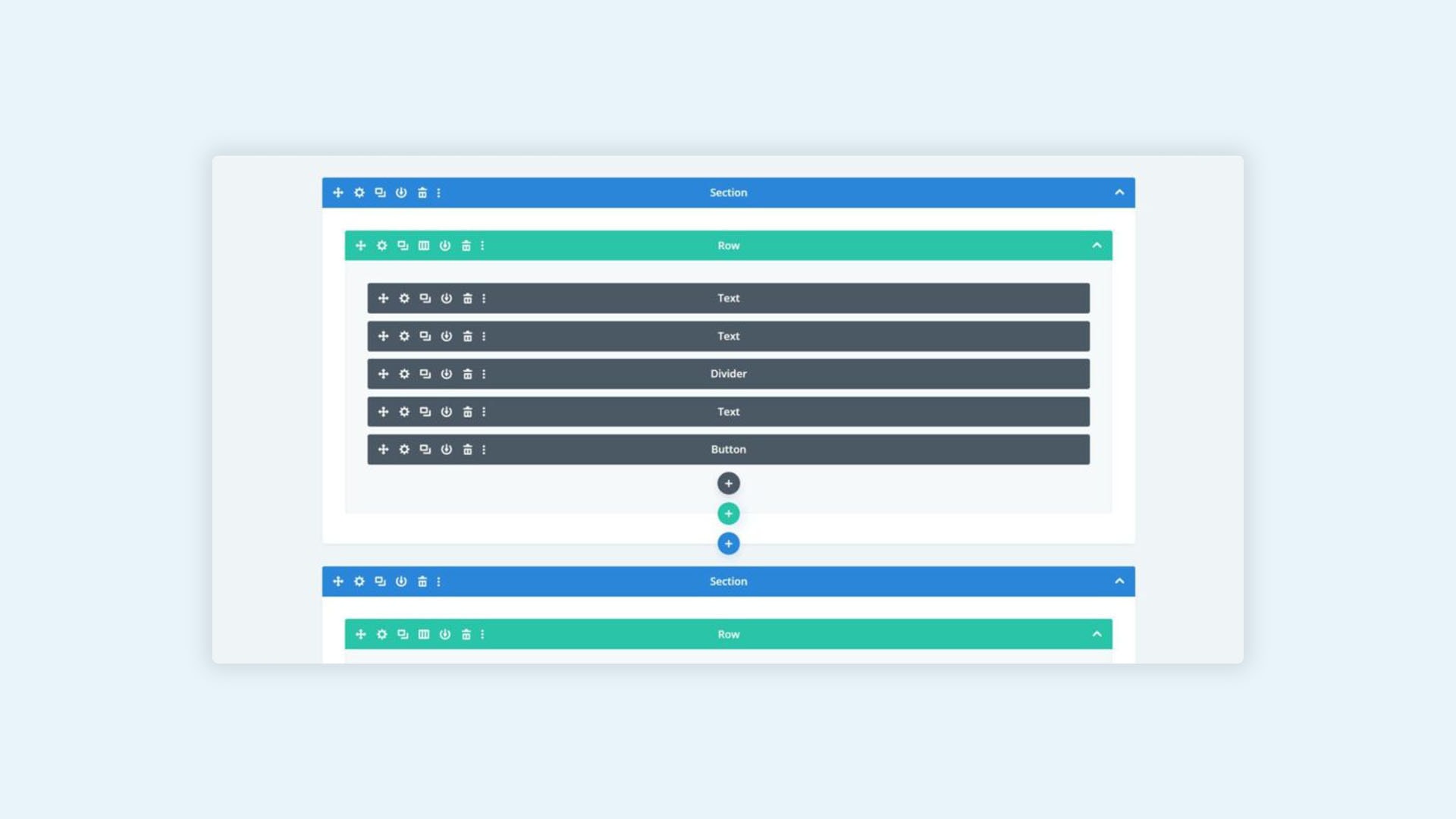
Your users are not the only ones exploring your website, you and your internal team need access too, to upload new content, make changes and update details.
Chances are you’ll need to spend some time learning the new system and getting training on any new programs you’ll need, however, once that is covered, getting into your site and working on what is needed should be straightforward.
If your website can’t be easily updated, there’s something wrong with your redesign. It could be the wrong content management system was allocated or your partner chose programs they are most comfortable with, not what’s the best fit for your business.
Make sure you clearly communicate your needs as part of your website redesign plan and ask your designer to keep you in the loop for all changes and what the impacts might be. This way you can get them corrected early on.
Once your website build is completed, making changes is a lot more difficult. You might even need to consider moving your website across to a new platform, a headache you really don’t want off the back of a redesign.
If this is not an option, make sure you get the right in-person training to understand the system you have inside out so you feel confident in making changes going forward. If you receive webcast training, be sure to record it so you can go back and watch it again if needed.
Another get around that is a little more expensive and inconvenient is to keep the website developer on your team to make changes and load content for you, however, if this is the case it should be communicated with you early on so you understand where you stand upfront as well as the consequences that may occur from having to relay changes through to another party.
If you know about these factors in advance you can put systems in place to allow for great communication and troubleshooting.
#10 Leaving Your Audience Out
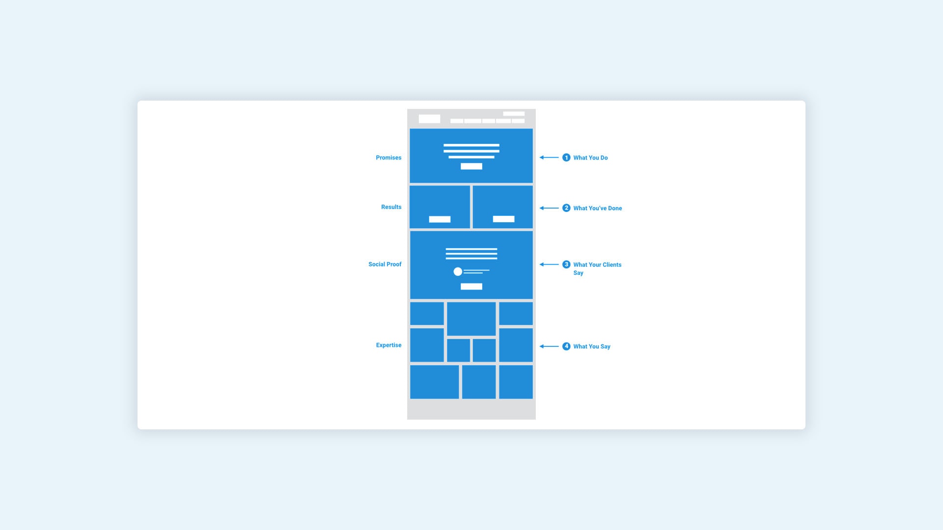
The best way to design your website is by centring it around your content. The big mistake businesses make is to put their company front and centre, when in fact, your readers are looking for a solution to their problem, provided by your company.
Yes, you are representing your company online but the purpose of it is to attract, maintain and keep a lead.
That means the focus needs to be not on your, but on them, your customer. Before you design your website, look at your content and what users are attracted to. Make sure you outline the main problems your customers have and how your company is able to solve them.
A solid content strategy is essential because this is how you communicate what you do with your reader as well as how it helps them achieve their goals.
Look to develop persona-focused content, which will give your website a customer based appeal.
Content is the reason visitors come to your website and also the driving base of web searching, SEO and clicks. For this reason, set content that your users love and need and build your website around making it stand out.
These are the key ingredients we use to structure website design around content:
- Home page with information on your business why, values and purpose (who can benefit from your service and why)
- Products
- Testimonials
- Blogs/Vlogs/feature content
- Contact information
Again you need to anticipate the user buying journey and put action steps in place to help them travel on their path with as little resistance as possible.
A well planned and executed website redesign can be a powerful way to increase your ROI, attract more online traffic, see leads converted as well as boost your brand recognition.
Your redesign is going to be a big project so be sure to set aside the time and budget you need to receive the best quality website that caters to your audience’s needs and provides the SEO and lead generation that will see profitable returns.
The look and feel of your website determine whether people trust you and continue using your site and business, so it needs to be perfect.
If you’ve recently gone through a redesign and your website is suffering as a result, work through the issues using the information provided, especially around improving your SEO and customer-based information.
If you need assistance redesigning your website or fixing a botched revamping, give us a call to discuss how we can enhance your user flow and provide the website content structure you need to get more leads and dominate SEO.


