
Last updated: September 2023
How much does website design in Singapore cost? Well, it depends! For a basic one-page site, the cost would range from $1,500-2,000 SGD. For something a bit more complex using WordPress templates, $3,000-5,000 SGD. You could expect to pay $5,000-10,000 SGD for a fully customised solution. In comparison, anything that includes eCommerce or membership sites would go up to around $20,000 SGD for website design and development costs.
So, while there are so many people that ‘can’ make a website, think about all of the Singapore website developers, designers, freelancers, experts, the guy sitting across from you in the kopitiam, and the girl next door in your shared workspace that can provide you with “the best” website solution for your business…
This is why the old saying ‘you get what you pay for’ is so important.
In this article, we explore how much it costs to design a website in Singapore and how you can unpack the question to ensure you get value for money in your quest for the ultimate site.

Table of Contents
What Are Your Objectives?
The key to any good website is ensuring your purpose is logically mapped out before you start.
If you’re building a small business website, who are your customers? What do you want them to do when they arrive at your site? Where is your lead generation coming from (source)? How are you planning to engage with them?
All of these elements will affect the cost of your website and are paramount to your site’s overall performance. For example, suppose you are building an eCommerce site with integrations such as subscription services, payment gateways and other plugins. In that case, these sites will cost more than building a brochure site for information purposes only without all the bells and whistles.
Remember that failure to plan is planning to fail, so if you don’t understand precisely what you want to achieve, speak with your website developer and business/marketing strategy team before investing in something that doesn’t work.

What Platform Are You Building It On?
The platform on which you build your website will most certainly determine the cost of the website build in Singapore and anywhere in the world. This is mainly due to the cost of the strategy, design, development testing, marketing, and sometimes plugin and theme requirements that will be needed for your finished site.
Whether you use WordPress, WooCommerce, Joomla, Craft CMS, Webflow, Shopify, BigCommerce, Weebly, or DIY builders such as Wix or Squarespace, your choice of platform will dramatically affect the price that you not only have to outlay but also a wide range of ongoing costs.
For example, building a custom WordPress eCommerce solution with WooCommerce and a range of plugins will cost significantly more than setting yourself up with a DIY Wix simple website solution as a startup.
Create Your Website With Services Like Wix, GoDaddy, Weebly, Squarespace, etc.
Using website builders on hosted platforms such as Wix, GoDaddy, or Squarespace can be a desirable solution to many small business owners and online store startups. It’s easy to see why, as they offer a free or very low-cost barrier to entry, usually about $20 USD a month.
As attractive as these hosted low-cost websites are for creating your website, you have limited control and ownership over your data and are usually locked into the templates and free plugins provided by the platform. Hosted solutions like Wix and Squarespace also have minimal SEO capabilities, meaning you own very little IP.
If you ever need to delete a Wix website or delete a Squarespace website, or perhaps even migrate the site as your business scales, you could have issues moving forward.
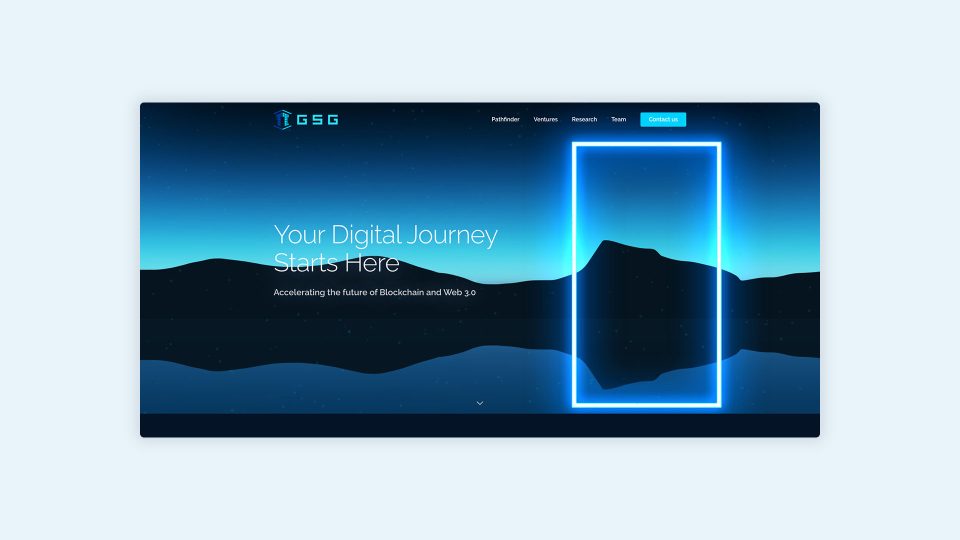
A Basic One-Page Business Website
Estimated Website Cost: $1,500 SGD – $2,000 SGD
Hundreds of website designers here in Singapore offer web design and development packages at reasonable rates, but how much does it cost in the long run?
Usually, these will display only the fundamental information; think of them as an extension of your business card, with just enough information to let visitors know that your company exists.
These low-cost websites may be appealing to some, but there are a few things you need to be aware of. More than likely, the cost is low because of the amount of work involved, so typically, your content will be thin and not optimised for search engine results pages.
These low-cost websites may be appealing to some, but there are a few things you need to be aware of. More than likely, the cost is low because of the amount of work involved, so typically, your content will be taken and applied on top of a basic template, usually without any thought for website visitors, mobile responsiveness, user experience or search engine optimisation. It is also unlikely that you can edit any of the content yourself without the right programming skills.
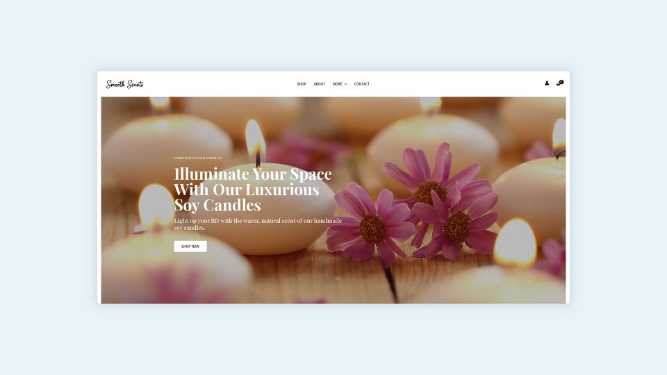
A Templated Website Using WordPress or Joomla
Estimated Website Cost: $3,000 SGD – $5,000 SGD
There are thousands of good-looking templates out there for WordPress, Joomla and Drupal, and many agencies and website designers will build your corporate website using pre-existing templates. These templates usually achieve a more polished and professional look than those who build themselves using the DIY approach.
We used this same approach in 2009 when we started Chillybin Web Design, as it was an affordable option for many of my clients to keep their website development costs down and to get their business online. This still applies to some small businesses and startups in [fl-year]. However, choosing a suitable template is very important. It’s still just a premium theme, which means it’s restrictive, lacks advanced features, and hasn’t been designed with your business goals and target audience needs in mind.
So, while it may look good and fit your budget, how much does it cost in terms of lost revenue and will it help you achieve your goals?
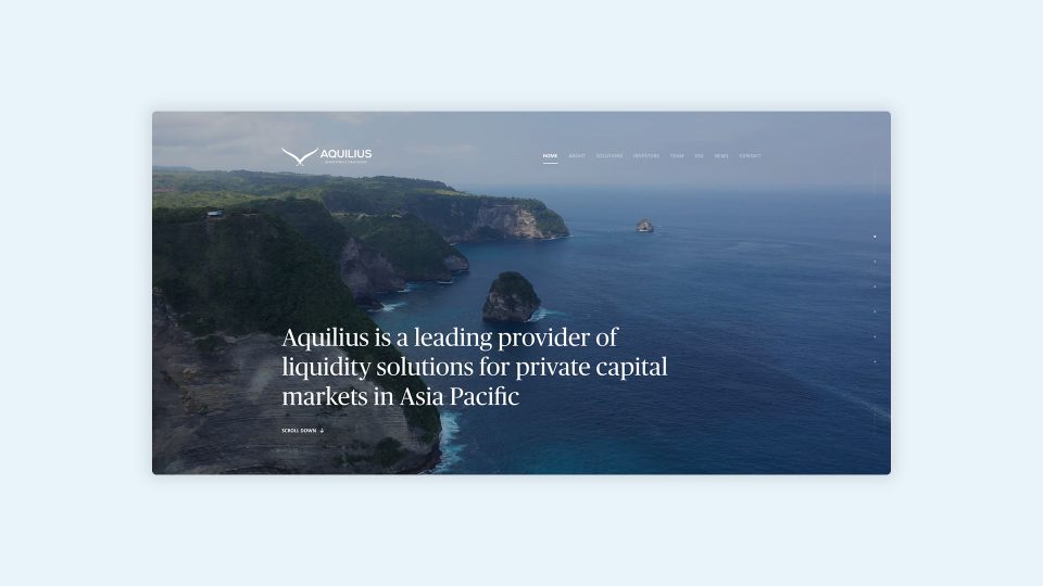
A Custom Designed and Developed Solution
Estimated Website Cost: $5,000 SGD – $10,000+ SGD
This is where you will find that your standard Singaporean web design agency and even some professional website designer freelancers will price their web design solutions, Chillybin included. At this budget range, your website should align with your corporate branding and business goals and appeal to your target audience’s needs.
A homepage design should be completely custom and bespoke, as well as your internal website pages. Web designers and agencies will spend a lot of time in the discovery or strategy part of the process to make sure that the end solution is aligned with the goals that you have set out for your website to achieve, which is typically some type of conversion, such as call, fill in a contact form, WhatsApp, or buy a product.
There can be additional add-ons at this price range, such as copywriting, search engine optimisation, performance and speed optimisation, email marketing, WordPress hosting, website maintenance & support, which can help to enhance the presentation and authority of your corporate website.
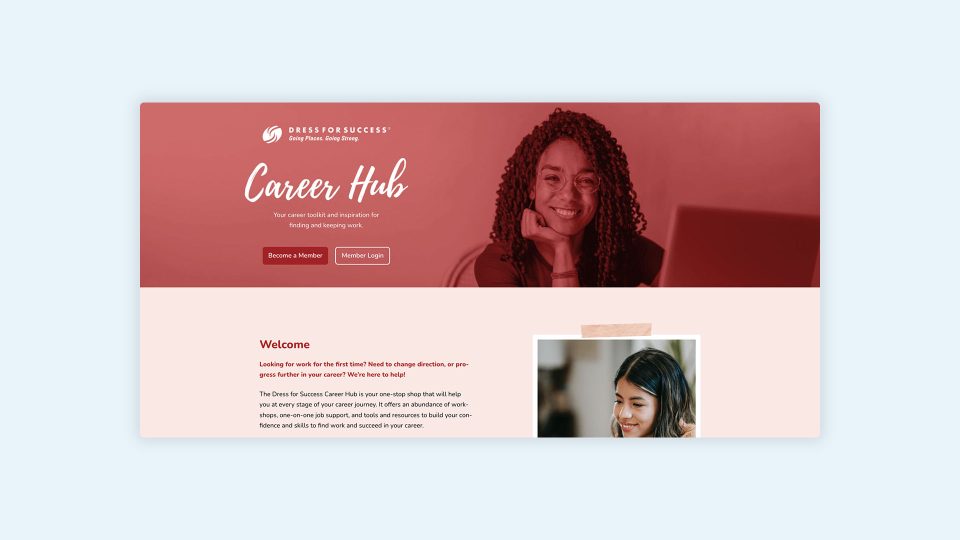
eCommerce, Applications, and Membership Websites
Estimated Website Cost: $8,000 SGD – $20,000+ SGD
While the illusion is in the market that you can get a well-designed and functional eCommerce solution using the DIY approach on Shopify and Squarespace, it’s not as easy as it seems.
There are some significant restrictions with Shopify, BigCommerce and Squarespace at their entry-level pricing, so you will typically have to upgrade or extend the service with add-ons, which could end up costing you around $300 USD per month, and you have to do all the work still yourself. So, what you might save initially in website development costs, you spend the same, if not more, in your time and monthly fees.
Web applications and membership websites are generally very technical and intelligent, with many custom functionality and integrations with third-party systems. In this price bracket, you’re paying for a knowledgeable and experienced team who can build and deliver to your specific requirements, usually from scratch, with bespoke website development.
We build stunning, user-focused websites that will wow your customers.
Are you a business owner in Singapore, Australia or worldwide? We work with clients across the globe to deliver beautiful yet functional website designs.
Key Things to Remember About the Cost Now and Ongoing for Your Singaporean Website
The best tip for building any website is the one we give for attending a job interview.
Dress for the job you want, not the job you have
Unknown
In short, if you are building a corporate website in Singapore or anywhere in the world, be prepared for the business you want, spend a little more at the start, do a few extra shifts at your current job and build a proper website with a qualified developer. You will reap the rewards sooner rather than later.

Website Development Costs Singapore – Pros and Cons
While it’s true that you could build a website for about $50 or engage a freelance WordPress developer to build one for $5,000 and beyond, there are pros and cons to all options…
WordPress Developer in Singapore
You know you’re getting the best by engaging a WordPress developer in Singapore. A quality website design agency will have a team of WordPress developers with experience, run on the board, and a host of testimonials to showcase their work.
They can write custom code to showcase your business the way you want and look at your business from a holistic point of view, helping you get the best website for now and well into the future.
Pros
- Customised theme and premium plugins
- Free SSL Certificate
- Big portfolio of web design work
- Experienced web developers
- In-house designers, developers and project managers
- Training is provided so you can update your site yourself.
- Your existing WordPress site remains functional while we build your new site.
- Many can offer WordPress hosting and Website Maintenance
Cons
- It’s more expensive than a DIY site, but you get what you pay for with website cost.
- Limited iterations. At Chillybin, we outline how many iterations we will provide during the quote and discovery phase.

Freelancer or Relative
Everyone has an UpWork or Fiverr web developer horror story, and if they don’t, it’s because they “have a nephew who is good with computers”.
Eek.
While a freelancer, friend or relative can build your WordPress website, should they?
If you’re making a blog to tell stories about your life, then slinging a few dollars to a niece or nephew won’t break the bank, but if the website is for your business or online store, you need to treat it like a business.
Pros
- Website cost is lower for small businesses just getting started
- Design services can be cheaper, helping you save on web design costs
Cons
- It may take them longer to complete the job if they ever finish
- Inexperienced in business-type web design
- No ongoing support
- The website won’t be optimised for search engines
- You will need to micro-manage the project
- The completed website will look cheap
- If you have an existing site, they may break it

DIY Website Builders
Yes, there are tons of YouTube tutorials and ‘plug-and-play websites on platforms like Squarespace where you can build your website.
But think about your time. How much does it cost your business to have you spending hours trying to build a website on a website builder instead of doing the things in your area of genius?
While you spend hours, days, or weeks going down the rabbit hole, something else will naturally have to miss out. What will it be? Customer service? Marketing? Time with your family?
Then, when the website goes live, it will still look like a DIY website and not the market killer you had in mind.
Pros
- Save on web design costs.
- With ready-made templates, you could add a logo, contact form, and image and publish your site in minutes.
Cons
- You will burn hours or days trying to implement everything to get a professional-looking website live.
- Everyone has access to the same free templates, meaning your site will look the same as others.
- For services like Wix, monthly website builder prices quickly add up.
- The website starts as free, but then hidden costs for custom functionality soon add up.
- You’re trapped on the DIY platform, so you’re limited to their tools.
- DIY website design always looks like DIY website design
- Have to spend time learning the technical skills a website developer already has so you can do it yourself
- Limited features and customisations
How Do I Plan a New Website Design?
Planning a new business website design involves many steps, from defining your goals and target audience to designing the layout, responsive web design, and choosing the right technology.
At Chillybin, we work through these steps with you and prompt you to think about your web design goals before we get into the website development side.
Here’s a detailed guide that covers each step of planning your web design with Chillybin.
Define Your Goals
The first step in planning your new website design is clearly defining your goals. What purpose should your custom website serve?
This could be anything from generating leads, selling products via an eCommerce website, and providing information to building brand awareness. Having a clear vision of your goals will guide the subsequent steps of your design planning.
Understand Your Target Audience
Next, you need to understand who your target audience is. What are their preferences, needs, and behaviours? This understanding will significantly influence your website’s design, as you’ll want to create a custom website that resonates with your audience and meets their needs.
Plan Your Content
Content is king, and planning it effectively is crucial to your website’s success. Determine the type of content your website will host, be it blog posts, product descriptions, company information, or contact forms.
Your content should be valuable, relevant, and engaging to your audience. Also, consider incorporating SEO strategies into your content planning to improve your website’s visibility on search engines.
Design the Layout and Navigation
Think about how you want your website to look and how you want users to navigate it. Sketch a rough layout of each page, considering where you want to place content, images, and calls to action. Ensure the navigation is intuitive and user-friendly, making it easy for visitors to find what they want.
Choose the Right Technology
You must choose the right technology depending on your website’s goals, audience, and content. This includes the content management system (CMS), coding languages, plugins, and more. Selecting technology that can support your website’s functionality and is within your budget and technical abilities is crucial.
Develop a Visual Identity
Your website’s visual identity should align with your overall brand. This includes choosing the right colour scheme, typography, images, and logo. A consistent visual identity helps build brand recognition and trust among your audience.
Incorporate Responsive Design
With increasing number of users browsing on mobile devices, your website must be responsive. This means it should automatically adjust to fit any screen size, providing a seamless experience whether users are on a desktop, tablet, or mobile phone.
Plan for SEO
Search engine optimisation (SEO) should be a key consideration when planning your new website design. From keyword usage in your content to metadata, alt tags for images, and a mobile-friendly design, ensure you’re incorporating SEO best practices.
WordPress Hosting
Not every web design agency will discuss web hosting when taking on your project because they’re website builders, not hosting companies.
However, at Chillybin, we know through experience that high-quality web hosting is a crucial cog in the wheel of website development.
We can help you choose web hosting with a hosting cost that suits your budget or discuss the pros and cons of hosts you may already be using.
Test and Refine
Testing is crucial once your website is built to ensure everything works as intended. This includes checking links, loading speed, and functionality across different devices and browsers. We use this testing phase to refine your design and fix any issues that arise before giving you complete training in the handover so you can do things like add blog posts or new images yourself – just one of the many reasons we love building WordPress sites, as they’re easy for anyone to use.
In conclusion, planning a new website design involves a series of carefully thought-out steps. With clear goals, an understanding of your audience, and meticulous planning and testing, you can create a website that effectively serves your audience, meets your business objectives, and will save money and time in the long run.
Bad Website Design Examples
When it comes to website design, knowing what not to do is just as important as knowing what to do, and if you choose a poor web design service or web design agency to save on design costs, disasters can happen.
While the website cost might be low, poor web design will cost more in lost sales and revenue, especially if you’re building an eCommerce website.
Let’s dive into some examples of poor website design practices that can hinder usability, alienate users, and harm your online presence.
Cluttered Layout
One of the primary bad website design practices is a cluttered layout. Websites overloaded with information, images, and animations can overwhelm users and make it challenging to find the necessary information. Not only does this lead to a confusing user experience, but it can also slow down your site’s load speed.
Case study: maneheavensg.com
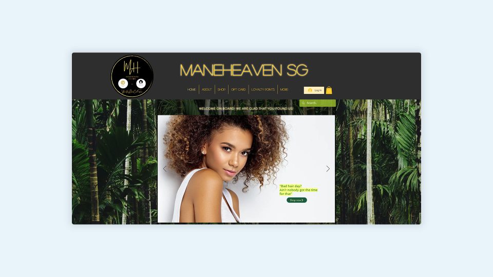
The example from a local hairdresser in Singapore has several issues, but the primary concern is the cluttered layout lacking clear direction. The website showcases a large logo and text version of the brand name, yet it fails to communicate its purpose.
A welcome message and rainforest background image further add to the confusion, along with a slider featuring a person with nice hair but conveying a negative message. The call to action is to buy something from their shop, leaving visitors unsure about the business and its services.
It is crucial to immediately communicate that this is a specialised salon for women with curly hair, offering specific products. Visitors should be able to understand the salon’s unique focus and offerings right from the start.
Additionally, the Contact information is hidden under a secondary “more” menu, making it difficult for users to locate the salon’s location. Easy access to contact information is essential for potential customers who want to book appointments or visit the salon.
By addressing these issues and improving the layout and messaging, the website can provide a clearer and more user-friendly experience for visitors, leading to increased engagement and potential business opportunities.
Poor Navigation
Poorly designed navigation can frustrate users and lead to a high bounce rate. If visitors can’t find what they’re looking for quickly and easily, they will likely leave and never return. This includes confusing menu structures, missing or broken links, and lacking a search function.
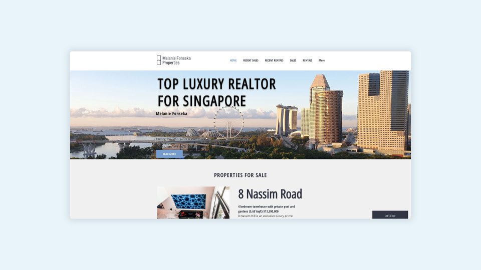
Case study: luxurysingaporeproperties.com
The luxury realtor example from Singapore exhibits multiple issues, primarily concerning navigation and user flow. While the initial navigation includes links to recent sales and rentals, it becomes confusing as they are repeated without clear indications.
Moreover, crucial pages such as “about” and “contact” are hidden under the “more” menu. Easy access to these pages is essential for visitors who want to learn more about the realtor and get in touch.
The website prominently displays the agent’s name. Still, visitors must browse numerous pages to discover who Melanie is and how she can assist with buying or selling a property. It is essential to communicate Melanie’s expertise, unique selling points clearly, and what sets her apart from the other 30,000 real estate agents in Singapore.
Furthermore, the website claims to be the #1 realtor but fails to provide concrete evidence or testimonials to support this claim. Including testimonials or highlighting achievements can help establish credibility and trust with potential clients.
Additionally, placeholder text within property listings undermines the professionalism and attention to detail that clients expect from a luxury realtor. Ensuring that all content, including property listings, is accurate and complete is crucial for building trust and credibility.
By addressing these issues and improving the navigation, messaging, and content accuracy, the website can provide a more user-friendly experience and establish a stronger presence in Singapore’s luxury real estate market.
Unresponsive Design
In today’s digital age, users access websites from various devices, including smartphones, tablets, and desktop computers. A site that is not responsive and does not adapt to different screen sizes can be challenging to navigate and may turn potential customers away.

Case study: bowentherapy.com.sg
The therapist example from Singapore demonstrates partial responsiveness due to being built on a DIY website builder platform. Although it includes a mobile menu and adapts partially for mobile and tablet devices, layout issues exist. Users may need to scroll horizontally to read the website and access the menu.
Initially, the page appears minimal, with just two lines of text, an image, and a logo. Considering limited space on mobile devices, it’s crucial to quickly communicate your unique value proposition to the target audience and demonstrate how you can solve their problems.
As you scroll down, the page becomes text-heavy with no clear call to action, and the same image is repeated in the header. This can lead to a lack of engagement and make it challenging for visitors to take the desired actions on the website.
Despite its size, with some improvements, this small clinic could achieve more success with an optimised website. By addressing the layout issues, ensuring a clear and compelling call to action, and using visual elements effectively, the website can better engage visitors and convert them into potential clients.
Improving the mobile responsiveness and navigation experience will enhance user satisfaction and make it easier for visitors to access the information they need. Additionally, considering the text-heavy nature of the page, breaking up the content into smaller sections and utilising visual elements such as images or infographics can make the information more digestible and visually appealing.
Overall, by improving the website’s responsiveness, layout, and user experience, the therapist example from Singapore can create a more compelling online presence and attract more clients.
Overuse of Flash and Auto-Playing Media
While Flash animations and auto-playing media can add visual interest, they can also slow down your site and annoy users, especially when not expecting it. Moreover, Flash is no longer supported on any device, meaning users might not be able to see your content.
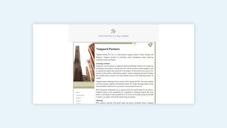
Case study: vp.com.sg
This multinational company example from Singapore showcases an outdated website that has remained unchanged since its publication in 2009. The website header relies on Adobe/Macromedia Flash, which officially discontinued support at the end of 2020. However, the actual demise of Flash was due to ongoing security vulnerabilities and its lack of compatibility with the iPhone.
Flash content was notorious for being resource-intensive, leading to significant delays in website loading times. This sluggishness can frustrate users and increase bounce rates as visitors abandon the site before it fully loads. Moreover, search engines struggled to parse Flash content, adversely affecting the website’s search engine optimisation (SEO) efforts.
Considering it is a multinational company with offices in Singapore, China, and Germany, one would expect a more contemporary approach to its website. In addition to the Flash dependency, the absence of a content management system (CMS) like WordPress means any changes must be made directly in the HTML source code.
Furthermore, the website lacks responsiveness, resulting in poor rendering on tablets and desktops. Despite having a relatively narrow content section, the side navigation requires users to scroll down to access different pages. Additionally, on certain inner pages, the navigation disappears, forcing users to rely on the browser back button or the links in the footer.
Suppose a potential visitor seeks a company capable of fulfilling their technology project goals in China. In that case, this website fails to instil confidence in a modern company equipped to meet the evolving needs of businesses in 2023 and beyond.
Bad Colour Choices
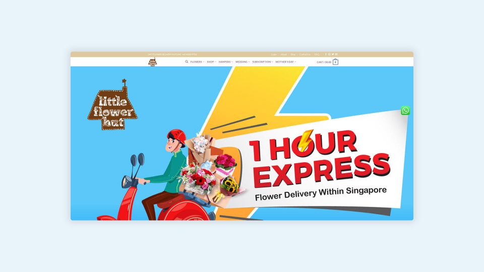
Poor colour choices can make a website hard to look at and even impact readability. Using colours that clash or make distinguishing text from the background challenging can quickly lead to user fatigue and dissatisfaction.
Case study: littleflowerhut.com.sg
This flower delivery example from Singapore showcases several design errors, but the first one that stands out when you first load the site is the contrast and clash of all the colours on the large banner. It conveys the message that this company does 1-hour express flower delivery, but not much more.
There are two logos on display, mainly because of the detail in the logo. It does not render very well at smaller resolutions, so they have added it as part of the banner. The banner is enormous, and you must scroll down slightly to see a big red banner with the phone number. While providing contact information is essential, this website has gone about it incorrectly.
If we look at their brand colours and logo, they are quite earthy, with the logo in the shape of a hut and the letters designed around garden items. However, this is contrasted with a blue, red, and yellow slab that doesn’t fit the brand colours. The company could achieve a similar effect by recolouring the stock graphic into its brand colours. It would be more effective to have the text in HTML on top of an image so that search engines could read it and attribute it to the business.
I searched for “Fastest Flower Delivery Singapore,” the company came up in sponsored listings but was towards the end of the search results page. We looked at about 20 sites while researching for sites with lousy colour choices using the keyword “flower delivery Singapore.” It’s important to note that almost all of their competition had a similar website layout, but their banners almost exclusively had photos of flower arrangements with text on top.
So, it’s essential to consider what your competitors are doing in the same space. While you don’t have to copy them, particular aesthetics work well for specific niches. Keeping within these design standards would work much better for this brand. The rest of the site is a mix of brown, pink, and blue shades, which work much better together. Although the site could use some updates for consistency, it’s not doing too bad overall, outside of the issues with the banner, which, unfortunately, is the first thing you see and likely don’t explore any further.
Lack of Contact Information
A common mistake on many websites is the lack of clear, easily accessible contact information. If a user wants to contact you and can’t find the information readily, it can lead to frustration and a lack of trust in your business.
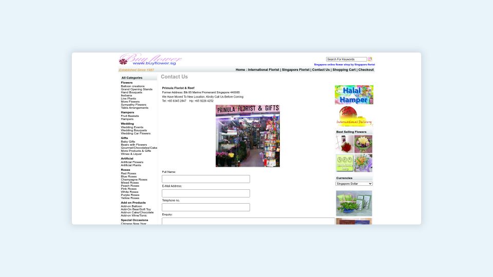
Case study: buyflower.com.sg
Unfortunately, another flower delivery example from Singapore exhibits numerous design errors that we have previously discussed. It suffers from a cluttered layout, poor navigation, lack of responsiveness, inappropriate colour choices, small text, and a significant absence of contact information.
Specifically, I want to highlight the perplexing decision to withhold their new shop location. Although the website features a convenient contact form and provides a handphone and shop phone number, it only mentions their old address in Marine Promenade. It instructs potential customers to contact them for the new address. Given the overall appearance of the website and the minuscule shop photo, it’s unlikely that many people would be motivated to call and go through the trouble of tracking them down.
In a competitive market, customers are likelier to choose a flower shop with readily available and accurate contact details or opt for an actively maintained website. The lack of transparent information raises doubts about the existence of this shop, predominantly since their Google Business Profile lists an address in an industrial estate in Defu Lane, which is not an appealing location for browsing flower options.
Therefore, updating contact information on your website is crucial to ensure accessibility, build credibility, inspire trust, and demonstrate a solid commitment to customer service. Having updated contact information on your website adds convenience for customers to reach out, seek support, and make inquiries. It also adds to the professionalism and trustworthiness of your business, showing that you value customer service and are transparent in your operations.
Ignoring SEO Principles
Not considering SEO during the design process is a bad practice that can severely affect your website’s visibility on search engines. This includes not optimising your site for relevant keywords, not using alt tags for images, and having slow load times.
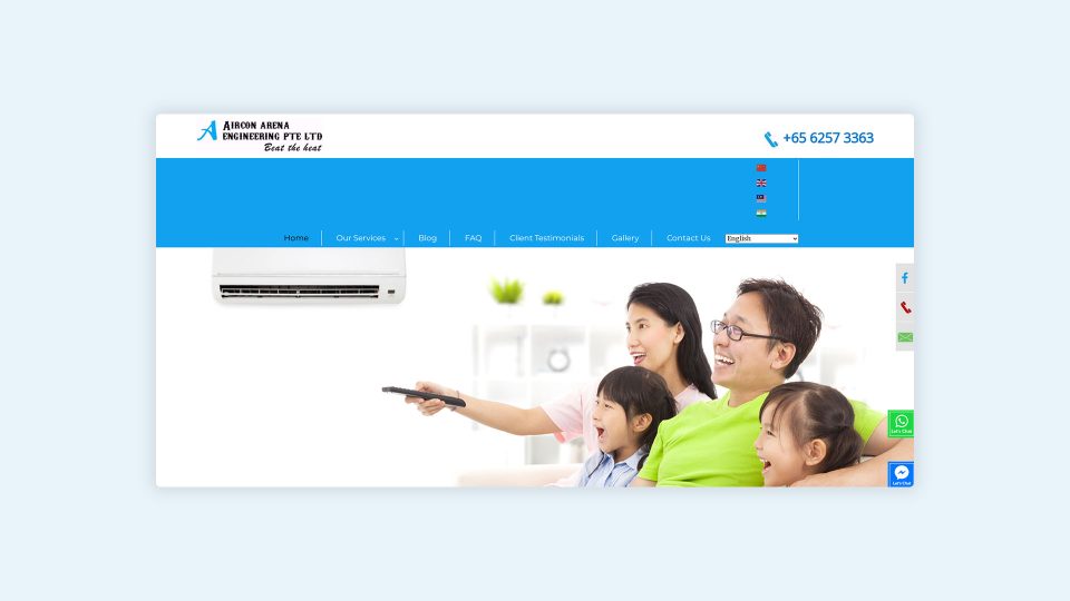
Case study: airconarena.com.sg
In this instance, from a Singaporean air conditioning company, several issues may contribute to its low ranking on the tenth page of our Google search for “air con repair Singapore.” At first glance, there are some positive aspects, such as a prominently displayed and linked phone number and WhatsApp and Messenger contact widgets. Additionally, the website is available in four languages. However, there is a problem with the language switcher, causing the navigation area to push the entire website down.
Regrettably, no text or message is conveying the company’s identity and how they can assist potential customers. When visitors come across the stock photo of a joyous family watching TV, they may not proceed further because the website fails to communicate how the business can meet their needs.
Upon investigating the site’s source code, it becomes apparent that it has been constructed with WP Bakery Page Builder, which can be resource-intensive and is often associated with inexpensive templates that have an appealing appearance but lack substance for the business. The homepage’s <h1> tag is labeled “About us,” effectively signaling to Google that a generic title is the most critical content on the page. To provide Google with more relevant information about the company, a more suitable tag such as “Singapore’s Premier Choice for Reliable and High-Quality Aircon Servicing” could be used, or any of these variations:
- Beat the Heat: Reliable Aircon Servicing to Keep You Cool in Singapore
- Say Goodbye to Aircon Problems: Quality Servicing Solutions in Singapore
- Hassle-Free Aircon Solutions: Trusted Servicing for a Comfortable Home in Singapore
- Stay Comfortable All Year Round: Expert Aircon Servicing in Singapore
- Expert Troubleshooting for Your Aircon Woes: Reliable Servicing in Singapore
All of these examples directly address the concerns of the target audience, who are likely experiencing issues with their malfunctioning or damaged air conditioning units and are seeking a company to provide repair or maintenance services, including chemical cleaning.
In conclusion, while it’s important to have a website that visually appeals to your audience, functionality and usability should never be sacrificed for aesthetics. By avoiding these bad website design practices, you can ensure that your site is user-friendly, responsive, and optimised for success.
Ready to work with the best website designer in Singapore?
Contact us today and let’s make your web design dreams a reality.
View case studies of some of the successful work Chillybin has provided for a range of clients across Singapore on our portfolio.
How much does it cost to design a website in Singapore? – FAQs
You may also like…


