
Are you struggling with an overcrowded business website, hoping to cater to everyone but failing to build strong audience attraction, engagement, and trust?
In this blog post, we’ll explore the reasons behind this phenomenon and the benefits of a simple and targeted website design that can increase your conversion rates, brand awareness, and revenue. We’ll also provide insider knowledge and research on achieving a clean and impactful website design, avoiding the common traps many businesses fall into.
So, let’s dive into the mechanics of minimalism in website design and learn how to design a website that truly resonates with your target audience.
Table of Contents
Everyone knows less is more, but putting it into practice isn’t easy, especially regarding your website design style.
A big reason behind overcrowded business websites is the fear of missing out (FOMO). Most businesses want to cater to everyone, please every audience and target the widest possible customer base. It seems logical from the surface: More customers = more sales = more revenue and a bigger company, right?
Digging deeper, the equation is far more complex. Proven website design strategies deliver a carefully targeted message to one specific audience. This creates powerful audience attraction, engagement and trust, leading to loyal clients, word-of-mouth advertising, and repeat sales. This is far more beneficial to your conversion rates and brand awareness to offer a simple, clean website design.
The less is more equation is the winner for delivering this impacting result. Getting it right requires insider knowledge and research, which is why business owners shouldn’t build their own website and hand it over to a website design expert who can get it done right in a fraction of the time.
How to Create a Clean Website Design
You want your site to make a crisp, clean, attractive first impression. You only get one shot at winning your audience over, so taking the time to get your website right is crucial. Clean design focuses on the careful and precise positioning of the important elements throughout the site – a place for everything and everything in its place. A big part of an attractive and clean website is determining the few key, clean design elements you want to showcase and understand the many things to avoid.
Some quick tips for getting the equation right include:
Have One Clear Direction
Ensure your website has a simple and intuitive design and the content aligns with your product and business values, pricing, branding, and colour scheme.
Say No To Ads
Ads might be a way to gain additional revenue, but they deter potential customers from your main goals and cause confusion. The point above is all about having one clean direction, and nothing will split your messages and dilute what you want to say faster than someone selling something else simultaneously.
You want to build a buyer journey where the user clicks on your end goal. Unless your end goal is for them to leave your website and click on something else, avoid the mistake of putting ads on your homepage.
Only Use a Sidebar if Necessary
Some websites need a sidebar to support their content and give the target audience more options, but this doesn’t apply to everyone. Don’t stick a sidebar in if all it does is fit with your content goals.
Keep Your Services and Products Up to Date
Remove any old images, information and products you no longer offer. Your target audience visits your website looking for information and assistance. If you have pages and pages of content related to services your company no longer performs, it can send a confusing message about what you do. Make sure what’s on your current website is an accurate representation of your core offers.
Know What Your Goal Is for Every Page
To deliver what customers want, you need to know what you want visitors to do (i.e. click on your products page, start a free trial, look at your team bio) and make that super appealing and easy to do with action steps and clear direction.
This is a great clean website design example of how this can work well:
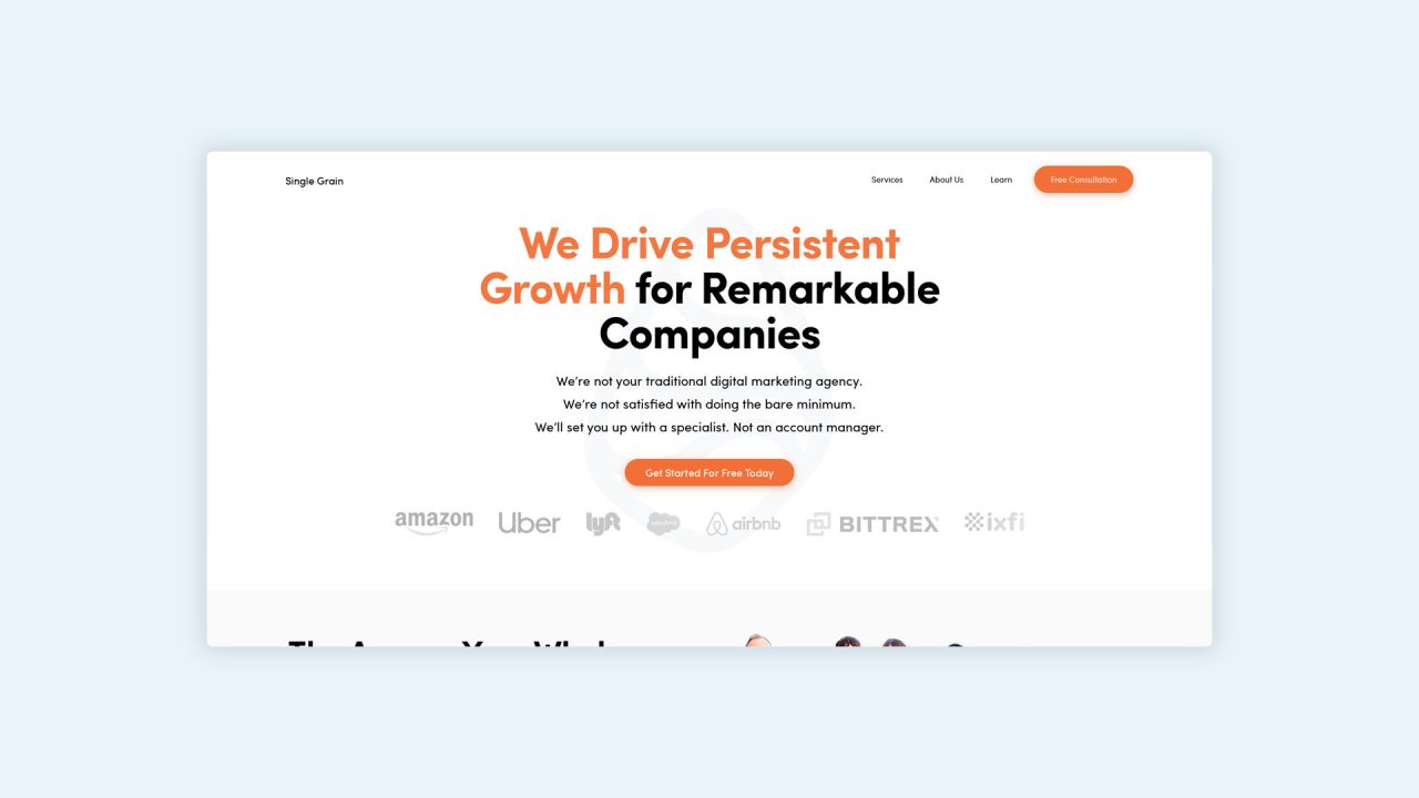
Single Grain is a great example of how powerful it is to have everything pointing in one direction. This homepage combines all the steps above with powerful, enticing results. There is only one message and it’s stated loud and clear.
We build stunning, user-focused websites that will wow your customers.
Are you a business owner in Singapore, Australia or worldwide? We work with clients across the globe to deliver beautiful yet functional website designs.
Reasons Why Your Website Should Have a Clean Website Design
It is staggering to discover that so many businesses overlook the importance of a simple, clean website design, especially given how many ways it gives back to your organisation. Here are eleven of the biggest reasons to go with a minimal website design and see big paybacks:
It’s Cheaper To Build
Look at your business goals, values, and what your business stands for. Capturing that in your web design is enough inspiration. You don’t need anything else to inspire or make it engaging. This straightforward concept is easy for you to research, will be unique to your business and will take less time for a website developer to build, saving you money and launching your new website quickly.
It will also be easier for your key stakeholders to check over, and you’ll have fewer requests for revisions and changes.
It Won’t Date Quickly
Website trends change fast. Keeping on top of them and maintaining a timeless look can be expensive if you must revamp your website yearly. A clean and simple website design will enable you to keep the same great look and feel longer without looking dated.
Busy designs fade fast. A minimalist website design can remain visually appealing for much longer. As well as saving you in updates, it sends a loud and clear signal that your website is timeless, professional and current.
Apple is a strong example of how minimal design works to develop an instant and long-lasting appeal. They can switch this up to be any product quickly and easily without completely redesigning the entire website.
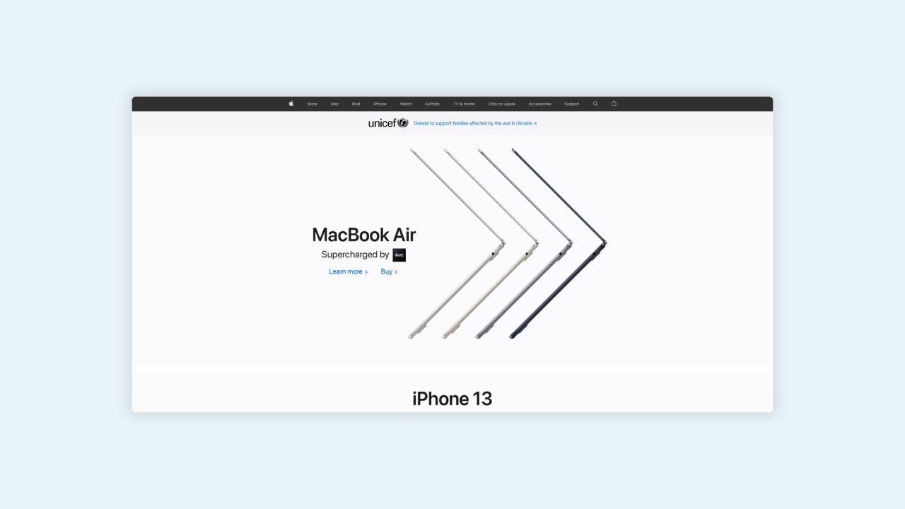
Even with their potentially bottomless marketing budget, Apple is smart enough to know there is no reason to waste time and energy redesigning the website every time a product is on offer, and they can upload the next feature, keeping their brand image familiar and trustworthy.
A good first impression encourages your target audience to stay and look around your website longer, increases their trust in your ability to back up your offering and provides more opportunities to receive a sign-up, conversion or see the customer return at a later date.
It’s Faster to Read
Less clutter on the page means less for a visitor to do. They can scroll and scan quickly and move from A to B to C without effort. They don’t come to your page to do work, just the opposite, and they are taking a break, quickly doing some research or trying to find an answer to something in their free time. Help them on their way quickly by keeping it simple.
By removing unnecessary elements, you can draw the reader’s attention to the things that matter most: Your content, product and solutions.
A great way to make a faster read is to include the following:
- White space
- Breathing room
- Simple colour scheme
- Clear headings and subheadings
- Basic and clear calls to action
- Bolded and enlarged quotes
- Numbered and bullet point list
- A clear Call To Action
For the ultimate website build, help the designer make the most important/relevant/current article stand out and draw attention by making the icons larger. Any other content of interest you want to be listed on the same page can be listed in easy bullet points or thumbnails to make scanning and selecting fast and easy.
It’s Easier to Remember
As much as you’d love for your target audience to buy right then and there, you need to consider that many will research their options and return to their shortlists later. Having a unique website is a big factor in helping your audience find their way back when they are not quite ready to commit and helping increase loyalty through repeat purchases.
Our brains look for familiarities and patterns and are attracted to what is already known and familiar. Psychologist George Miller found that the human brain can recall around seven pieces of information simultaneously. This is important science to remember with your minimal website design: What are the main pieces you want people to remember about your website, style and brand?
When there is less to process, there is less to retrieve, making memories stronger and memory recall clearer.
A clear example of this in action is the Fork & Pencil recipe website. The bold images and simple structure make it easy for their target audience to browse and find something, even if they don’t know what they want. They’ll also be enticed back to try another recipe for another meal and recommend their friends simply because of how attractive the website design is.
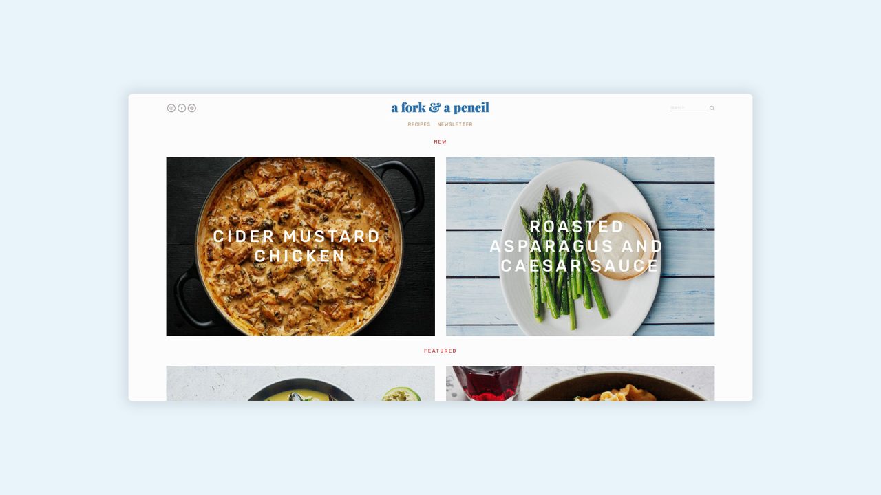
There is every reason to click back, sign up, comment and talk about this website.
Clean, modern website designs with low complexity require less work, less thought, and there is less to remember, making these sites more memorable. Your key information will stand out hours after the user has left your page.
You’ll See Faster Loading Times
Even when you optimise a busy website, it will still have a slower loading time than a clean website. With fast loading times being essential to your target audience and Google, it is a big benefit to have a clean website design that loads quickly without any additional effort or maintenance from you or your developer.
Features that are heavy and will weigh down your website load and interaction times include:
- Complex images
- Features
- Multiple user options
Cutting down to a simple and clean website will eliminate these issues and give you lightning-fast loading times.
It’s Easy to Navigate
Your website and app must be easy to build a strong prospect experience and create a smooth buyer journey.
By limiting the number of options on the website, the user needs to think less, explore less and can save time quickly clicking to where they want to go.
- Simple and minimal navigation menu choices
- Well-placed, basic and necessary buttons
- A clear and decluttered header bar
- Anticipate the user’s next steps and make that available front and centre
It Feels Genuine
Transparency creates trust because it looks like you have nothing to hide. Busy and over-complex websites are not just overwhelming; they seem like giant sales banners. No one likes to be sold to, especially if there is a constant feeling of a catch waiting around the corner. Instead, focus on delivering a quality product that fulfils the reader’s needs. Let them be the ones to decide if they want to buy it or not. They are intelligent enough to make a buying decision without you nudging them in a certain direction.
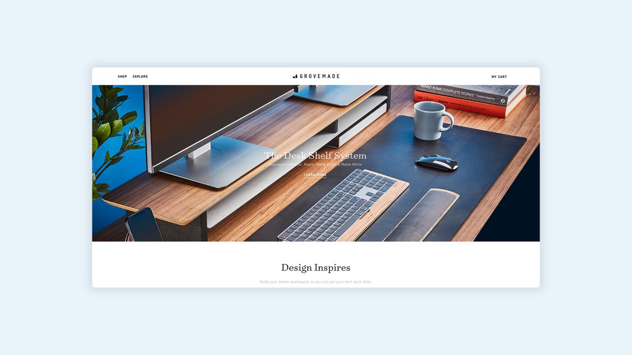
Grovemade creates desktop accessories. Their website isn’t afraid to get up close and personal, providing a feeling of total honesty and stripping back to just their product.
Better Conversion Rates
Once your target audience clicks your website, you need them to stay. From there, you need them to convert. Without sticking to that first landing page and securing a purchase, your business isn’t going to see success.
If the issue is website design, it could be that your swirly graphics, decorative backgrounds and many shop details are pulling attention and resources away from your products and what you do.
Visitors will be more likely to convert when they:
- Like their experience with your website
- Get a clear understanding of what you do
- Can clearly see your why (your overall mission)
- Can apply your solution to their situation
A neat and clean website builds trust and quickly provides visitors with the information they need.
As long as what you offer matches what they are looking for, they’ll not hesitate to purchase.
When it comes to choosing what to include in your new, clean, modern website design, put your energy and focus on your business and product values to showcase:
- What you do
- Why you do it
- How you can help
Once that’s covered, you can cover how they can buy or contact you.
If any of these three pillars fails; leads, browsing, conversions, you’ll need to go back to the Google Analytics drawing board and understand where the disconnect is.
It’s Easy To Keep Things Organised
Having a well-organised and clean structure for your corporate website is especially big for E-commerce sites, but it’s good to remember for all businesses.
Everything must be categorised and organised when you have a simple website.
While it might take time to organise your website offering, keeping it neat and tidy will be easy once completed.
You can easily add new products to the correct sections, add updates, delete old offers and keep things clean with less effort, less time and fewer complications than on a busy, crowded website.
It also means you’ll be able to see errors quickly, and fewer things can break and go wrong.
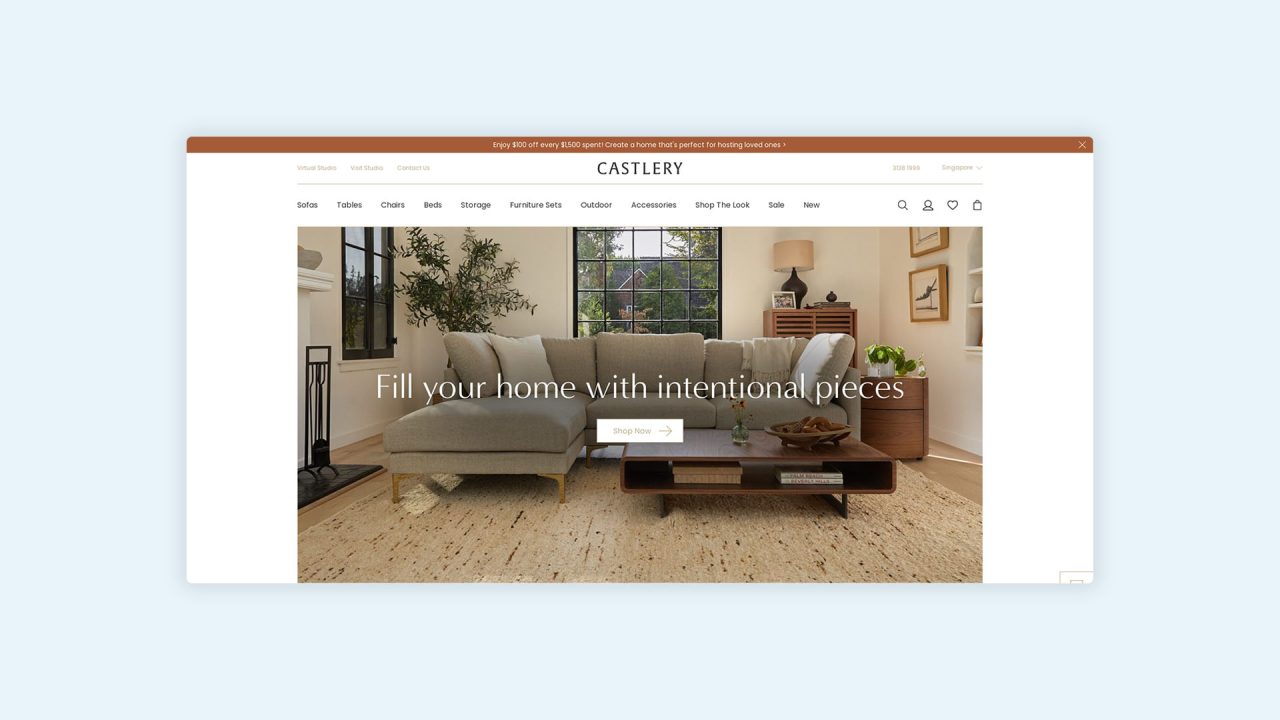
Castlery is a great example of how to offer simplicity in a situation that could be complex. There are so many choices and so many products to choose from. Instead, Castlery has focused on its range of internationally designed furniture, which stands out from other Singaporean furniture stores.
The gentle theme and strong call to action back up their soft and gentle claims and help give any uncertain visitor a clear and uncomplicated place to begin. We hope the menus for other products are clear and well-defined for everyone else.
Cheaper Hosting
While you can get away with cheap hosting for your business website, it does pay to go with a better hosting package that gives you better security and more capacity. That said, you don’t have to pay big money just for the sake of it.
A more complex website takes up more hosting space and needs more room on a server.
A simple and clean website design makes higher-quality hosting packages more affordable.
It’s Easier for Google to Crawl
When you have simple web pages and a clear relationship between the page content and their relationships to related pages, it’s not necessarily easier for users to follow; it’s also quick and easy for Google and other search engines to crawl and map. The reward for this is better SEO and more opportunities for organic clicks from search engine returns.
Make sure you break up your content with headings and use the appropriate hierarchy to show content flow and internal links to show strong relationships between page content.
A sitemap is a small and easy addition that will make this a simple and easy process. We go into this in more detail in our guide, with everything you need to know about our web design process.
What are the best colours to choose for a clean website design?
A clean web design typically uses only 2 or 3 colours. Generally, they will be paired with blues or blacks and whites and could include three different colours for more variety. However, note that this does not mean you need only these colours, and we recommend restricting the colours for you so that the website does not feel too loud and cluttered.
Should I avoid including other design elements in a clean design?
No. Clean websites are not required to use the same colours or the same text. When looking for clean website layouts, it will be clear to see what layouts have pictures and forms that will be useful for your clean website designs. Make them prominent and maintain a simple layout with numerous elements and features.
Creating an Engaging User Experience
Less really is more. These eleven reasons are just the tip of the iceberg, and plenty of other benefits exist. If you already have a website out there that is cluttered, overcomplicated and busy, you’ll benefit from going back to the start to build a website that truly reflects who you are and what your business does.
As you have seen from the examples of clean, modern website designs, there is no one-size-fits-all approach. You can still get creative and show some personality, which will appear even more powerfully because the page has fewer distractions.
A simple website is easier to use, looks great, feels great and speaks on your behalf as organised, professional and trustworthy.
Stripping back will also make your life easier, with fewer headaches and costs.
To get started, delete anything that isn’t your main focus and look for opportunities to use white space.
If you need help designing a website with enhanced user flow, more leads and dominating SEO, contact us to see how we can help. You’ll not only have a more functional and responsive website, but it will also look more beautiful too.
Reasons Why Your Website Should Have a Clean and Simple Design – FAQs
There are many reasons why your website should have a clean and simple design. However, there may be some questions that you have before you proceed. Here are some frequently asked questions about the benefits of a simple website design.
You may also like…


