
Visual hierarchy plays a crucial role in web design, guiding users’ attention and enhancing overall usability. It involves arranging visual elements strategically to create a clear order of importance, helping visitors navigate and absorb information effortlessly. By employing principles such as size, colour, contrast, and spacing, website owners can direct users’ focus to key content and call-to-action elements.
Effective visual hierarchy contributes to a seamless user experience by reducing cognitive load and allowing visitors to quickly find what they’re looking for. It helps structure content in a logical manner, making websites more intuitive and easier to navigate. When implemented thoughtfully, visual hierarchy can significantly improve engagement, conversion rates, and overall user satisfaction.
Key Takeaways
- Visual hierarchy is a crucial principle in web design that guides users’ attention to the most important elements on a page. By strategically using size, colour, contrast, positioning, and whitespace, designers can create a clear path for users to follow, enhancing usability and user experience.
- Effective visual hierarchy relies on several key elements, such as size and scale, colour and contrast, typography, positioning, and negative space. These elements work together to establish focal points, arrange information logically, and create visual relationships between different sections of content.
- Implementing visual hierarchy involves techniques like establishing clear focal points, arranging elements strategically using common layout patterns (like the F-pattern or Z-pattern), and utilising size and scale to emphasise key information. Consistency in design elements across the website reinforces the visual hierarchy and improves the overall user experience.

Table of Contents
Understanding Visual Hierarchy
Visual hierarchy in web design organises elements to guide users’ attention and improve their experience. It structures content to enhance usability and make information easily digestible.
Defining Visual Hierarchy
Visual hierarchy refers to the arrangement of design elements based on their importance. It creates a clear path for users to follow, helping them navigate a website effortlessly. This concept is rooted in how humans process visual information, prioritising certain elements over others.
Visual hierarchy uses various techniques to emphasise key content. These include size, colour, contrast, positioning, and whitespace. Larger elements typically draw more attention, while contrasting colours can highlight important information. The strategic placement of elements on a page also influences how users interact with the content.
Principles of Visual Hierarchy
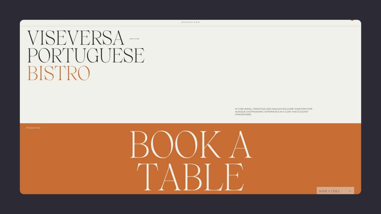
Several key visual hierarchy principles guide the creation of effective visual hierarchies in web design. Size and scale play a crucial role, with larger elements generally perceived as more important. Colour and contrast can direct attention to specific areas or call-to-action buttons.
Positioning is another vital principle. Elements placed at the top of a page or above the fold are often seen first. Whitespace, or negative space, helps separate different sections and prevents visual clutter. Typography also contributes to hierarchy, with headings and subheadings guiding users through the content.
Consistency in design elements across a website reinforces the visual hierarchy. This helps users quickly understand the structure and importance of different sections. By applying these principles, designers can create intuitive and user-friendly websites that effectively communicate their message.
Elements of Visual Hierarchy
Visual hierarchy in web design relies on several key components to guide users’ attention and create an effective layout. These elements work together to structure information and enhance the overall user experience.
Key Elements in Design
Size and scale play a crucial role in visual hierarchy. Larger elements naturally draw more attention, making them ideal for headlines or important calls to action. Colour and contrast are equally important, with brighter or contrasting colours standing out against muted backgrounds.
Typography choices significantly impact hierarchy. Different font sizes, weights, and styles can emphasise certain text elements over others. Headings typically use larger, bolder fonts than body text to establish their importance.
Positioning is another vital factor. Elements placed at the top of a page or in the centre often receive more attention than those at the bottom or sides. This principle applies to both overall page layout and individual content sections.
The Role of Negative Space
Negative space, also known as white space, is the empty area between design elements. It’s a powerful tool for creating visual hierarchy and improving readability.
The strategic use of negative space helps separate different content sections, making it easier for users to scan and understand information. It also draws attention to specific elements by isolating them from surrounding content.
Balanced negative space prevents visual clutter and creates a sense of elegance in design. It allows important elements to ‘breathe’ and stand out, enhancing their impact on the viewer.
Utilising Visual Cues
Visual cues guide users through a website’s content and highlight important information. Arrows, lines, and other directional shapes can lead the eye to specific areas of a page.
Icons and images serve as powerful visual cues. Well-chosen icons can quickly convey meaning and draw attention to key features or actions. Images, especially those featuring people or products, naturally attract users’ gaze.
Animations and micro-interactions can also act as visual cues. Subtle movements or transitions can highlight interactive elements and guide users through complex interfaces.
Creating Visual Hierarchy in Web Design
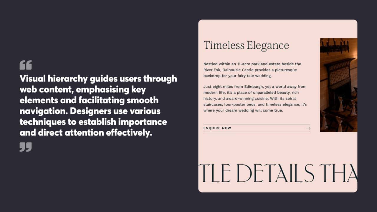
Visual hierarchy guides users through web content, emphasising key elements and facilitating smooth navigation. Designers use various techniques to establish importance and direct attention effectively.
Establishing Focal Points
Focal points draw users’ attention to critical areas of a webpage. Designers create these by using contrasting colours, unique shapes, or prominent positioning. A striking header image or a bold call-to-action button can serve as effective focal points.
Colour plays a crucial role in establishing focal points. Bright or contrasting hues naturally attract the eye, making them ideal for highlighting important elements. Strategic use of white space around key components also helps them stand out.
Typography can create focal points too. Large, bold headings or unique fonts for important text draw attention and convey significance.
Arranging Elements Strategically
The arrangement of elements on a webpage significantly impacts user experience. Designers often use grid systems to organise content logically and create visual balance.
The F-pattern and Z-pattern are common layouts that align with natural reading habits. The F-pattern works well for text-heavy pages, while the Z-pattern suits pages with fewer elements.
Grouping related items together helps users process information more easily. This principle of proximity creates visual relationships between elements, guiding users through the content.
Using Size and Scale
Size and scale are powerful tools for creating a visual hierarchy. Larger elements naturally draw more attention than smaller ones, making them suitable for key information or primary calls to action.
Designers can use a range of sizes to create a clear hierarchy of information. Headings, subheadings, and body text of decreasing sizes guide users through content levels.
Scaling can also create depth and interest. Overlapping elements of different sizes can create a sense of layering, adding visual appeal to the design.
Effective Web Design Strategies
Visual hierarchy in web design guides users through content and enhances usability. Key strategies involve thoughtful use of white space, intentional visual flow patterns, and maintaining visual consistency across pages.
Utilising White Space
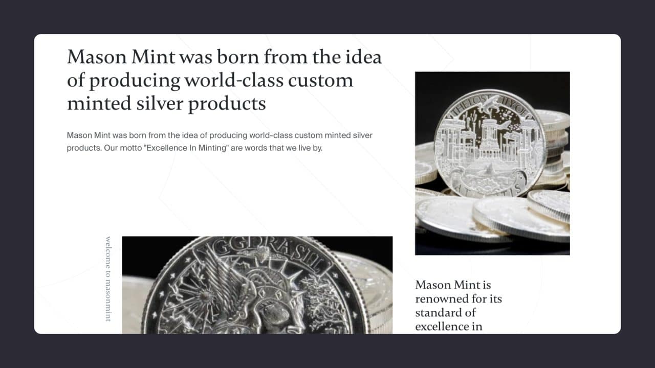
White space, also known as negative space, plays a crucial role in effective web design. It refers to the empty areas between elements on a page. Proper use of white space improves readability and focuses attention on important content.
Designers can use white space to group related elements and separate distinct sections. This creates a clear visual structure and reduces cognitive load for users. White space around text blocks enhances legibility, making content easier to read and understand.
The strategic placement of white space also draws attention to calls to action and important elements. By surrounding key items with empty space, designers can make them stand out and increase user engagement.
Employing Visual Flow Patterns
Visual flow patterns guide users’ eyes through a web page in a specific order. Two common patterns are the Z pattern and the F pattern.
The Z pattern follows the natural eye movement across a page, starting at the top left, moving horizontally to the top right, diagonally down to the bottom left, and ending at the bottom right. This pattern works well for pages with balanced layouts and clear hierarchies.
The F pattern mimics how users scan text-heavy pages. Eyes move horizontally across the top, then vertically down the left side, occasionally scanning right. This pattern suits content-rich sites like blogs or news portals.
Designers can use these patterns to place important elements along natural eye paths. This ensures key information and calls to action are easily noticed and engaged with.
Ensuring Visual Consistency
Visual consistency creates a cohesive user experience across a website. It involves maintaining uniform design elements, colour schemes, typography, and layouts throughout different pages.
Consistent navigation menus and page structures help users quickly locate information. This familiarity reduces cognitive load and improves overall usability.
A unified colour palette reinforces brand identity and creates visual harmony. Consistent use of fonts for headings and body text enhances readability and maintains a professional appearance.
Designers should create and follow style guides to maintain visual consistency. These guidelines outline specific rules for design elements, ensuring a unified look across the entire website.
Web Design Visual Hierarchy Best Practices
When it comes to web design, a well-planned visual hierarchy is crucial for guiding users’ attention and creating a seamless user experience. Here are some best practices to keep in mind:
- Use Size and Scale: Larger elements naturally draw more attention than smaller ones. By varying the size and scale of design elements, you can create a clear visual hierarchy that highlights key information. For instance, use larger fonts for headlines and smaller ones for body text to guide users through the content.
- Choose Typography Wisely: Typography is a powerful tool for establishing a clear visual hierarchy. Different font sizes, weights, and styles can help differentiate between various levels of information. Bold and large fonts for headings, medium weights for subheadings, and regular weights for body text can create a structured and easy-to-follow layout.
- Select Colors Strategically: Colors can evoke emotions and draw attention to specific elements. Using contrasting colours can help important elements stand out. For example, a bright call-to-action button against a muted background will naturally attract users’ eyes, guiding them towards desired actions.
- Use Whitespace Effectively: Whitespace, or negative space, is essential for creating a clear visual hierarchy. It helps separate different elements, reduces visual clutter, and makes the design more breathable. Proper use of whitespace can guide users’ attention to the most important parts of the page.
- Create a Clear Focal Point: A focal point is a key element that draws users’ attention first. It can be created using size, colour, and typography. For example, a large, colourful banner at the top of the page can serve as a focal point, guiding users to the main message or call to action.
- Use Repetition and Consistency: Consistency in design elements such as colours, fonts, and spacing helps create a cohesive look and feel. Repetition of these elements across the website reinforces the visual hierarchy and makes it easier for users to navigate and understand the content.
- Test and Iterate: Testing your visual hierarchy with real users is crucial. Gather feedback and observe how users interact with your design. Use this information to make necessary adjustments and improve the overall user experience. Iterative testing ensures that your visual hierarchy remains effective and user-friendly.
Prioritising Content and Elements
Effective visual hierarchy guides users through web content, emphasising key information and creating a clear path for interaction. Proper prioritisation reduces cognitive load and improves user experience.
Highlighting Important Elements
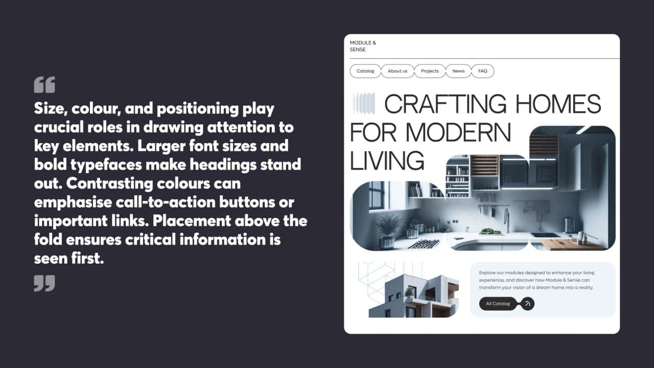
Size, colour, and positioning play crucial roles in drawing attention to key elements. Larger font sizes and bold typefaces make headings stand out. Contrasting colours can emphasise call-to-action buttons or important links. Placement above the fold ensures critical information is seen first.
White space around essential elements creates focus. Icons and images can quickly convey meaning and attract the eye. Animation or subtle movement can direct users to specific areas, but should be used sparingly to avoid distraction.
Managing Repetitive Elements
Consistent styling for similar elements helps users quickly recognise and understand their function. Navigation menus, form fields, and buttons benefit from uniform design across a website.
Grouping related items visually through proximity or shared characteristics aids comprehension. Breaking long lists into smaller chunks or using accordions for expandable content prevents overwhelming users.
Pattern interrupts can highlight special offers or featured content within a repetitive layout. This technique should be applied judiciously to maintain overall coherence.
Avoiding Visual Clutter
Simplicity is key to maintaining a strong visual hierarchy. Removing unnecessary elements and consolidating similar functions reduces cognitive load. Whitespace between elements prevents a cramped, cluttered appearance and improves readability.
Progressive disclosure techniques reveal additional information only when needed, keeping initial views clean and focused. Clear, descriptive labels eliminate the need for excessive explanatory text.
Limiting colour palettes and font choices creates a cohesive look. Using a grid system for layout ensures alignment and balance, reducing visual noise and creating a sense of order.
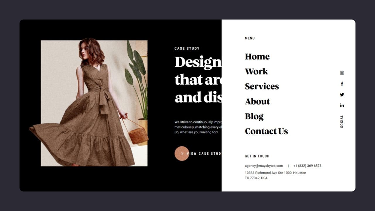
User Navigation and Interaction
Visual hierarchy in web design plays a crucial role in guiding users through a website and shaping their interactions. It helps direct attention, simplify use, and improve overall usability.
Directing User Focus
Effective visual hierarchy draws users’ gaze to key elements on a webpage. Designers use size, colour, and contrast to highlight important information and calls to action. Larger or bolder elements naturally attract more attention, while contrasting colours make certain items stand out.
White space around elements can also emphasise their importance. By isolating key components, designers create focal points that guide users’ eyes. Strategic placement of elements, like positioning important content in the upper left corner where users typically start scanning, further directs focus.
Typography plays a significant role too. Varying font sizes and styles help establish a clear reading order, with headings and subheadings breaking content into digestible chunks.
Facilitating Intuitive Use
A well-structured visual hierarchy makes websites easier to use and understand. It organises information logically, helping users quickly find what they need without feeling overwhelmed.
Grouping related elements visually through proximity, similar styling, or enclosing borders creates clear sections. This organisation aids users in quickly grasping the site’s structure and content.
Consistent design patterns across pages help users learn the interface faster. When navigation menus, buttons, and other interactive elements maintain a uniform style and location, users can interact more confidently.
Visual cues like arrows or highlighted paths can guide users through multi-step processes or lead them to take desired actions. These subtle nudges improve the flow of user interactions.
Conducting User Testing
User testing is vital to refine visual hierarchy and improve navigation. It reveals how real users interact with a site and highlights areas for improvement.
Eye-tracking studies provide valuable insights into where users look first and how they scan pages. This data helps designers adjust element placement and styling to better guide attention.
A/B testing different layouts or design elements can show which options lead to better user engagement and task completion rates. Small tweaks in visual hierarchy can sometimes yield significant improvements in usability.
Gathering qualitative feedback through user interviews or surveys complements quantitative data. Users can explain their thought processes and point out confusing or frustrating aspects of the design.
Regular testing throughout the design process helps catch issues early. It allows designers to iterate and refine the visual hierarchy before launching, resulting in a more user-friendly final product.
The Importance of Visual Hierarchy in Web Design
Visual hierarchy in web design guides users’ attention and improves their overall experience. It shapes how visitors interact with a website and influences their actions.
Impacting User Experience
Visual hierarchy significantly affects how users perceive and navigate a website. By employing size, colour, contrast, and space, designers can create a clear structure that helps users understand the content’s importance. Large headings, bold text, and prominent images draw attention to key information, while smaller elements indicate secondary details.
Effective visual hierarchy reduces cognitive load, allowing users to quickly scan and comprehend the page layout. This ease of use leads to increased engagement and satisfaction. Users are more likely to stay on a site that presents information in a logical, visually appealing manner.
Supporting the Desired User Actions
A well-crafted visual hierarchy directs users towards specific goals or actions. By strategically placing and styling elements, designers can highlight calls-to-action, important links, or critical information.
For example, a brightly coloured button stands out against a neutral background, encouraging clicks. Similarly, placing key information above the fold ensures it’s seen immediately. These techniques guide users through the intended journey, whether it’s making a purchase, signing up for a newsletter, or accessing specific content.
Good visual hierarchy also helps maintain consistency across a website, reinforcing brand identity and creating a cohesive user experience. This familiarity builds trust and makes navigation more intuitive, supporting user interactions and desired outcomes.
The Benefits of a Well-Designed Visual Hierarchy
A well-designed visual hierarchy offers numerous benefits for web designers and users alike. Here are some of the key advantages:
- Improved User Experience: A clear visual hierarchy guides users’ attention and creates a seamless user experience. By structuring content logically and highlighting important elements, users can easily find what they’re looking for, reducing frustration and enhancing satisfaction.
- Increased Engagement: When users can quickly and easily navigate a website, they are more likely to engage with the content. A well-designed visual hierarchy can encourage users to explore more pages, read more articles, or interact with various elements, leading to higher engagement rates.
- Better Conversion Rates: A clear visual hierarchy can significantly improve conversion rates by directing users’ attention to key elements and calls to action. By making it easy for users to find and act on important information, you can increase the likelihood of achieving desired outcomes, such as sign-ups, purchases, or inquiries.
- Enhanced Credibility: A well-organised and visually appealing website can enhance credibility and trust with users. When a website looks professional and is easy to navigate, users are more likely to perceive it as reliable and trustworthy, which can positively impact their overall experience.
- Improved Accessibility: A clear visual hierarchy can improve accessibility by making it easier for users, including those with disabilities, to navigate and find information. Proper use of headings, contrast, and spacing can enhance readability and ensure that all users have a positive experience.
- Increased Brand Recognition: Consistent use of visual hierarchy across a website can reinforce brand identity and create a cohesive look and feel. This consistency helps users recognise and remember the brand, contributing to stronger brand loyalty and recognition.
- Better Search Engine Optimisation (SEO): A well-designed visual hierarchy can improve SEO by making it easier for search engines to crawl and index content. Clear headings, logical structure, and well-organised content can enhance the website’s visibility in search engine results, driving more organic traffic.
By implementing these best practices and understanding the benefits of a well-designed visual hierarchy, web designers can create more effective, user-friendly websites that engage and convert users while enhancing overall brand perception.
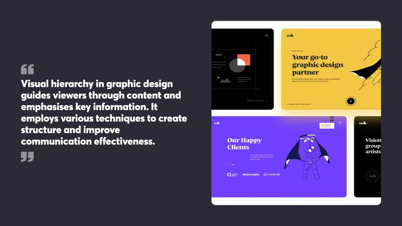
Visual Hierarchy and Graphic Design
Visual hierarchy in graphic design guides viewers through content and emphasises key information. It employs various techniques to create structure and improve communication effectiveness.
Contrast and Emphasis
Contrast is a powerful tool in the visual hierarchy. Designers use size, colour, and typography to highlight important elements. Larger text or bold fonts draw attention to headings. Colour contrasts make critical information stand out.
White space around elements increases their prominence. Designers strategically use empty areas to create breathing room and focus. This technique prevents visual clutter and improves readability.
Typography choices also contribute to hierarchy. Different font weights, styles, and sizes establish relationships between text elements. Headings typically use bolder, larger fonts than body text.
Guiding the User’s Eye
Effective visual hierarchy leads viewers through content in a logical order. Designers use alignment, proximity, and repetition to create clear pathways.
Alignment organises elements into visual groups. Consistently aligned items appear related and form cohesive structures. This helps users quickly scan and understand layouts.
Proximity places related elements close together. This creates visual connections and helps users associate information. Grouping similar items makes content easier to process.
Repetition of colours, shapes, or styles creates unity across a design. It helps users recognise patterns and navigate complex information. Consistent use of visual elements reinforces the hierarchy and improves usability.

Implementing Visual Hierarchy on a Web Page
Visual hierarchy guides users’ attention and helps them navigate a web page efficiently. It involves organising design elements strategically and creating a user interface that emphasises key information.
Organising Design Elements
Visual hierarchy relies on the careful arrangement of page components. Size plays a crucial role, with larger elements drawing more attention. Designers use this principle to highlight important headings or calls to action. Colour and contrast also direct focus, as bright or contrasting hues stand out against neutral backgrounds.
Spacing is another vital tool. Generous white space around elements makes them more noticeable. Grouping related items together creates visual relationships and helps users understand content structure. Typography choices further reinforce hierarchy, with varied font sizes and weights distinguishing different levels of information.
Alignment and positioning contribute to a clear visual flow. Placing key elements in prominent spots, such as the top left corner, takes advantage of natural reading patterns.
Understanding the User Interface
A well-designed user interface (UI) supports visual hierarchy by presenting information logically. Navigation menus should be easy to spot and use, often placed at the top or left side of the page. Clear labels and consistent styling help users quickly find what they need.
The layout should guide users through the content in order of importance. F-pattern and Z-pattern designs work well for many websites, aligning with typical eye-tracking patterns. Breaking content into scannable chunks with subheadings and bullet points improves readability.
Interactive elements like buttons and forms should be obvious and inviting. Using familiar UI patterns helps users feel comfortable and confident as they move through the site.
Mastering visual hierarchy takes practice and attention to detail. However, its impact on website effectiveness makes it a worthwhile skill for website owners to develop and refine.
At Chillybin, we have a combined X years of experience designing websites that implement the perfect visual hierarchy for turning your visitors into leads, and leads into sales.
If it’s time for a professional set of eyes to look over your website, contact us today.


