
Good website typography is central to the effectiveness of visual communication. On a business website, the choice and use of typefaces can significantly influence how visitors perceive and interact with content.
Effective web typography goes beyond selecting appealing fonts; it also includes understanding the subtleties of typefaces, considering how letters and words appear on different screens and ensuring that text is readable and accessible to as wide an audience as possible.
Font sizing, scaling, colour, and contrast all contribute to making a website’s words legible and visually attractive. Typographic choices can enhance user engagement by facilitating easy reading and setting the tone for a site’s design.
The goal of a great website designer is to strike a balance between aesthetic appeal and functional design to support a perfect user experience.
Key Takeaways
- Enhance User Engagement: Effective typography enhances user engagement by making content more readable and visually appealing, guiding users through the website with a clear visual hierarchy and intuitive design.
- Ensure Accessibility and Legibility: Prioritise legibility and accessibility by selecting appropriate typefaces, font sizes, and contrast ratios to ensure that text is readable across all devices and accessible to users with visual impairments.
- Legal and Ethical Font Use: Be mindful of legal considerations and font licensing to ensure ethical and lawful use of typefaces in web design, avoiding potential legal issues and ensuring compliance with licensing agreements.
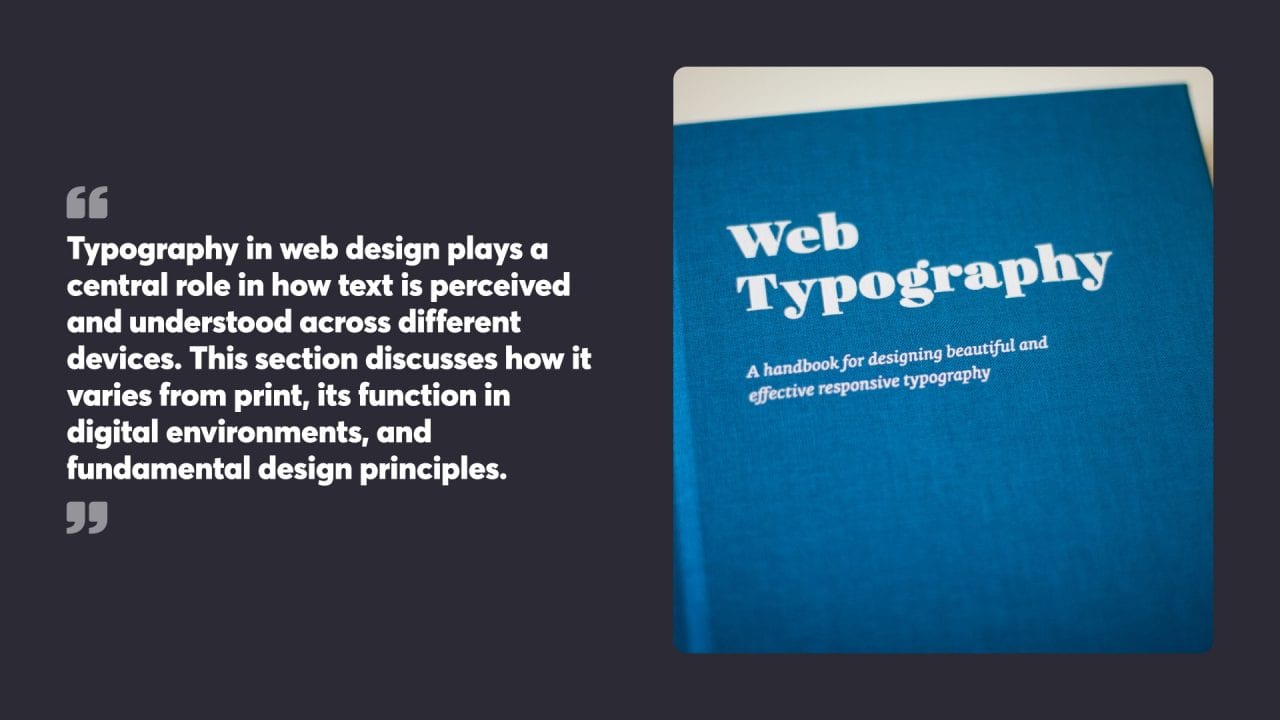
Table of Contents
Understanding Web Typography
Typography in web design plays a central role in how text is perceived and understood across different devices. This section discusses how it varies from print, its function in digital environments, and fundamental design principles.
The Role of Typography on the Web
Typography on the web extends beyond the selection of font or typeface. It is critical in creating a clear, reader-friendly environment. Good typography leads to improved user experience, setting the tone and guiding readers through the content with ease. Typography works to achieve balance and consistency, which are vital in maintaining engagement.
Typography vs Printed Text
Differences between digital and printed text are noticeable. Screen resolutions directly influence the legibility of digital text, and as such, typographic choices must be adapted. Web typography requires consideration for variable screen sizes and ensures that text remains legible across different devices.
Basics of Typographic Design
Several factors contribute to efficient typographic design on the web:
- Hierarchy: Establishing a visual hierarchy helps guide the reader’s eye and provides a logical structure to the content.
- Readability: This is achieved by selecting appropriate typefaces and ensuring contrast between the text and background.
- Responsiveness: Typography must adapt to various device screens, maintaining legibility and aesthetics.
A good starting point in typographic design is considering the purpose text serves and the experience it provides to the reader.

The Anatomy of Web Fonts
Typography plays a critical role in the design and readability of web pages. This section sheds light on the various elements that constitute web font anatomy, focusing on font families and their styles, the characteristics that distinguish serif from sans serif typefaces, as well as the meaning behind font weights and styles.
Font Family and Font Styles
Font families are groups of fonts that share an overall appearance but differ in stroke weight, slant, and width. For instance, the Times font family includes styles like Times Roman and Times Italic. Font styles in CSS refer to qualities such as italic or oblique. Designers use these to add emphasis or to distinguish certain parts of the text on web pages.
Distinguishing Serif and Sans Serif
Serif fonts are characterised by small lines or strokes attached to the end of larger strokes in letters. Examples include Times New Roman and Georgia. Serif fonts are often used in headings and taglines to create a classic and elegant style. Sans serif fonts, such as Arial and Helvetica, do not possess these embellishments. On screens, sans serif fonts typically offer better clarity, especially at smaller sizes, making them a popular choice for body text in web design.
Understanding Font Weights and Styles
Font weight refers to the thickness of the characters in a font. It ranges from thin to black, with normal and bold being the most commonly used weights in web content. Diverse weights convey different tones and hierarchies within the text. In addition, font styles describe the inclination of the font, with normal, italic, and oblique being the primary styles used in web typography. They provide a method of emphasising text or delineating different types of content.
Selecting the Right Typefaces
A careful selection of typefaces is vital for the readability and aesthetic appeal of a website. Choices range from system fonts renowned for their compatibility to Google fonts valued for their diversity.
System Fonts versus Web Safe Fonts
System fonts are pre-installed on various operating systems, offering high compatibility and fast load times. Examples include Arial and Times New Roman. In contrast, web safe fonts such as Helvetica and Georgia are universally supported across browsers and devices, reducing the risk of text displaying incorrectly.
Exploring Google and Specific Fonts
Google fonts present an extensive library of free type resources, enhancing design flexibility. Specific fonts from this service can effectively embody a brand’s identity, but careful consideration is required regarding legibility and appropriateness for the content.
Combining Multiple Typefaces
When using multiple typefaces, the key is creating a balance. A harmonious mix can be achieved by pairing serif with sans serif typefaces, such as using a sans serif font for body text to enhance readability, considering contrast and complementarity. The aim should be to improve readability while reinforcing the site’s character.

Font Sizing and Scaling
Font sizing and scaling are crucial for creating accessible and visually appealing websites. These techniques influence readability and user experience across different devices.
Establishing Hierarchical Font Sizes
Creating a visual hierarchy with text involves using varied font sizes to differentiate between types of content. Headers are typically larger, drawing attention, while body text is smaller, maintaining readability. Lists and tables support the organisation of information, with bold and italic styles emphasising key points.
Adapting Fonts for Screen Sizes
Responsive typography ensures that text remains legible on all screen sizes. This adaptation involves adjusting font sizes for various devices, from mobile to desktop. Media queries in CSS allow fonts to change dynamically, maintaining user experience across different viewing contexts.
Font Size and User Interface Design
In user interface design, font size affects how users interact with a page. Larger fonts can highlight interactive elements such as buttons, while legible body text sizes support effortless information processing. Font sizes between 14-24px are common for ensuring clear text on desktop interfaces, with larger sizes on mobile devices to account for smaller screens.
Optimising Text Layout
Optimising text layout involves adjusting line length, line height, and vertical spacing to enhance text readability.
Effective Line Length and Line Spacing
Line length significantly affects readability. Designers recommend 50-75 characters per line for optimal readability. This range helps the eye easily return to the start of the next line. Line spacing, also known as leading, plays a pivotal role as well.
The ideal line height varies depending on the font size, but a general rule is to set it at 120%-150% of the font size. This creates a balanced visual space, preventing overlapping and ensuring individual lines of text remain distinct within a block.
Control of Vertical Spacing and White Space
Vertical spacing between paragraphs and headings breaks information into digestible chunks. Consistent vertical spacing creates rhythm and makes the text block appear organised. White space plays an indirect role in guiding readers through the content and can alleviate visual clutter. Proper use of vertical spacing and generous white space maintains focus on the text and aids in overall document clarity.
The Impact of Alignment and Spacing on Readability
Proper alignment is crucial for maintaining an organised layout. Text can be aligned left, right, centred, or justified. Left alignment is the most common as it follows the natural reading pattern in English, thereby improving readability.
Spacing around text, referred to as margins and padding, should be adequate to prevent text from merging with other elements on the page. This attention to spacing minimises distractions and can significantly improve the reader’s experience.

Colour and Contrast in Typography
Effective web typography leverages colour and contrast to improve readability and provide visual cues. These elements are crucial for creating text that is both visually appealing and functional on various backgrounds.
Choosing Text Colours for Readability
Selecting the right text colours involves more than aesthetics. It plays a significant role in how easily users can read and comprehend content. High contrast between text and its background is pivotal to ensure that it stands out clearly. For instance, using a dark font on a light background or vice versa can be beneficial.
However, it is important to be cautious of colour combinations like red and green which might cause issues for people with colour vision deficiencies. Readability also depends on external factors such as screen brightness, ambient light, and even the presence of glare.
Contrast Ratios for Light and Dark Backgrounds
Contrast ratios determine how well content can be distinguished from the background. The Web Content Accessibility Guidelines recommend a minimum contrast ratio of 4.5:1 for normal text and 3:1 for large text. This ensures that the text is discernible against its background, whether it is light or dark.
Higher contrast ratios may be necessary for elements that serve as critical visual cues, directing the reader’s focus to different parts of a site. These guidelines apply to all text on the web, supporting visual clarity for a wide audience, including those with visual impairments.
Enhancing User Engagement
Effective typography elevates user engagement on websites by crafting a visual order and facilitating interactive experiences.
Using Typography to Create a Visual Hierarchy
The strategic use of typefaces, font sizes, and styles organises content, guiding users through a web page with ease.
Headings and subheadings are bold or larger in size, drawing attention and providing an entry point into the content.
Body text benefits from good line spacing, typically 1.4 to 1.6 times the font size, which improves readability.
Colour can highlight important information or links, encouraging user interaction.
Typography as a Tool for User Interface Engagement
Typography in user interfaces shapes the way users interact with a website.
Well-chosen fonts convey brand personality and establish an intuitive user interface.
CTA buttons with clear, legible fonts invite actions, directly affecting a site’s conversion rates.
Accessible typefaces and adequate contrast are vital for readability and inclusivity, ensuring users with varying visual abilities can interact without strain.
Accessibility in Web Typography
Accessibility in web typography involves selecting and structuring text in ways that are readable across various devices and ensuring that typography choices promote inclusivity and readability for all users.
Ensuring Text Accessibility on Various Devices
The choice of font and its display on different screen resolutions are critical considerations for accessibility. A well-considered font stack enhances consistency across different browsers and operating systems.
Responsive design principles govern text resizing, so content remains legible on screens as small as smartphones and as large as desktop monitors. Web pages need to adjust text size without loss of content clarity or functionality. Media queries are a valuable CSS tool for adjusting text attributes to match different screen sizes.
Inclusivity in Typography Choices
Typography should serve a broad audience, including individuals with learning disabilities like dyslexia. Fonts like OpenDyslexic are crafted to improve readability for dyslexic users. In addition, using bold for emphasis rather than colour ensures that the information is accessible to those with colour vision deficiencies.
The legibility of text is of high priority; it involves considering letter spacing, line height, and contrast. Fonts need to be selected with attention to their clarity and readability to avoid excluding users.

Legal Considerations and Licensing
Web fonts and font choices are governed by particular legal agreements. These agreements define the use and distribution of fonts, particularly important for web designers when selecting typefaces for body text.
Understanding Font Licensing
Font licensing is the legal mechanism that controls the way a font may be used. A font license is issued by either the type foundry or the designer who created the font. Each license guides what can be done with the font, including where it can be used, whether it can be shared, and the number of devices it can be installed on. Web fonts often come with their own sets of licenses, as their use on websites poses different challenges and requires different permissions compared to print fonts.
- Desktop Licenses: Typically allow fonts to be used in static graphics and documents but not embedded on websites.
- Webfont Licenses: Specifically permit fonts to be used on websites, often with page view restrictions.
- App Licenses: Allow fonts to be used within mobile and desktop applications.
Choosing Fonts within Legal Boundaries
Selecting the right font within legal boundaries involves careful consideration of both aesthetics and licensing restrictions. Designers should make a practice of confirming the licence terms before using a font in their project. Free fonts can be appealing for their lack of upfront cost, but it’s important to verify whether they are free for commercial use as well.
Some type foundries offer trial fonts that might be used for free initially but require a paid licence for ongoing or commercial use. When choosing fonts for body text, accessibility and readability on the web are also important considerations.
- Font Licences and Accessibility: Ensure the font choice is accessible for all users, which may include considerations around legibility and load times.
- Paid vs Free Fonts: Paid fonts are typically accompanied by clearer and more extensive licence agreements compared to free fonts.
- Licence Compliance: Check the terms for each font used in a design to adhere to legal and ethical standards.
Selecting Fonts for Web Use
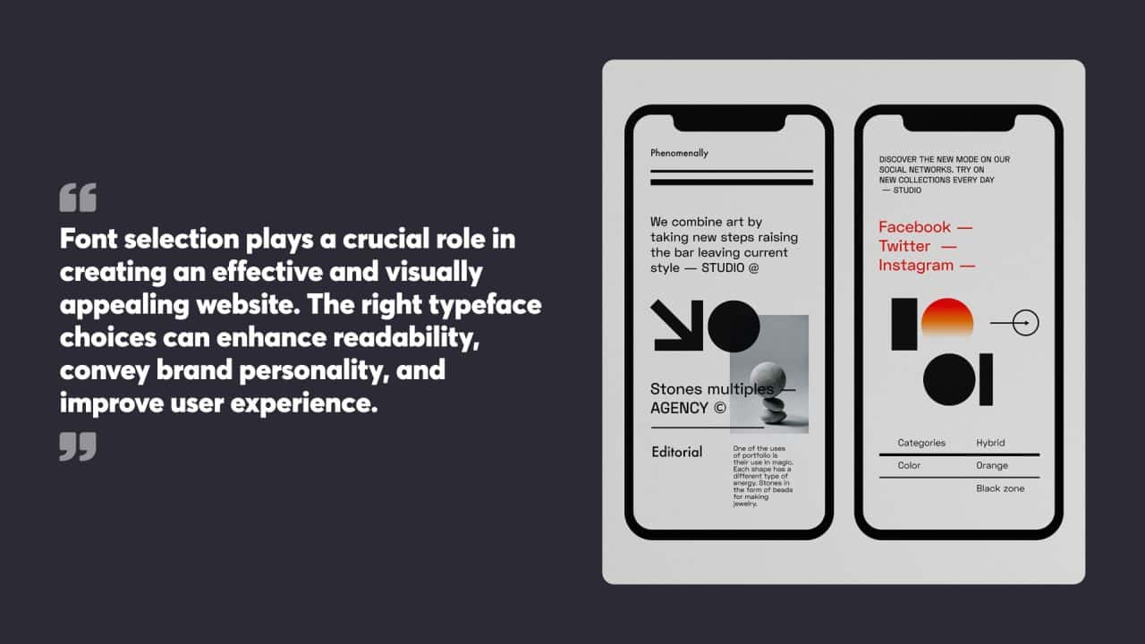
Font selection plays a crucial role in creating an effective and visually appealing website. The right typeface choices can enhance readability, convey brand personality, and improve user experience.
Serif vs. Sans Serif Fonts
Serif fonts feature small decorative strokes at the ends of letters, while sans-serif fonts lack these embellishments. Serif fonts often convey a traditional or formal tone, making them suitable for academic or professional websites. Times New Roman and Georgia are common serif options.
Sans serif fonts, on the other hand, offer a clean and modern look. They’re generally easier to read on screens, especially at smaller sizes. Arial, Helvetica, and Verdana are popular sans-serif choices for web use.
When selecting between serif and sans serif fonts, consider the website’s purpose, target audience, and overall design aesthetic. Many designers mix both styles, using serif for headings and sans serif for body text to create a visual hierarchy.
Web Safe and Custom Fonts
Web-safe fonts are pre-installed on most devices, guaranteeing consistent display across different systems. These include Arial, Times New Roman, and Courier. While reliable, they can limit design options.
Custom fonts offer more creative freedom but require careful implementation. Services like Google Fonts provide a wide range of free, web-optimised typefaces. These fonts are hosted on external servers and loaded via CSS, expanding design possibilities while maintaining good performance.
When using custom fonts, it’s important to specify fallback options in case the chosen font fails to load. This typically involves listing web-safe alternatives after the primary font in the CSS font stack.
Importance of Font Licensing
Font licensing is a critical aspect of web typography that’s often overlooked. Many fonts, especially premium options, require a licence for web use. Using unlicensed fonts can lead to legal issues and potential fines.
When selecting fonts, check the licensing terms carefully. Some fonts are free for personal use but require a paid licence for commercial websites. Others may have restrictions on the number of page views or domains where they can be used.
Services like Google Fonts offer a range of free, open-source options that are safe for both personal and commercial use. For premium fonts, designers can purchase web font licences from type foundries or use subscription services like Adobe Fonts.
Implementing Fonts on the Web
Web fonts play a crucial role in creating visually appealing and readable websites. Proper implementation techniques allow designers to use a wide range of typefaces while maintaining compatibility across different browsers and devices.
Using CSS for Font Integration
CSS provides powerful tools for integrating fonts into web designs. The font-family property specifies the typeface for text elements. Designers can list multiple font options in order of preference, with fallback choices ensuring text display even if specific fonts are unavailable.
@font-face rules allow custom fonts to be loaded directly from a website’s server. This CSS at-rule defines a font’s name and source file location. Multiple font weights and styles can be declared separately for comprehensive typographic control.
Web-safe fonts like Arial, Helvetica and Times New Roman offer reliable fallback options. These widely available system fonts display consistently across platforms when custom fonts fail to load.
Leveraging Google Fonts and Font Services
Google Fonts provides a vast library of free, open-source web fonts. Designers can browse and select fonts, and then generate code snippets for easy integration. The service handles font hosting and delivery, simplifying implementation.
To use Google Fonts, designers add a link tag to the HTML head or import the font using CSS. Multiple fonts and weights can be combined in a single request to optimise loading times.
Other font services like Adobe Fonts offer premium typefaces with similar ease of use. These platforms manage licensing and hosting, allowing designers to focus on typography rather than technical details.
Exploration of Web Font Formats
WOFF (Web Open Font Format) is the recommended format for web fonts. It compresses font data for faster loading and includes metadata for licensing information. WOFF2, an improved version, offers even better compression.
TTF (TrueType Font) and OTF (OpenType Font) are older formats still used in some cases. While they work on many browsers, they lack the optimisation of WOFF.
EOT (Embedded OpenType) is a legacy format developed by Microsoft for use with Internet Explorer. It’s no longer necessary for modern web design but may be included for backward compatibility.
Typography and User Interface Design
Typography plays a crucial role in UI design, affecting readability, visual hierarchy, and overall user experience. It shapes how information is presented and perceived across different devices and platforms.
Consistency and Readability
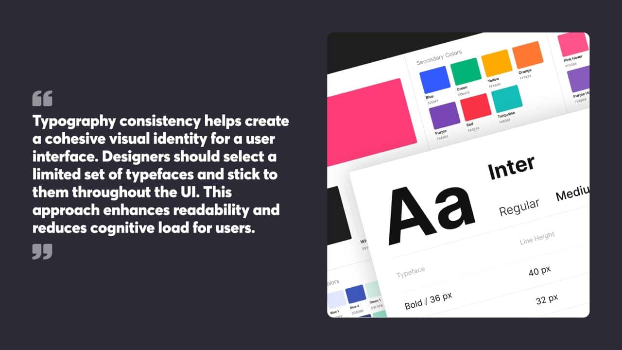
Typography consistency helps create a cohesive visual identity for a user interface. Designers should select a limited set of typefaces and stick to them throughout the UI. This approach enhances readability and reduces cognitive load for users.
Font sizes and line heights need careful consideration. A clear typographic scale ensures proper hierarchy and improves scanability. Appropriate contrast between text and background colours is vital for legibility.
Designers must also pay attention to letter spacing and line length. The optimal line length for body text typically falls between 50-75 characters per line. Proper letter spacing, or tracking, can improve readability, especially for smaller text sizes.
Responsive Typography for Mobile Devices
Mobile devices present unique challenges for typography in UI design. Smaller screens require careful consideration of font sizes, line heights, and spacing to maintain readability.
Responsive typography adapts to different screen sizes and orientations. This might involve adjusting font sizes, line heights, and even typefaces to suit various devices. Scalable vector graphics (SVG) fonts can help maintain crisp text rendering across different screen resolutions.
Touch targets for interactive text elements should be large enough for easy tapping. A minimum size of 44×44 pixels is recommended for touch-friendly interfaces.
Integrating Typography in UI Design
Typography integration goes beyond selecting fonts. It involves creating a visual hierarchy that guides users through the interface. Headings, subheadings, body text, and UI elements should work together to create a clear information structure.
White space, or negative space, is a powerful tool in typographic design. Proper use of white space can improve readability and draw attention to key elements. It also helps create a sense of balance and organisation within the UI.
Typography can convey brand personality and set the tone for the user experience. The choice of typefaces, their combinations, and how they’re used can significantly impact the overall look and feel of a UI design.
Practical Typography Techniques
Mastering typography techniques enhances readability and visual appeal in web design. These methods focus on optimising font sizes, adjusting spacing, and using alignment effectively.
Optimising Font Sizes and Line Height
Font size and line height play crucial roles in web typography. Designers typically use pixels, ems, or rems to set font sizes. A base font size of 16 pixels is common for body text, with headings scaled proportionally larger. Line height, also called leading, affects readability and visual rhythm.
For body text, a line height of 1.5 to 1.6 times the font size often works well. Headings may use tighter line heights, around 1.1 to 1.3 times the font size. Adjusting these values helps create a balanced, easy-to-read layout.
Mobile devices require special attention. Font sizes may need to increase slightly for smaller screens to maintain legibility. Responsive design techniques allow for automatic adjustments based on screen size.
Manipulating Letter Spacing and Tracking
Letter spacing, or tracking, refers to the space between characters in text. Proper letter spacing improves readability and aesthetic appeal. Too little space can make text appear cramped, while too much can disrupt the flow of reading.
For body text, the default letter spacing usually suffices. However, headings and other display text often benefit from slight adjustments. Negative letter spacing can create a tighter, more cohesive look for large text, while positive spacing can add emphasis or create a more open feel.
CSS provides the ‘letter-spacing’ property for fine-tuning. Values are typically set in ems or pixels. Small adjustments, such as -0.05em for headings or 0.1em for all-caps text, can make a significant difference in appearance.
Effective Use of White Space and Alignment
White space, or negative space, is a powerful tool in typography. It helps guide the eye, create hierarchy, and improve overall readability. Generous margins and padding around text elements prevent a cluttered appearance and enhance focus.
Paragraph spacing is particularly important. A margin-bottom of 1em to 1.5em on paragraphs creates clear separation without excessive gaps. Lists and other text elements also benefit from carefully considered spacing.
Alignment affects both readability and visual style. Left-aligned text is the most common and easiest to read in longer passages. Centre alignment works well for headings or short blocks of text. Justified text can create clean edges but may cause awkward word spacing if not carefully implemented.
Consistency in alignment and spacing throughout a design creates a cohesive, professional look. Grids and baseline alignment can further refine typography, creating a sense of order and balance in the layout.
Creating a Visual Hierarchy
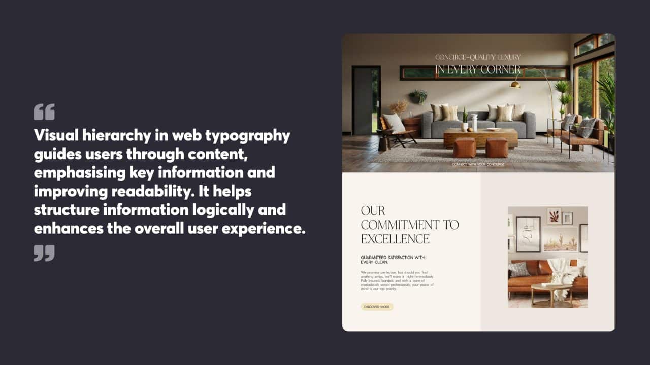
Visual hierarchy in web typography guides users through content, emphasising key information and improving readability. It helps structure information logically and enhances the overall user experience.
Contrast and Weight
Font weight plays a crucial role in establishing text hierarchy. Bold typefaces draw attention to headings and important elements, while lighter weights suit body text. Varying font sizes further accentuates this hierarchy, with larger sizes for headings and smaller ones for supporting text.
Designers can create contrast by mixing different typefaces. Pairing a serif font for headings with a sans-serif for body text adds visual interest and improves readability. Colour also aids in creating contrast, with darker shades for primary content and lighter hues for secondary information.
White space around text elements helps define hierarchy by giving important content room to breathe. This negative space improves legibility and prevents visual clutter, allowing readers to focus on key messages.
Organising Content with Typography
Typography helps organise content into digestible chunks. Headings and subheadings break up long blocks of text, making it easier for readers to scan and find relevant information quickly.
Line spacing (leading) and paragraph spacing contribute to content organisation. Adequate spacing between lines improves readability, while gaps between paragraphs signal topic changes or new ideas.
Text alignment plays a part in organising content. Left-aligned text is easiest to read for most languages, while centred text can highlight short, important messages. Justified text creates clean edges but may cause readability issues if not carefully implemented.
Typography as a Tool for Navigation
Typography guides users through a website, acting as a visual navigation system. Clear, consistent styling of menu items, buttons, and links helps users identify interactive elements quickly.
Breadcrumbs, often styled with smaller, lighter text, show users their current location within a site’s structure. This typographic treatment helps differentiate navigation elements from the main content.
Call-to-action buttons benefit from bold, attention-grabbing typography. Larger font sizes and contrasting colours make these elements stand out, encouraging user interaction.
Hover effects on linked text, such as colour changes or underlines, provide visual feedback to users. These subtle typographic changes improve the overall navigation experience by indicating clickable elements.
Typography Pairing Strategies
Effective font pairing is crucial for creating visually appealing and readable web designs. It involves combining typefaces that complement each other while maintaining visual harmony and establishing a clear hierarchy.
Pairing Multiple Typefaces
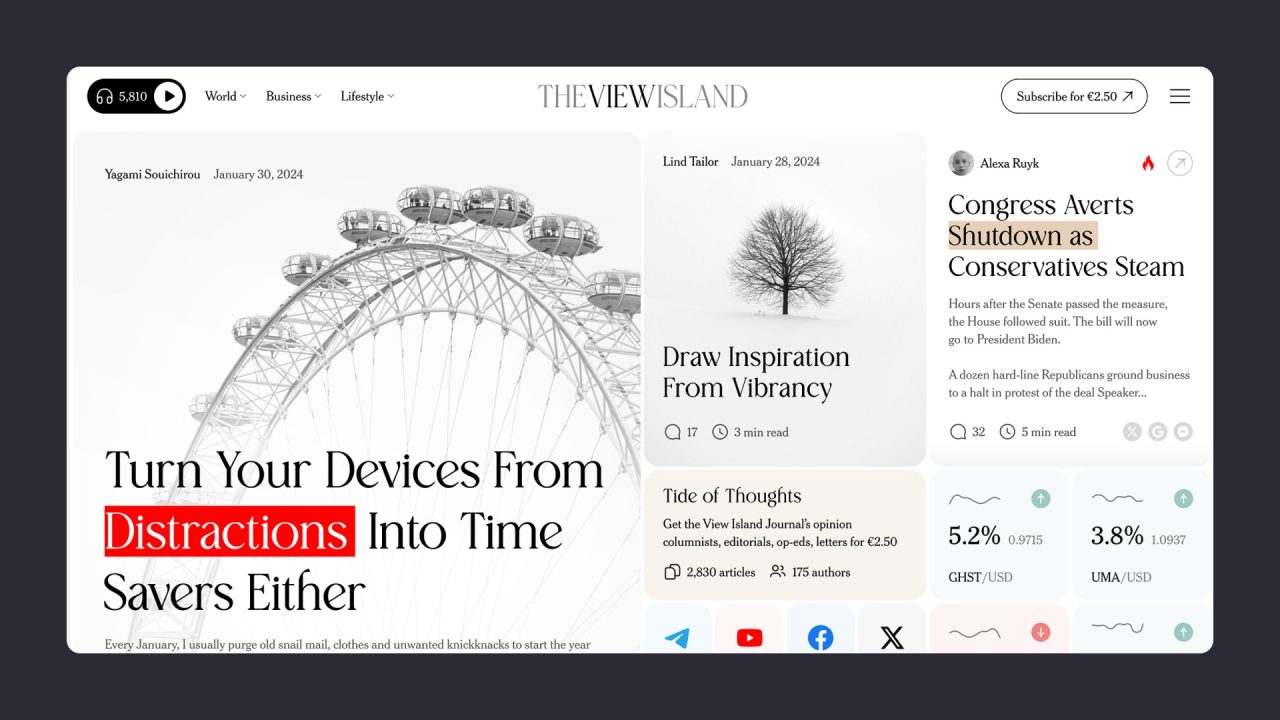
Selecting compatible typefaces requires careful consideration of their characteristics. A common approach is to pair a serif font with a sans-serif font to create contrast. For example, using a serif font for headings and a sans-serif for body text can enhance readability and visual interest.
Another strategy is to choose fonts from the same family or superfamily. These typefaces are designed to work well together, sharing similar proportions and characteristics. This approach can create a cohesive look while still allowing for subtle variations in style.
When pairing multiple typefaces, it’s important to limit the number used. Generally, two to three fonts are sufficient for most web designs. Using too many fonts can lead to a cluttered and confusing visual experience.
Harmony and Conflict in Font Pairing
Achieving harmony in font pairing involves finding a balance between similarity and contrast. Fonts that share certain qualities, such as x-height or stroke width, can create a harmonious relationship. However, some degree of contrast is necessary to maintain visual interest and establish hierarchy.
Conflicting font pairings can be intentionally used to create visual tension or draw attention to specific elements. This technique should be used sparingly and with purpose. For instance, pairing a bold, decorative font with a simple sans-serif can create a striking contrast for a headline or call-to-action.
It’s essential to consider the mood and message of the content when selecting font pairings. The chosen typefaces should align with the overall tone and purpose of the website.
Common Pitfalls to Avoid
One frequent mistake in font pairing is choosing typefaces that are too similar. This can create a bland, uninteresting design that lacks visual hierarchy. On the other hand, pairing fonts that are drastically different can result in a chaotic and unprofessional appearance.
Another pitfall is ignoring the historical context of typefaces. Combining fonts from vastly different time periods or styles can create an inconsistent look. It’s important to research the background and intended use of typefaces before pairing them.
Overusing decorative or display fonts is a common error. These fonts should be reserved for headlines or short pieces of text, as they can become difficult to read in longer passages.
Failing to test font pairings across different devices and screen sizes is a critical mistake. What looks good on a desktop may not translate well to mobile devices, so thorough testing is essential.
Advanced Typography Tips
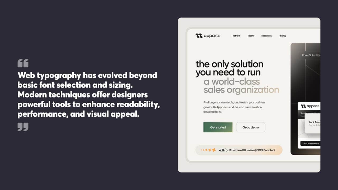
Web typography has evolved beyond basic font selection and sizing. Modern techniques offer designers powerful tools to enhance readability, performance, and visual appeal.
Incorporating Variable Fonts
Variable fonts represent a significant leap in web typography. These versatile typefaces allow designers to adjust various attributes like weight, width, and slant along a continuous axis. This flexibility enables precise control over typography without loading multiple font files.
Variable fonts shine in responsive design. They adapt seamlessly to different screen sizes and orientations, maintaining optimal legibility across devices. Designers can create fluid typographic animations, gradually modifying font characteristics as users scroll or interact with the page.
Implementing variable fonts requires attention to browser support. While adoption has grown, fallback options should be provided for older browsers. Careful selection of axes and performance optimisation are key to maximising the benefits of this technology.
Typography in Web Efficiency and Performance
Typography plays a crucial role in website performance. Optimising font loading can significantly improve page speed and user experience.
Font subsetting is an effective technique. It involves creating custom font files that contain only the characters needed for a specific website. This reduces file size and speeds up loading times.
Using the WOFF2 format offers superior compression compared to older font formats. It’s widely supported and can dramatically reduce file sizes.
Lazy loading techniques can prioritise the display of critical text content. By deferring the loading of non-essential fonts, websites can achieve faster initial render times.
Caching strategies for web fonts can further enhance performance. Proper configuration of cache headers allows browsers to store font files locally, reducing subsequent page load times.
Future Trends in Web Typography
The future of web typography is closely tied to advancements in display technology and user interaction.
Augmented reality (AR) and virtual reality (VR) present new frontiers for typography. These immersive environments demand typefaces that maintain legibility across 3D spaces and varying viewing angles.
Responsive typography is likely to become more sophisticated. Machine learning algorithms may dynamically adjust typographic elements based on user preferences, reading speed, and environmental factors.
Accessibility will remain a key focus. Improved screen readers and voice interfaces will influence typographic choices, emphasising clarity and proper semantic structure.
Custom fonts generated by AI could become more common. These fonts might adapt in real time to suit specific content or user needs, pushing the boundaries of personalised typography.
At Chillybin, we recognise that effective typography is essential for creating compelling and accessible web experiences. We select and implement typefaces, font sizes, and colour contrasts to ensure your website looks visually appealing while enhancing readability and user engagement. Our website design projects balance aesthetic appeal with functionality, ensuring that your content is accessible to all users and compliant with legal standards.
To discover how the right typography can elevate your website’s design and user experience, contact us today.


