Foxtel Australia
Fresh new web designs for a new era of television
Foxtel is a household name in Australia, but as streaming services such as Netflix grabbed a foothold in the market, they needed to get their online presence up to the standard their clients expected - and fast.
Foxtel provides Australian families with some of the world's best shows and sporting events, all in one place.
When their team reached out to Chillybin, they had a lot of pages dedicated to their programmes, but they were old, outdated, and didn’t integrate well with their current offerings.
We started working first on their Channel [V] projects and then got involved in building the sub-channel pages for History Channel. Then we undertook the job of building out all the Foxtel TV channel pages, evolving them over time.
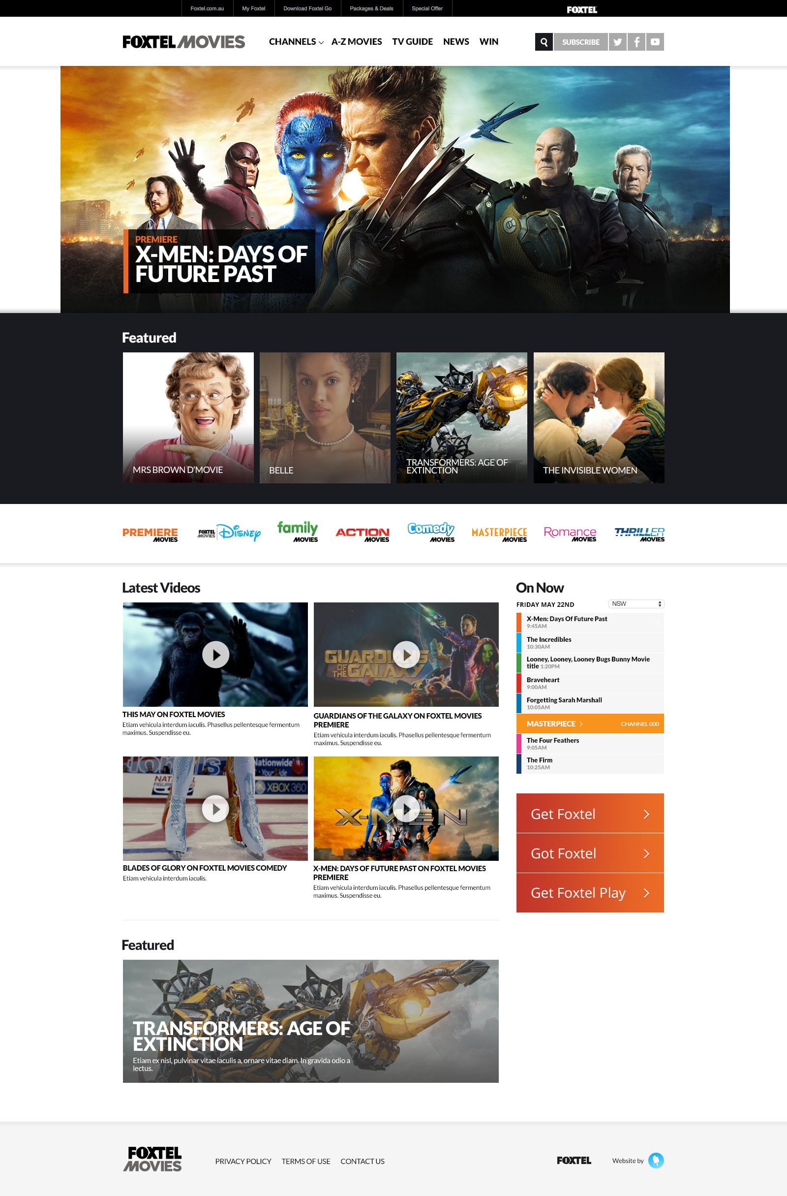
Then came Foxtel Movies, where we were required to build a more dynamic movie guide with listings.
Client
Foxtel Australia
Location
Australia
Our role:
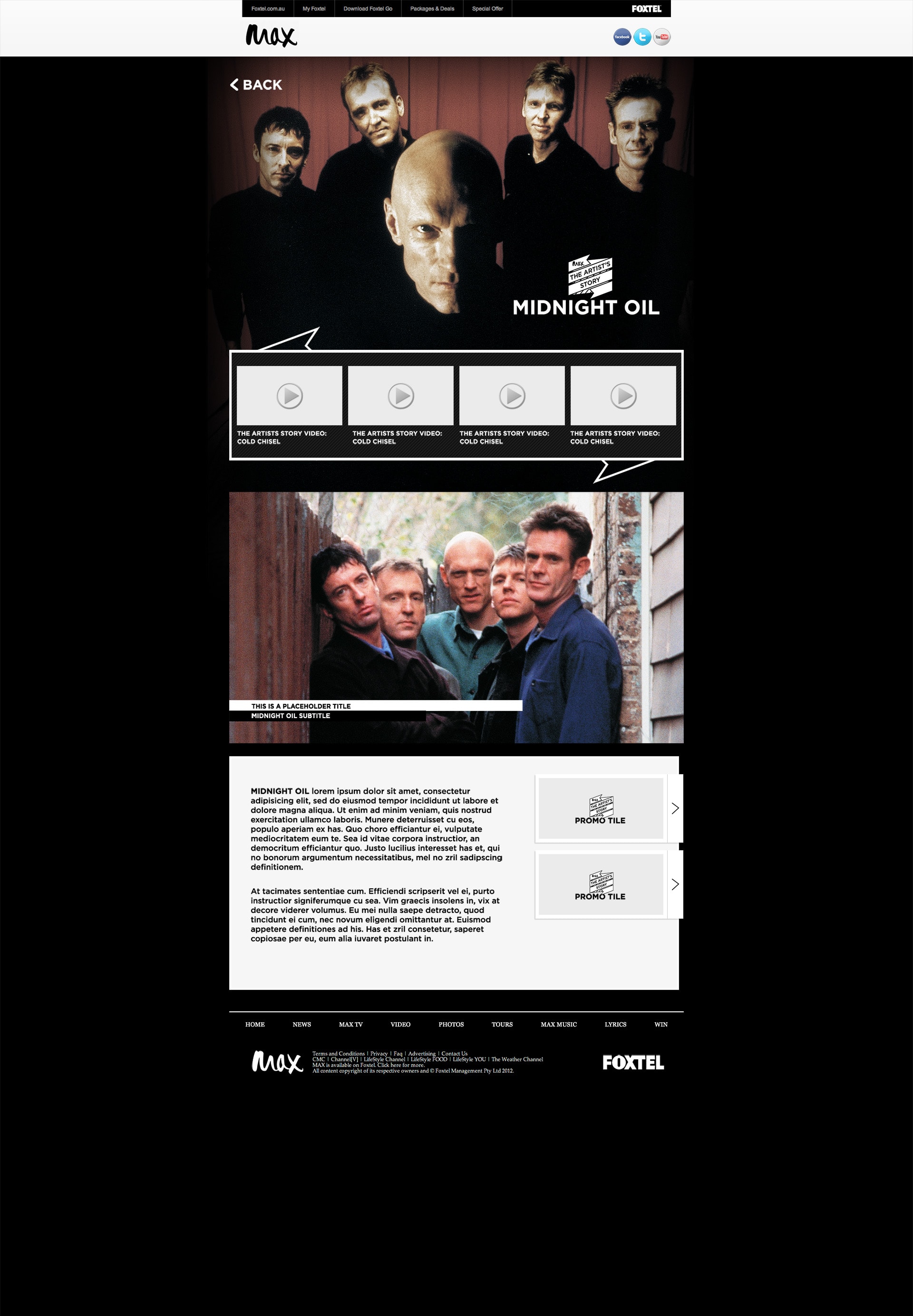
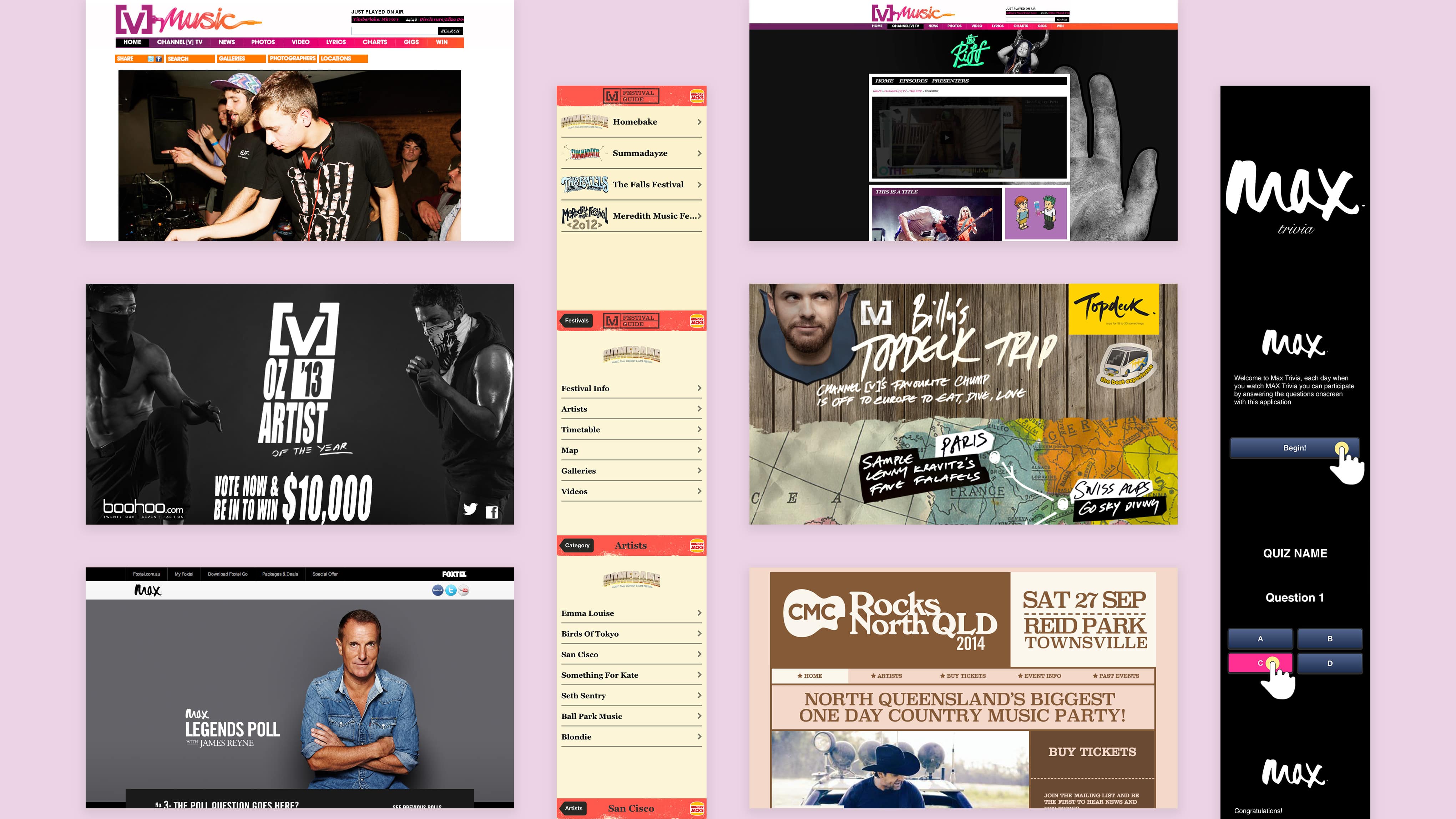
Channel [V]
The Riff
Channel [V] announced that their popular programme “The Riff” would go from being shown once a week to every Monday through Saturday! In anticipation of this, Channel [V] reached out to Chillybin to design and develop a website that allowed them to keep their fans updated on everything “The Riff” each day.
We were able to deliver a home page for “The Riff” that showcased what would be televised each day, and also provide the team with a flexible video slider, allowing them to showcase their daily video content as well.
CMC Rocks
CMC Rocks is Australia’s Biggest International Country & Roots Festival, and to coincide with their artist announcement Chillybin redesigned and re-developed their website to be more engaging for their fans.
The website for CMC Rocks was built for the Genesis Framework by StudioPress & WordPress Content Management System to allow easy administration and flexibility over all aspects of the website. The design was inspired by the poster art provided by the team at Country Music Channel, the website was designed and developed to be responsive so that it looks perfect on mobile, tablet and desktop browsers while still showcasing all of the design elements on each platform. The system allows his management full access to change just about any aspect of the site through the administration modules in a quick and easy system that gives them highly detailed analytics at their fingertips.
Oz Artist of the Year
[V] Oz Artist of the Year is the annual award show where Australian music fans nationwide get to vote for the Australian act they dig the most.
The website was a custom build with a simple Content Management System to allow for basic administration over the voting and knockout rounds. The design was inspired by the poster art provided by the team at Channel [V], a mobile version of the website was also designed and developed to work with a Q Code campaign. Through the duration of the campaign, the website was very successful, with more than 1.6 million votes from over 22,000 total voters!
History Channel
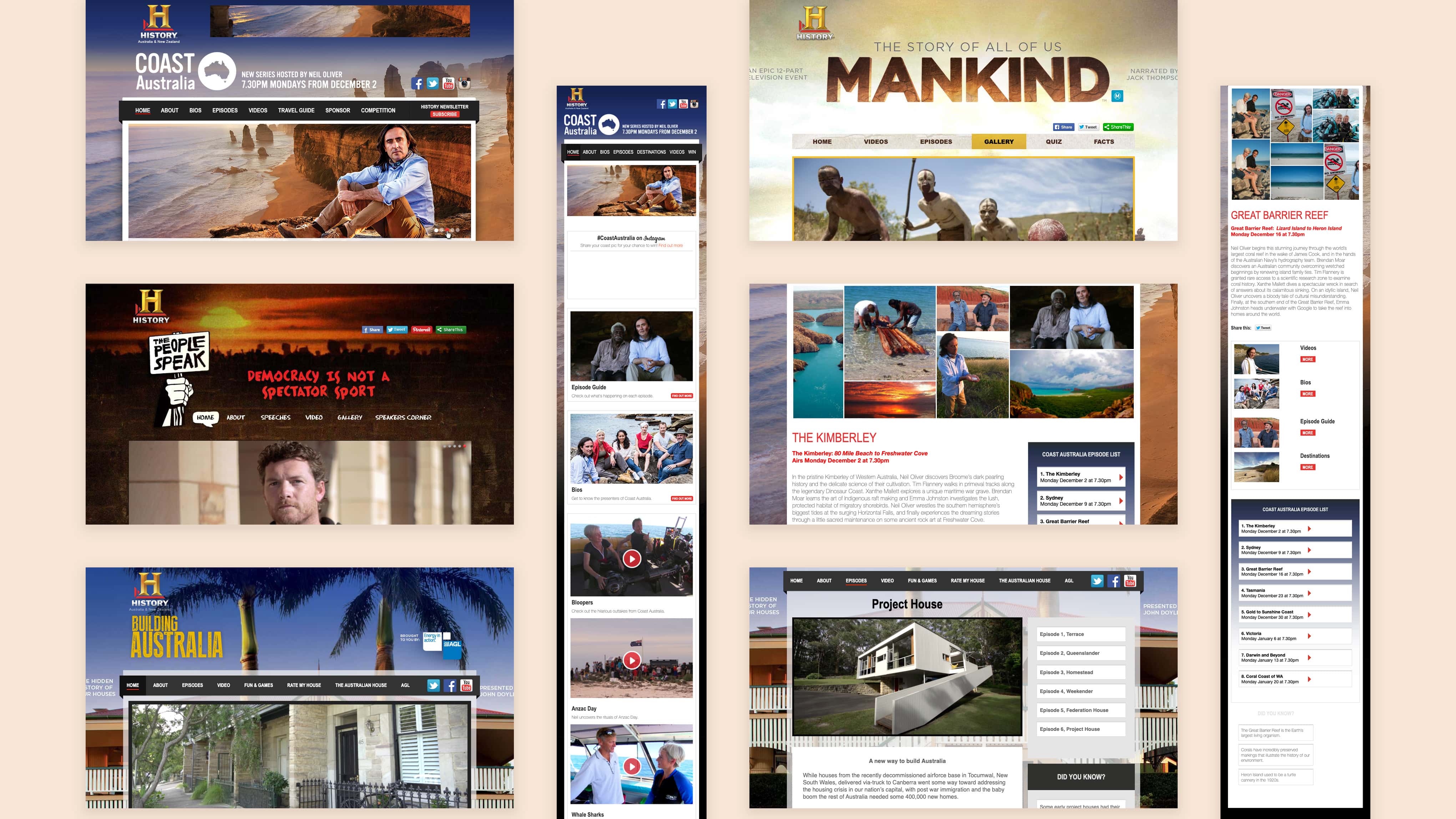
Building Australia
The History Channel’s programme ‘Building Australia’ is a colourful series that uncovers the hidden history of Australia’s houses and takes a beautifully nostalgic walk through iconic houses, from yesteryear right through to the present day.
The History Channel got in touch with ChillyBin to develop a micro-site to showcase all six episodes of the show. The site not only archives all the previously aired episodes, but gives users the ability to upload their own experiences which can get featured on the site, and allows the client to show and hide content from unaired shows.
Coast Australia
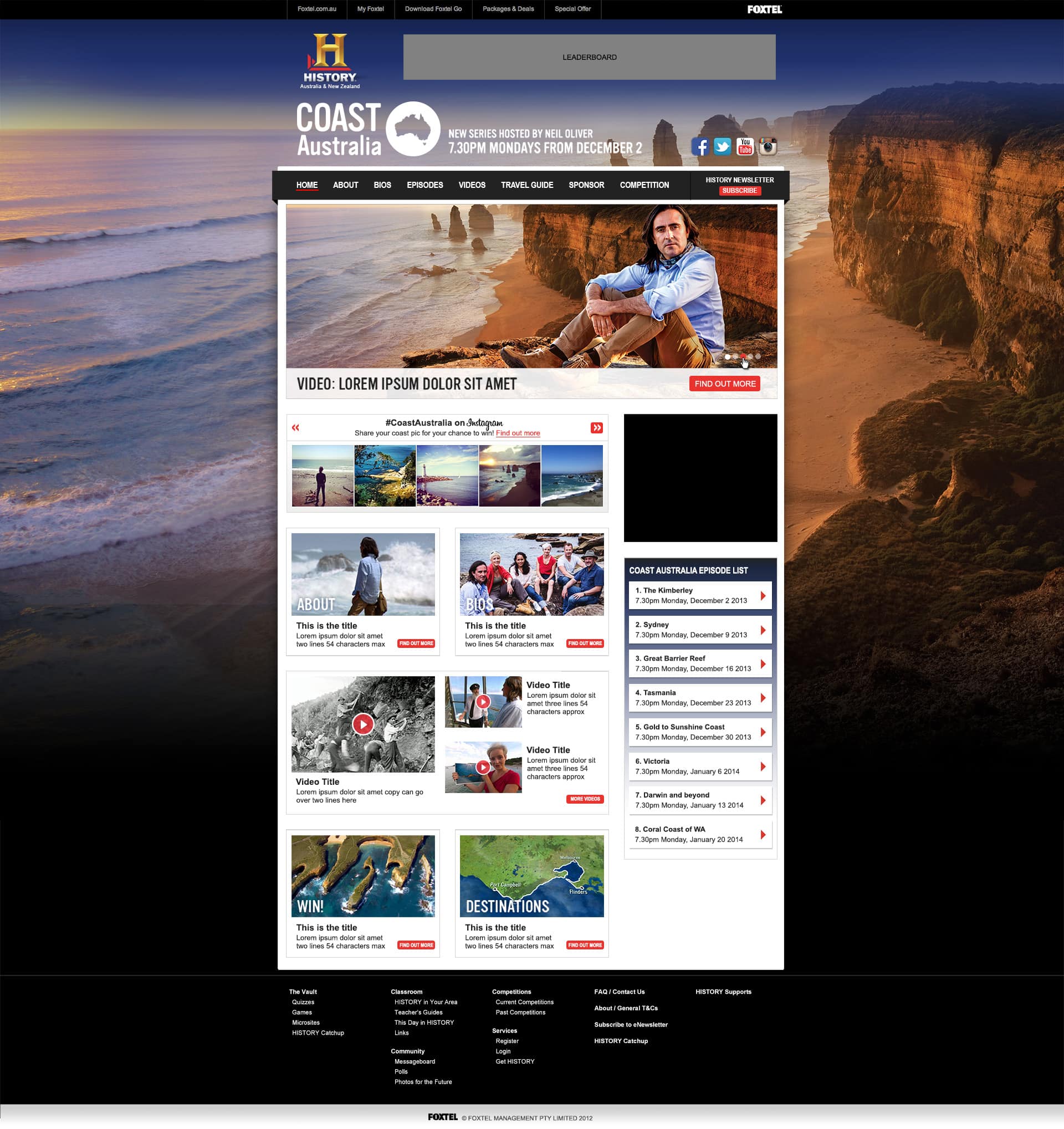
This documentary series focuses on Australia’s amazing coastline, as internationally renowned host Neil Oliver and co-hosts gather stories about its history, people, archaeology, geography, and everything else in between.
In order to help promote the show, History Channel Australia reached out to ChillyBin to create a micro-site in anticipation of the launch. On a tight timeframe, we were able to quickly finish the website, provide Instagram integrations, and also video integration through Brightcove.
The People Speak
The website for The People Speak was built for the Genesis Framework by StudioPress & WordPress Content Management System to allow easy administration and flexibility over all aspects of the website.
The website was designed and developed to utilise a number of custom page layouts and custom widget areas while still making it very easy to maintain from an administrator's perspective.
The website has integrated Facebook social commenting, a parallax timeline system, advertisement management, Brightcove video embedding as well as multiple photo galleries to name but a few features.
The system allows The History Channel full access to change just about any aspect of the site through the administration modules in a quick and easy system that gives them highly detailed analytics at their fingertips!
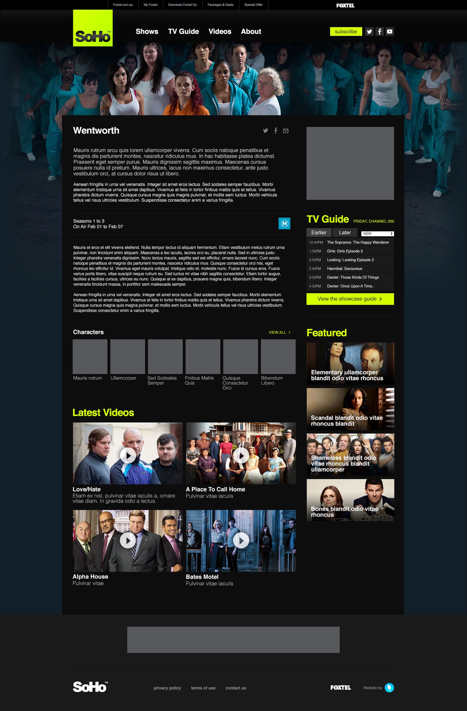
Foxtel Channel Websites
The Comedy Channel
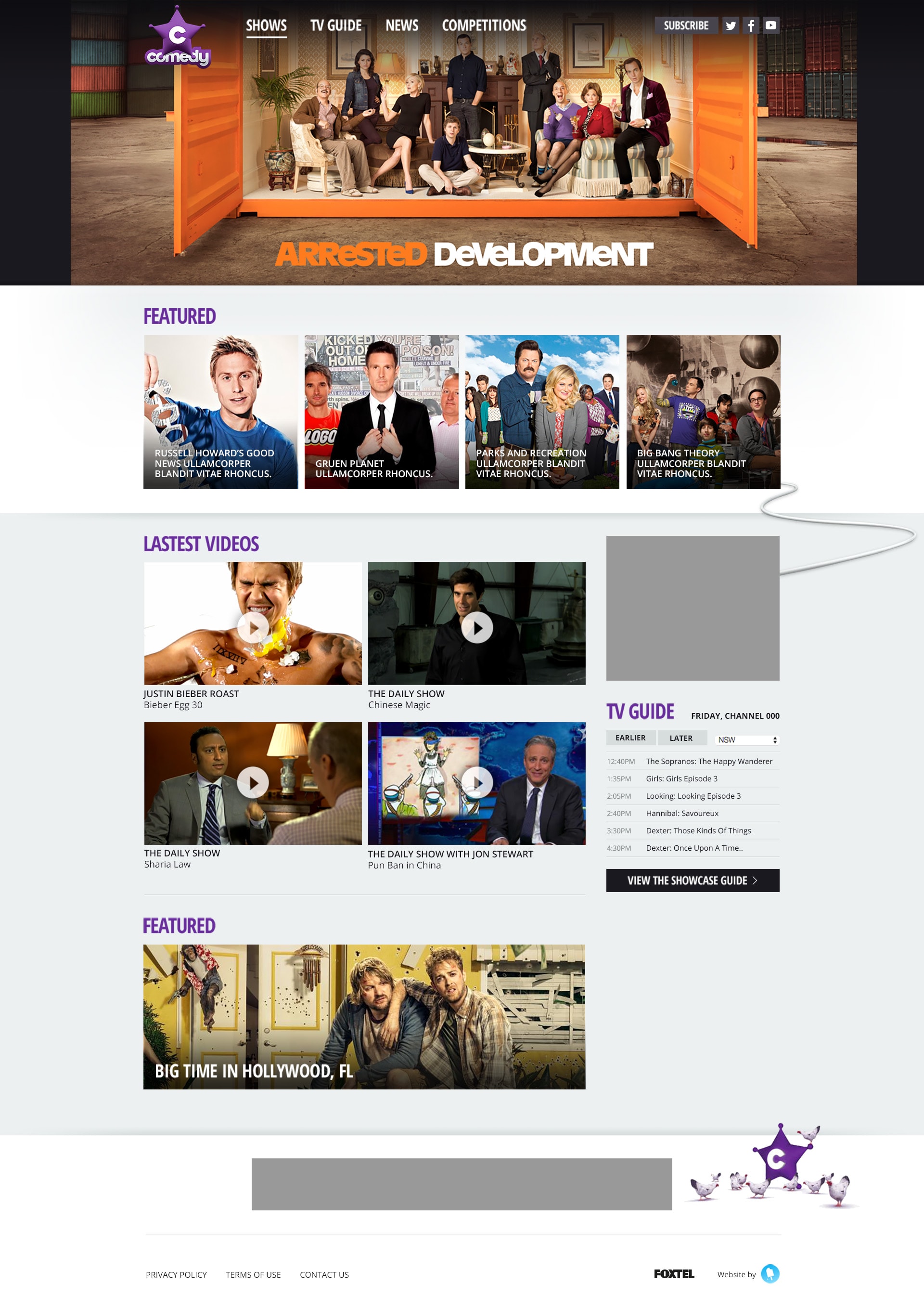
After realising the need to spruce up their current design, The Comedy Channel reached out to ChillyBin to help freshen things up and bring a more modern feel to the channel’s website.
Since the client wanted to go with a more modern feel, we knew that a cutting edge responsive design that integrated perfectly across all device types was a no brainer.
Content is King, so when incorporating the new layout, we kept this in mind. We provided the client with a clean and stylish new design that puts emphasis on displaying and showcasing content for users, making it simple for viewers to select and watch the show they want, when they want.
Fox 8
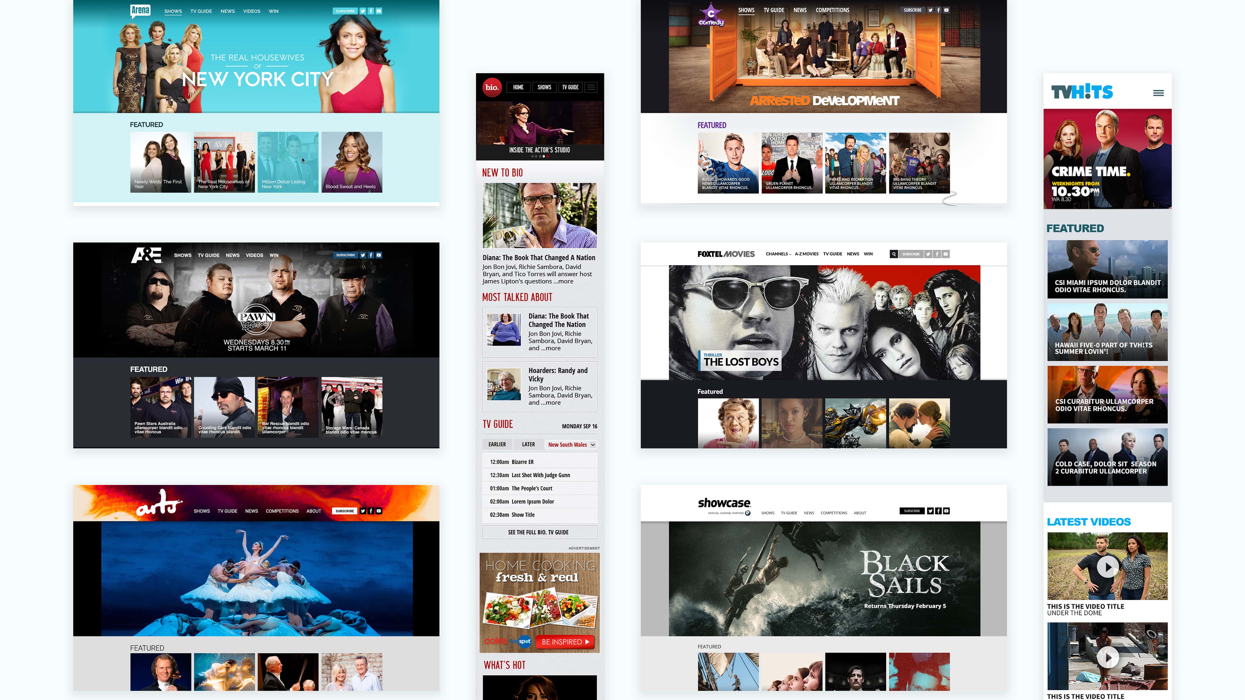
The team at Fox 8 had a goal to reach a larger audience, so the new site needed to be mobile-friendly so that users can view and navigate menus and episodes from their smartphones, tablets, and other mobile devices.
Since one of our main goals was to provide a tighter focus on branding across the site, we made sure each show and its sub-pages carried over all the branding elements specific to that individual show.
Lastly, the custom homepage slider we created allows Foxtel to easily choose a colour to associate with a show, which determines the colour for all links, titles, and other content associated with each show and its sub-pages.
Foxtel Movies
To breathe new life into Foxtel Movies, we were engaged to build a website that allows viewers to keep up with what’s going on and keep informed about their favourite movies.
We provided them with a custom responsive template, that is similar in structure to their other websites, in order to maintain branding consistency.
The content for the website is held in XML files which are used to import new movies, actors and data to keep the site fresh and organised. We also integrated custom search and sorting to help make things go smoother and work efficiently, providing a fantastic user experience for movie-watchers.
Website Development
In order to provide the team at Foxtel with everything they needed, we designed, built and incorporated a custom ‘Foxtel starter site’ across the websites. This Foxtel template is a responsive template that we use on all the websites we create for Foxtel as consistent design, development and branding are one of their major requirements. The template has been customised to fit with the site’s unique design, as well as allow users to browse comfortably on multiple screen sizes and devices.
Foxtel also wanted a way to associate different tv shows with specific colours in order to tighten up show branding across the website, as well as add additional advertising modules and customise the look and feel of each show page which they can now do thanks to the lights, camera, action approach from the team at Chillybin!
