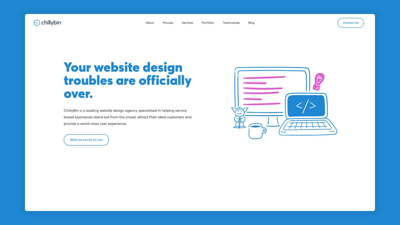
It all started over a year ago. It was obvious to us – the Chillybin website had outstayed its welcome since its last major website redesign in 2017. Here’s how and why we decided to redesign our website and won two awards.
A visual refresh was long overdue for us, and while our website still looked great compared to our competition in Singapore, as an agency we have moved on in our product offering and the website didn’t fully encompass all the services and solutions that we offer to our clients.
Why did we decide to do a redesign? As a busy, full-service digital agency, we know that a website and brand refresh is no small project. It requires planning, research, strategy, design and development resources, and, most of all — time.
We couldn’t wait to start reimagining how to showcase our best portfolio work and all of the genius things our agency can do — but first, we needed to pause to answer the question of “What is the Chillybin story at this moment? And why should people care?”
Our new website design wasn’t only about a visual update – the new web design had to include more information about our services while remaining easy to consume and use. And above all, the information we added had to be valuable to people.
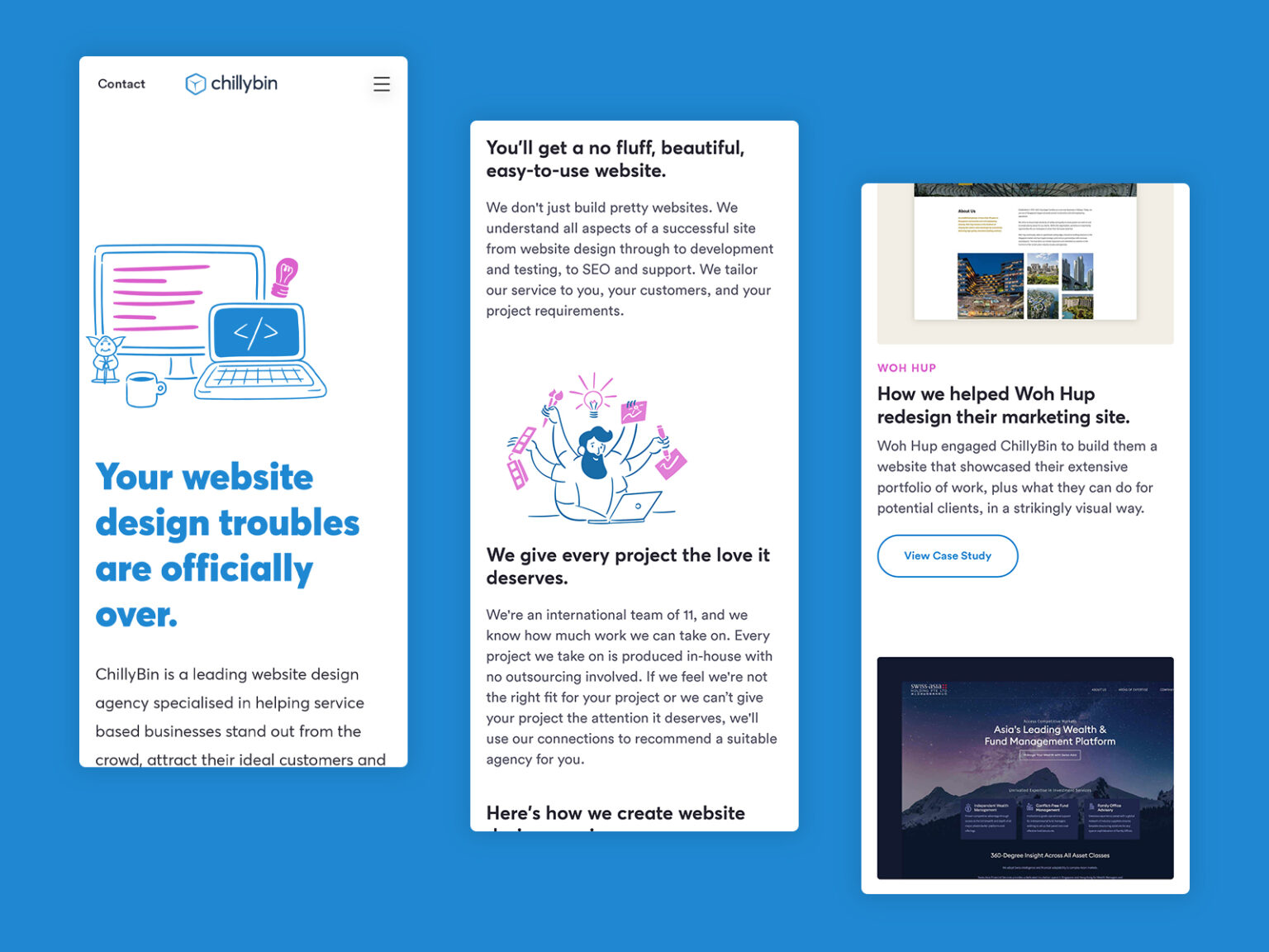
Our web design service offering has not changed; it has been redefined and clarified. The previous website version focused on design services like print, packaging, and application design. While, as an agency, we are capable of such work, it’s not how we want to present ourselves to our target audience.
Our web design philosophy has grown over the years, and we have a clear focus and expertise in purposeful user flows and prospect experience design, where we can shape your prospect’s experience and guide them to take action.
Our other core service, website development, has been redefined and clarified. Our previous web development services focused on mobile app development, bespoke and CMS development, and API integrations, which were not at the core of the work we wanted to produce for our clients.
We have the expertise as developers to work in this space, but to serve our clients and their potential clients better, we needed to focus on our speciality: WordPress development.
WordPress is a platform that our founder, Shaan, has been working with since 2003 and has been integral to the growth of our website design agency in Singapore in recent years. We only use WordPress now, which is a huge strength. With the team fully entrenched in one system, we can confidently say that we can deliver a world-class WordPress website – every time.
We build stunning, user-focused websites that will wow your customers.
Are you a business owner in Singapore, Australia or worldwide? We work with clients across the globe to deliver beautiful yet functional website designs.
We needed our new site to allow for quick and easy updates by our marketing team and content expansion and evolution while maintaining a seamless experience for our readers. As part of our development philosophy — we believe in a technology opportunistic approach — that is, selecting the right tech stacks based on the designs and the predominant business goals we are trying to achieve.
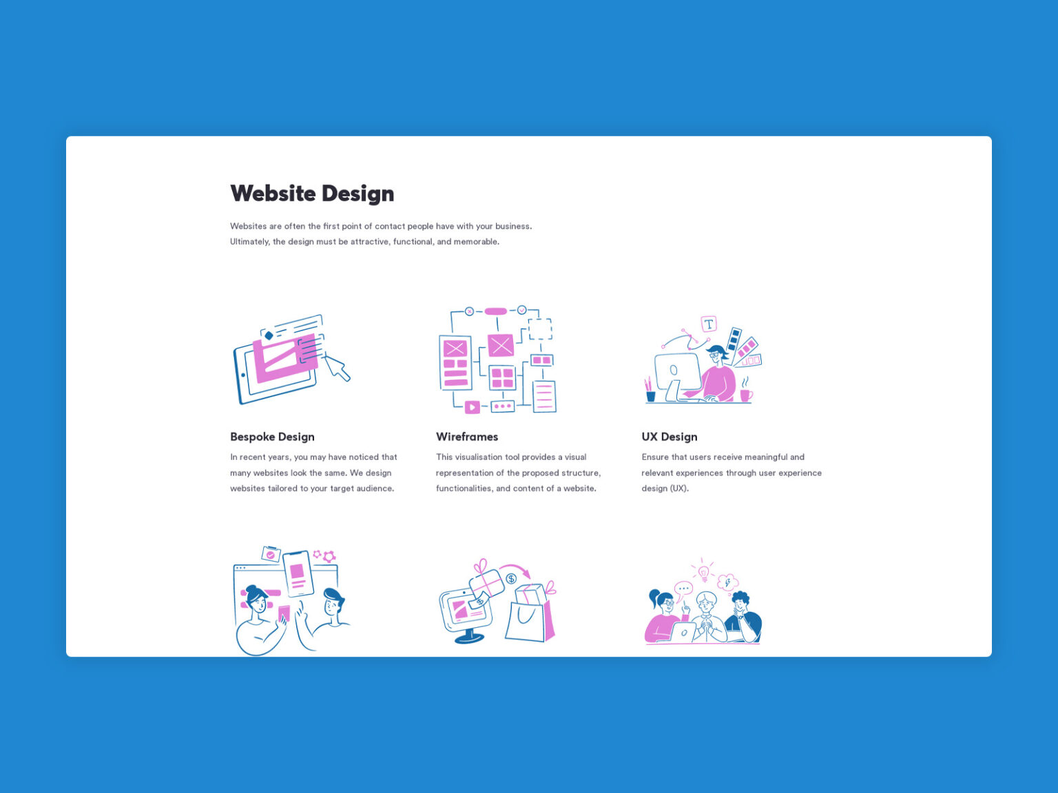
The redesign of our website wasn’t only about a visual update – the new design had to include more information about our streamlined services, including Search Engine Optimisation, e-commerce development with WooCommerce and Shopify and our Digital Marketing offerings, which were not a big focus of our previous website. Still, we have been having a lot of success in these areas for our clients. With the new design, we also wanted to make sure that it was clear to potential clients that we have successful internal project processes where we work together to get the best combined results.
This called for longer pages with better organisation, navigation, integration and calls to action – on each individual page and through the website as a whole.
Our culture is built on teamwork, respect, and recognition. Our unified brand story must be reflected in our creative and content strategy before architecting and designing the new site in revisiting our history.
As a B2B digital agency, we also needed our new website to support our marketing, sales, and recruitment efforts and grow our business. The best way for us to do this is to “show — don’t just tell.”
We took some time to curate our vast portfolio to showcase some of our truly innovative work — our greatest client successes that not only look good and perform well but, more importantly, drive actual business results.
Sadly, this was an area of the business that had been neglected over the past few years, and the work presented in our portfolio was not indicative of our recent work. We took significant time to clean it up and re-factor our work into the new templates with a clear focus on the results and benefits we drive.
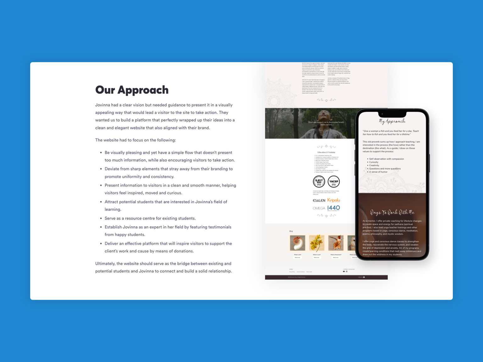
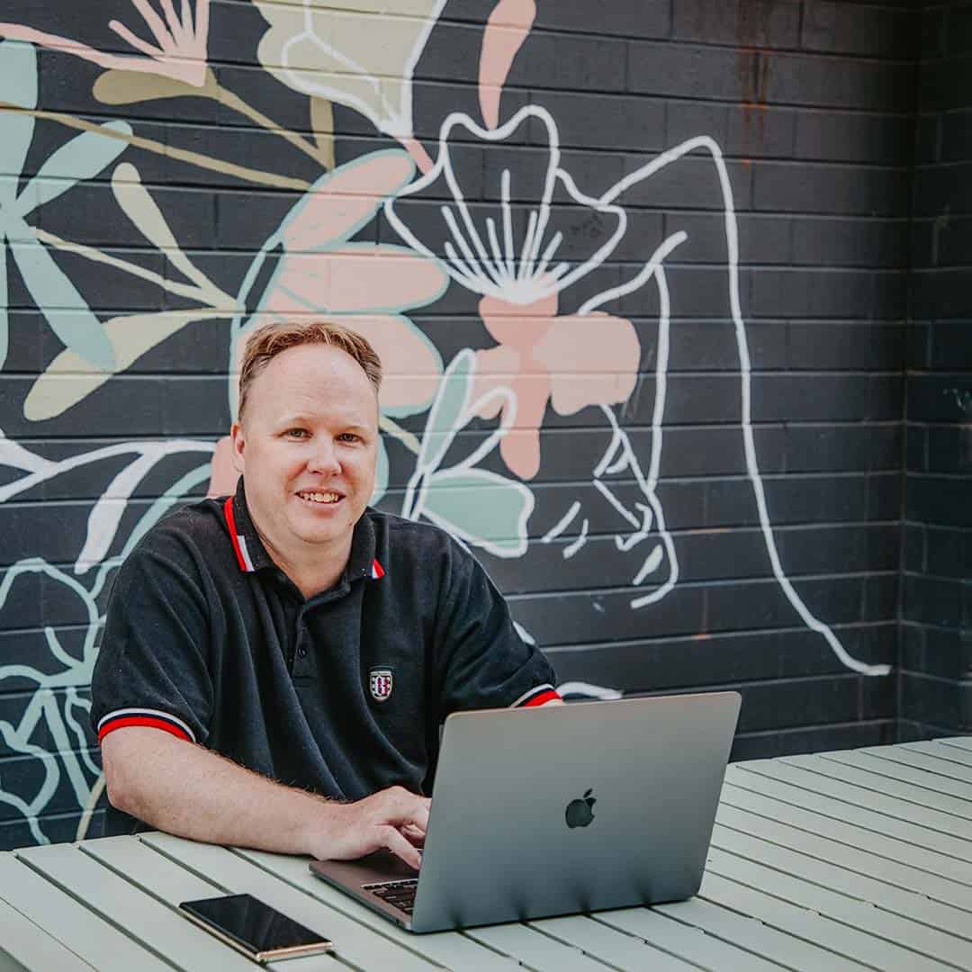
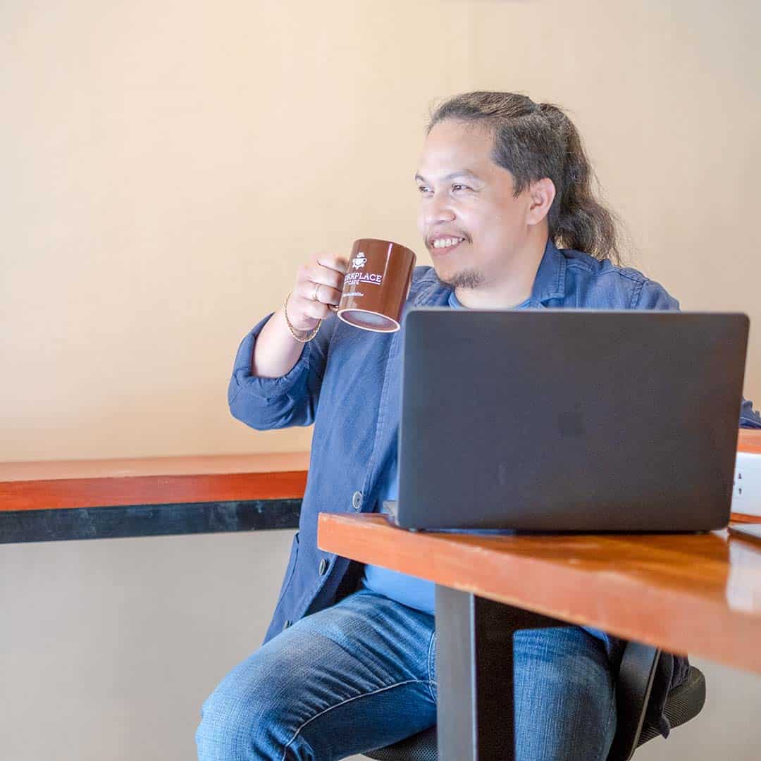
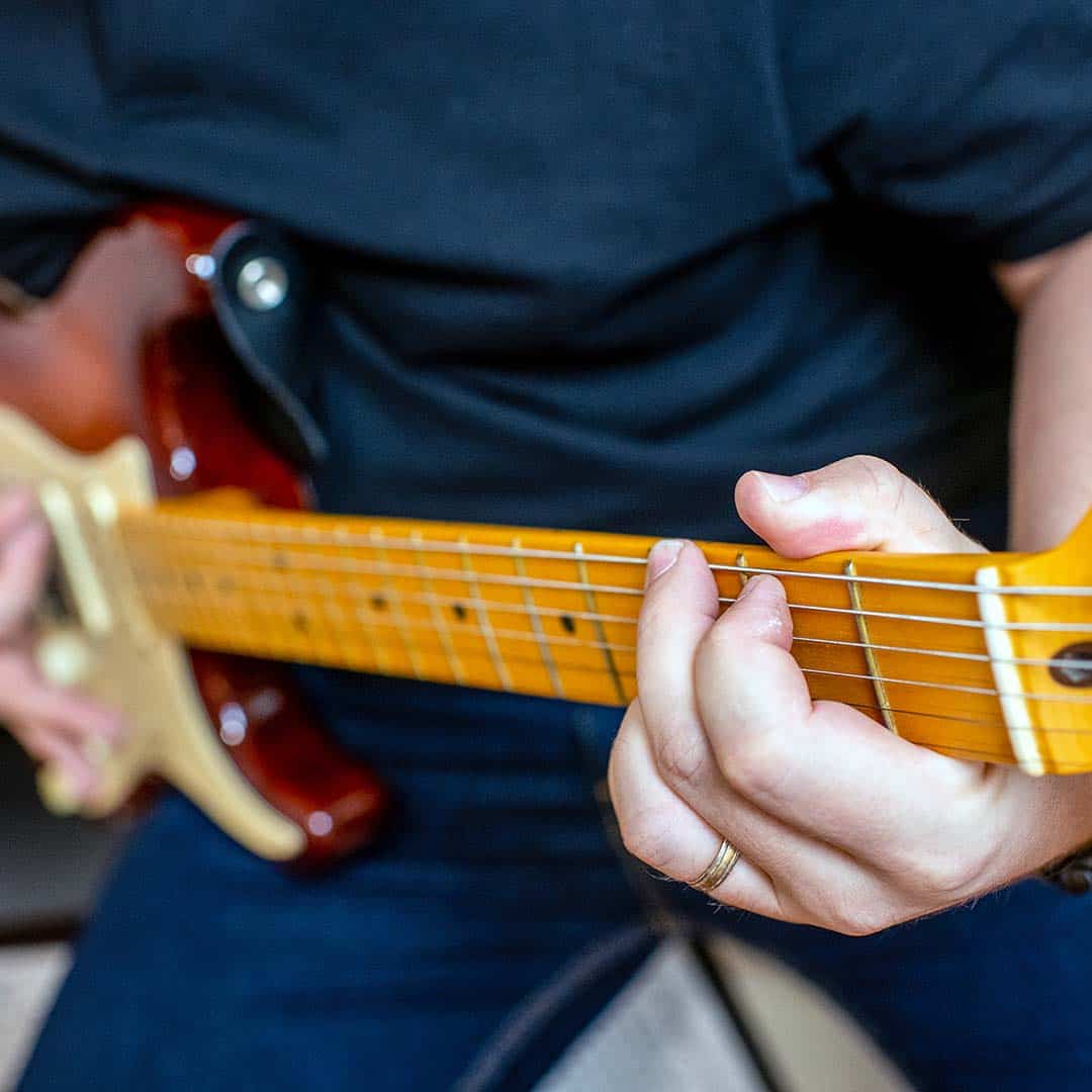
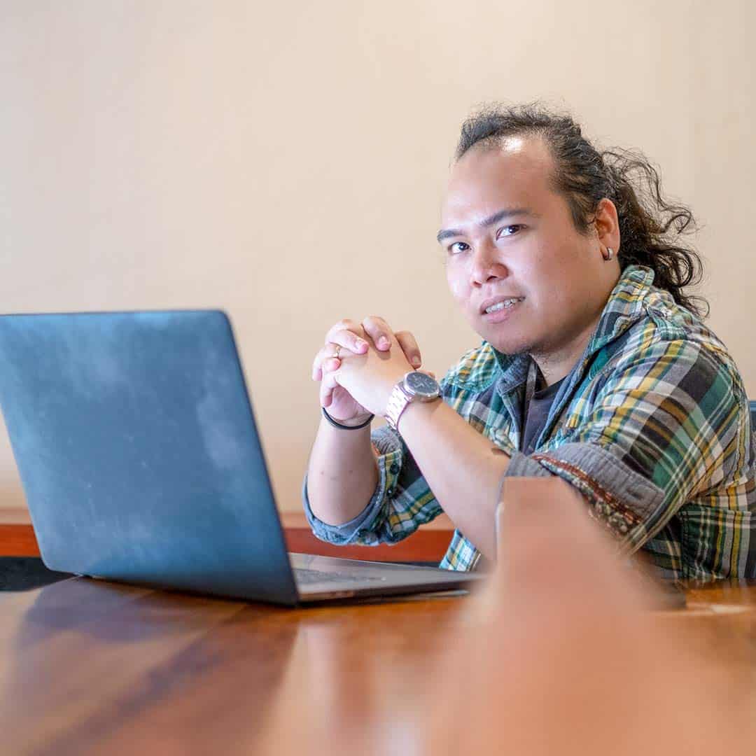
Our team has grown over the past few years, and the previous site did not highlight the incredible individuals who work tirelessly every day. As we have always been a proudly remote-based web design agency, we organised a team of photographers to head out and capture photos of our team where they feel most comfortable, in their space.
The benefits of remote work for our team and Chillybin have never been more evident than through the past couple of years of COVID restrictions. Our remote approach allowed us to remain operational with minimal disruptions and, most importantly, increased flexibility for our team to spend more time with their young families and have a better work-life balance.
Recently, Singapore announced that 75% of the workforce can return to their offices if necessary. Still, for many employees, with over two years of working from home, that’s not a logical option anymore. It’s exciting to see these changes and the adaptation of video calls in place of physical meetings being more widely adopted, as they are all practising that we have perfected at Chillybin over the past 13 of working remotely from home.
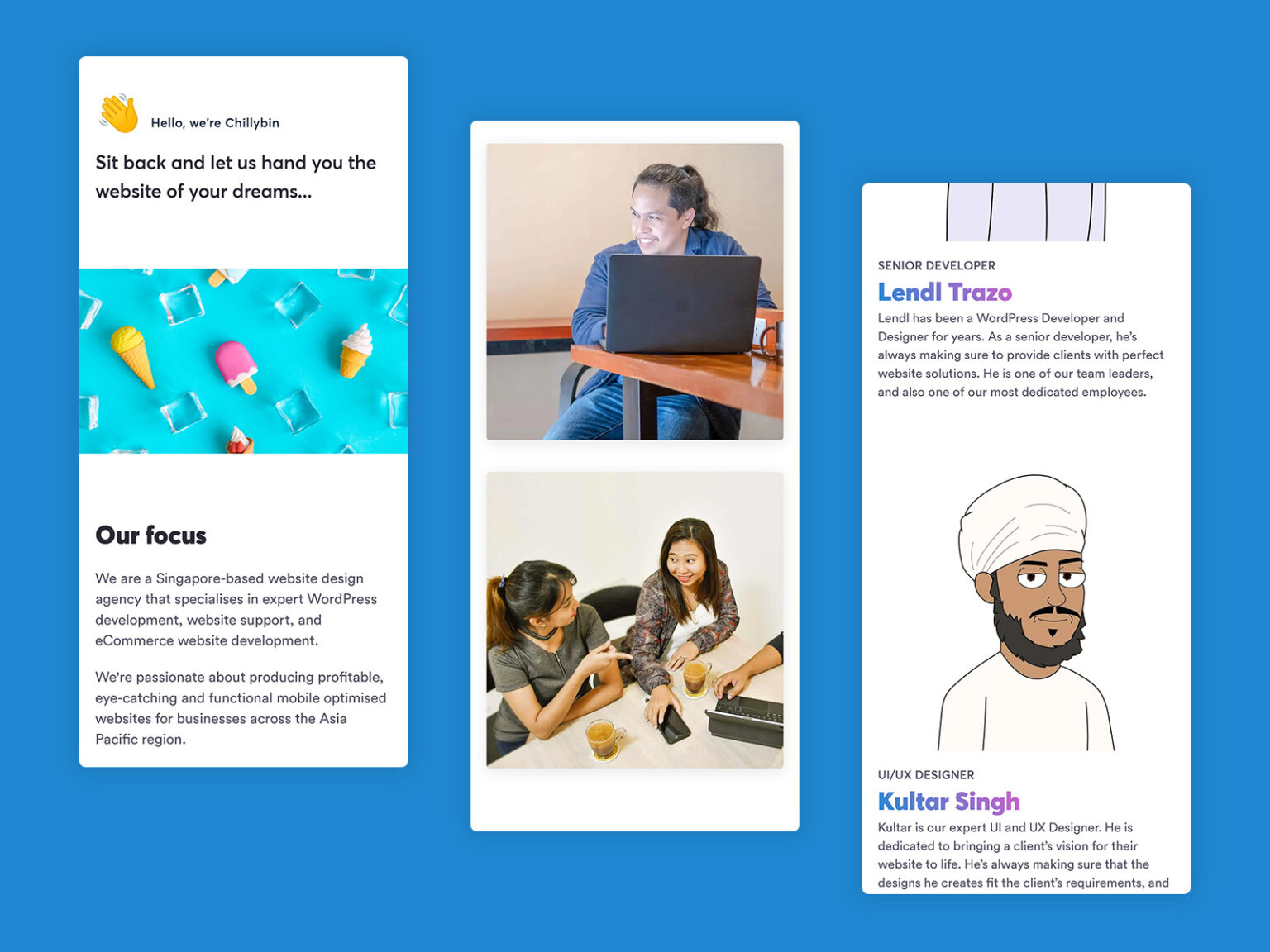
The website redesign’s main focus was to provide more information about our services while remaining easy to consume and use for our clients and easy for us to manage from a marketing and development perspective. The previous website, built in 2016 and launched in 2017, was a product of its time.
It was built on the Bones for Genesis theme framework, which was lean and a fantastic Genesis starter theme for WordPress integrated with custom fields via Advanced Custom Fields. Still, it also meant we needed to fire up the console, re-compile all the assets through Webpack/Grunt/Gulp, and push to Gitlab whenever we wanted to make an update.
For an agency like Chillybin, it was limiting our adaptability to change and being flexible with our designs based on evidence of how our target audience interacted with our website.
The new website is built in Beaver Builder, on top of our core WordPress development stack that we have perfected for our clients, so it only makes sense that we should use it ourselves. Beaver Builder is a flexible drag-and-drop page builder for WordPress. We love it because it makes creating great-looking content in WordPress as user-friendly as possible.
Beaver Builder also allows our marketing team to quickly create landing pages to offer our expertise through lead magnets while remaining a solid, robust development tool to keep our WordPress developers happy.
The new website is also built using the Beaver Builder Theme, a fast, adaptable, and minimalistic theme framework that we have customised to keep it lightweight yet still powerful enough to give our team all the options we need without sacrificing versatility.
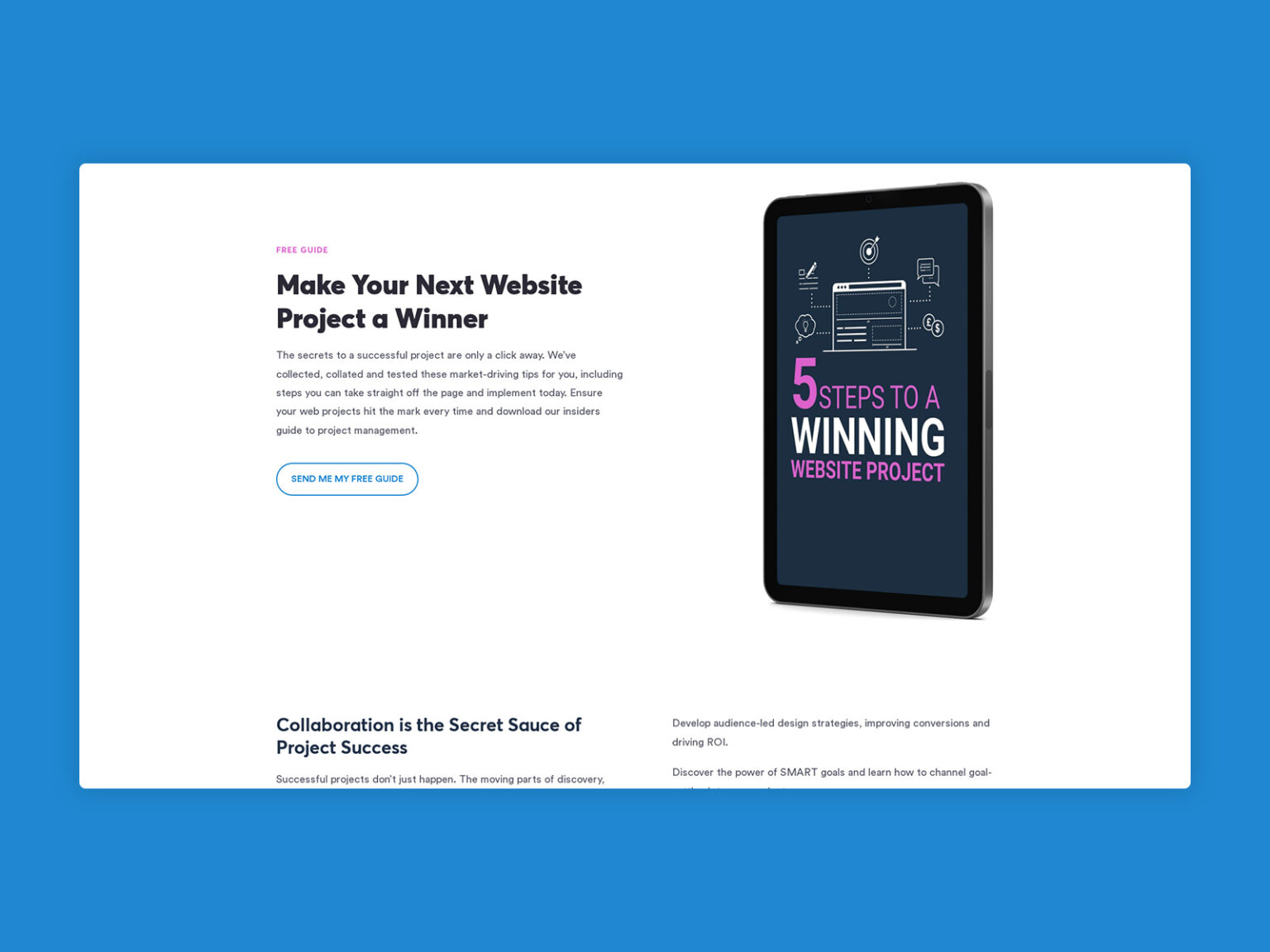
Imitation is the sincerest form of flattery that mediocrity can pay to greatness.
Oscar Wilde
The final reason we made the change was the influx of copycat designs that we have been seeing across the web, including an “agency” in Bali that had basically ripped the whole site, including our Facebook pixel, Google Analytics code, fonts, colours, HTML and CSS and modified it slightly for their use.
The rest of the site doesn’t look perfect, so they must have designed that part themselves. Unfortunately, plagiarism is widespread in our industry and nearly impossible to prevent. The best thing we can do is to call them out and keep producing award-winning website designs that “inspire” other agencies.
On the other hand, if you’re looking for a high-quality agency based in Bali, look no further than Tiago and his team at SDB Agency. They do some great work, and on Beaver Builder too!
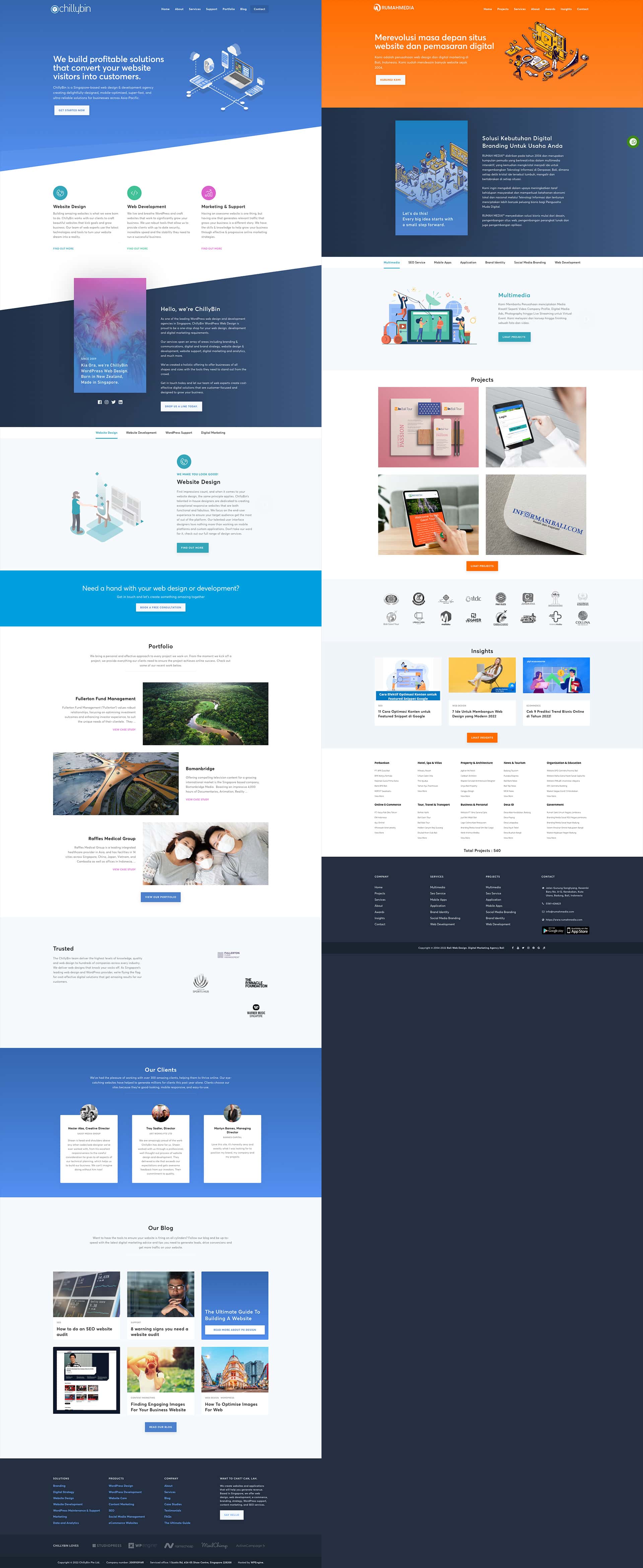
As Copyscape premium members, we regularly check how many people have “borrowed” our copywriting for their sites. We have reached out to all of the offending people, and most of those we contacted took down the offending material.
Duplicate content gets penalised by Google, so we always recommend that clients use Copyscape to look for people plagiarising their content so they can work to get it removed.
Table of Contents
How Did We Get Started on the New Website Design?
First, we got the team together – our lead designer, Kultar; our lead developer, Lendl; our marketing manager, Jarrod; advice from Dan on our SEO team and Shaan, our director. We discussed what we wanted to improve, throwing many ideas on the table.
We looked at competitors on the global market and pinpointed what we liked in their web presence and what we didn’t. We analysed the feedback and questions we’d gotten over time from colleagues, clients and friends. Then we discussed what’s realistic and technically possible versus priorities and desired timelines and agreed on short- and long-term goals.
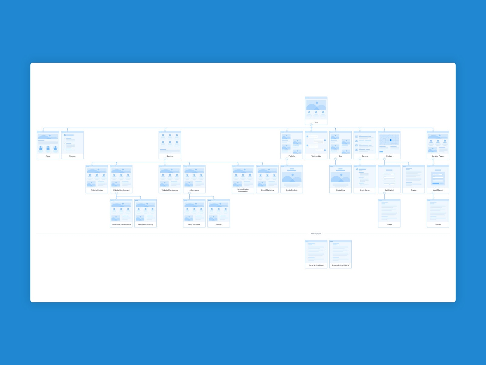
After the kickoff meetings, we started collaborating in Flowmapp on the new structure and navigation of the website. We recognised some navigation issues in our user flow and structural SEO issues with duplicated and unnecessary content and landing pages. The findings were fascinating – some were expected, and others were beneficial to identify more opportunities for improvement.
What Was the Website Design Process Like?
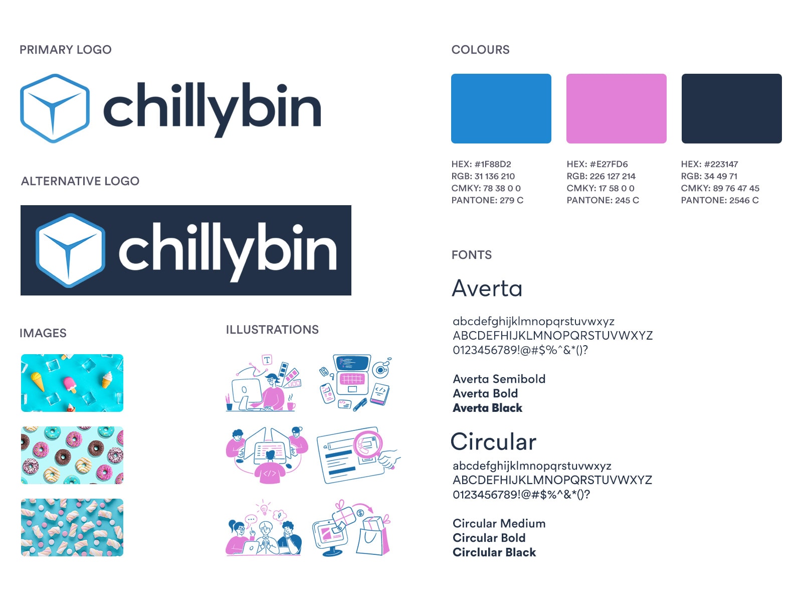
We looked at many agency websites for inspiration and created an idea board of different elements, interactions and techniques we wanted to try and possibly incorporate. Our visual identity was refreshed in 2017, but something about the wordmark didn’t resonate with our director, who wanted something a little more modern and bold. Hence, as part of the redesign process, we started with tweaks to our logo, colour palette and fonts.
We have refined our brand colours to a more minimalist palette with three primary colours incorporated with varying shades and opacity. We’ve kept our main headline font, Averta, but swapped out Proxima Nova with the fantastic Circular and feel that it’s come together well. With the colours and fonts decided, we made the required changes to our logo, which keeps the logomark the same with only minor colour changes. We revised the logotype to incorporate Averta and amended the colour palette.
We opted to avoid using stock photos on the new site. Instead, we set up several local photographers to take photos of the team in their space, where they feel comfortable, which adds personality to the design. You get to see the people working on your projects rather than a well-lit studio with faceless people with good hair.
Shaan dragged all of the old website content into individual Google docs and collaborated with Jarrod to write the initial content with the help of our keyword and competition research. We first created an interactive mock-up to use as a basis for discussion and analysis. When the team have something visual to look at to imagine how the new website will look and feel, they can offer better and more concise feedback
Website Redesign Challenges
One challenge was finding the best way to communicate all the information about our services in the best organised and most concise way. It was a difficult task because we had a lot to offer, and we didn’t want to cannibalise our SEO with competing pages, so keeping all relevant information on one page rather than breaking them down was essential.
Another tricky part was that the service pages became quite long with quite a bit of whitespace, so we needed to offer users a way to navigate inside the pages and know where they are at all times. We introduced sticky side navigation for that purpose, which we believe was a good solution.
A challenge all designers face, and this website redesign project was no exception, was deciding which visual ideas, colours and illustrations to incorporate and how to get unstuck from creative blocks. We wanted the design to be fresh, yet not foreign and utterly different from our existing design that was so familiar to our clients (and copied by our competition).
The role of the visuals should be to guide the eye and supplement textual information, not drive away focus from it. As with every design, the web pages should have a visual rhythm that helps the user scan the content and browse through it without getting overwhelmed, with areas for the eye to rest and other areas to dive deeply into.
Creating a balanced layout and composition is about creating a hierarchy based on prioritising the most important content you want the user to see. It’s always a process, and it doesn’t happen fast, but it’s one of the most critical parts of a website project, and it’s also what new designers and small agencies struggle with most often.
Using the Best Website Redesign Tools
We started our first sketches using Good Notes 5 on an iPad Pro. For the prototyping, design and handoff, we used Adobe XD and also designed and made changes to some elements in the browser as we went. We used Adobe Photoshop and Illustrator to create visual content – photographs, icons, and illustrations. We communicated via Slack for internal team meetings and ClickUp for project management.
Of course, WordPress is our content management platform, and we constructed everything in modules so that we could reuse and recreate almost anything with Beaver Builder later on.
The Results of Our Website Redesign
The new Chillybin website is easier to navigate, innovative, engaging, and reflective of our brand, and it communicates the value Chillybin offers in the most straightforward and best possible way. We are not done yet; there are more pages in the works, and we’ll continue redesigning and improving them, but we are thrilled with the result so far, and we hope our users are too.
Websites are living, breathing things; they can and should be updated and optimized continuously. In the coming weeks and months, we’ll roll out updates as planned and tweak things as we learn from our analytics. We’re excited about what our team has achieved in launching our new site and eager to continue improving upon it.
Thanks to our redesign team: Shaan Nicol, Lendl Trazo, Jarrod Partridge, Kultar Singh, Dan Rippon, Paris Hasch and Veena Dangalan.
