Selecting the appropriate colour scheme for a website is critical for fostering brand recognition and establishing a strong brand identity. The colours chosen for a website’s design are not just for aesthetic appeal; they communicate and resonate with visitors on a psychological level, a concept known as colour psychology. Introducing a well-thought-out colour palette is essential in website design, as it involves selecting primary and secondary colours, accent colours, and neutral colours to create a cohesive look.
Colours have the power to influence emotions and perceptions, hence why understanding colour theory and the psychology behind colours is essential for website designers. It’s about creating a visual experience that aligns with a brand’s messaging and engages the intended audience.
Choosing a colour palette for your website involves more than just picking your favourite colours. It requires careful consideration of how different hues work together to create a cohesive and accessible design. Contrast and readability must be prioritised to ensure the website is user-friendly for all visitors, including those with visual impairments. Working alongside skilled web designers, testing various colour combinations, and iterating based on feedback can result in a harmonious colour scheme that elevates the user’s experience.
Key Takeaways
- Align colours with Brand and User Psychology: Selecting colours that reflect your brand identity and resonate with your audience’s psychological responses is crucial. This alignment helps in establishing a strong brand presence and fostering emotional connections with visitors.
- Prioritise Accessibility and Readability: Ensure that your colour choices enhance readability and accessibility. High contrast ratios and thoughtful colour combinations make your website user-friendly for all visitors, including those with visual impairments.
- Iterative Testing for Optimal Results: Continuously test and refine your colour palette through A/B testing and user feedback. This iterative approach helps in creating a cohesive and effective colour scheme that improves user experience and engagement.

Table of Contents
Understanding Colour Theory
Colour theory is the science and art of using colour. It explains how humans perceive colour, how colours mix, and the visual effects of specific colour combinations. The colour wheel is a practical framework for determining which colours work well together.
Primary, Secondary, and Tertiary Colours
The primary colours are red, blue, and yellow. They serve as the foundation from which all other colours are created and cannot be formed by mixing other hues. When you combine primary colours, you get secondary colours: green (from blue and yellow), orange (from red and yellow), and purple (from red and blue). Tertiary colours are made by mixing a primary colour with a secondary colour, resulting in hues like red-orange or blue-green, further expanding the palette.
Warm and Cool Colours Explained
Colours are also divided into warm and cool tones. Warm colours, like red, orange, and yellow, evoke emotions ranging from comfort and warmth to hostility and anger. Conversely, cool colours, including blue, green, and purple, are known to invoke calmness and have a soothing effect but can also be associated with sadness or indifference. The distinction between warm and cool colours is crucial for conveying the right mood and message in design.
The Colour Wheel as a Guide
The colour wheel is an indispensable tool for designers, illustrating the relationships between colours. It’s structured with primary, secondary, and tertiary colours, and helps designers create visually appealing palettes. Using the wheel, we can develop various colour schemes, like analogous, complementary, and triadic, which provide different visual experiences and can influence the viewer’s perception and interaction with the design. An analogous colour scheme, for instance, uses colours that are next to each other on the colour wheel to create a modern yet sophisticated website.

The Psychology of Colours
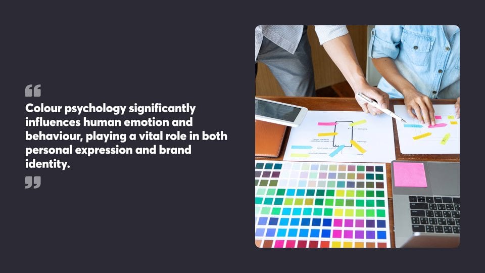
Colour psychology significantly influences human emotion and behaviour, playing a vital role in both personal expression and brand identity.
Emotional Responses to Colours
Colours elicit a diverse range of emotions from individuals, which vary based on cultural and personal experiences. Red, for instance, commonly evokes feelings of passion and urgency, while blue is associated with trust and tranquillity. Businesses use these emotional responses to their advantage, choosing colour palettes that elicit the desired reactions from their target audience.
- Red: Excitement, Energy
- Blue: Calm, Reliability
- Yellow: Optimism, Creativity
- Green: Growth, Harmony
- Orange: Enthusiasm, Fun
- Purple: Luxury, Wisdom
- Black: Sophistication, Elegance
- White: Purity, Simplicity
Colour Psychology in Branding
In branding, colour psychology is central to developing a company’s personality and ensuring consistent messaging. Brands select colours that align with their values and the emotions they wish to spark in consumers. For example, a brand focused on sustainability might choose green to communicate its commitment to environmental responsibility. Similarly, luxury brands often select black or deep purple to convey a sense of exclusivity and sophistication.
- Green (Sustainability): Eco-friendly, Nature
- Black (Luxury): Prestige, Formality
- Blue (Healthcare): Trustworthiness, Professionalism
- Orange (Retail): Approachability, Confidence

Selecting Your Website’s Colour Scheme
Selecting a colour palette for a website involves strategically choosing background and accent colours that align with your brand and create a visually appealing environment for visitors. Understanding and utilising effective colour combinations can further enhance the visual appeal and user experience.
Creating Your Own Palette
When building a personal palette, it’s critical to understand the basics of colour theory and the emotional associations of different hues. Complementary, analogous, and triadic are common schemes you could explore. Complementary schemes involve two colours opposite each other on the colour wheel, creating a dynamic look. Analogous palettes use adjacent colours for a more harmonious feel, while triadic schemes involve three evenly spaced colours that provide a vibrant contrast with a balanced look.
Incorporating Brand Colours
Incorporate your organisation’s existing colours into the website’s design to maintain brand continuity. These brand colours often dictate the dominant hues used throughout the site and can be supported by secondary colours to create depth. If your brand colour is blue, symbolising trust and reliability, use it prominently and select additional shades or complementary colours to round out the design.
Choosing Background and Accent Colours
When selecting background and accent colours, consider visual contrasts that ensure readability and ease of navigation. The background colour should be unobtrusive and support the content, while accent colours draw attention to crucial elements like calls to action. Typically, a neutral background with thoughtfully placed accent colours works well. For example, a soft grey background with a vibrant green accent can highlight important features without overwhelming the senses.

Colour Schemes Explained
When designing a website, selecting a colour scheme involves strategic choices that directly impact the aesthetic and functionality of the site. One effective approach is using a complementary colour scheme, which creates a dynamic and attention-grabbing interface by pairing colours that offer sharp contrasts. These decisions are based on understanding the interplay of colours and their psychological effects on users.
Monochromatic Colour Scheme
A monochromatic colour scheme revolves around a single hue, employing various tints, shades, and tones of that colour to create a cohesive look. This scheme is known for its harmonious appearance and is often associated with sophistication and elegance. While visually less complex, monochromatic schemes can still be striking when executed with a careful balance, offering simplicity that doesn’t sacrifice visual appeal.
Complementary Colour Scheme
Complementary colour schemes are built on colours that sit opposite each other on the colour wheel. This contrast creates a dynamic and attention-grabbing interface, with the high contrast offering a clear division between elements. It is effective in highlighting key features and guiding the user’s eye where designers want attention focused. Care should be taken in the saturation and value of these colours to avoid overwhelming the user.
Analogous Colour Scheme
Analogous colour schemes utilise colours that are adjacent to each other on the colour wheel. They often reflect a coherent feel, displaying a connection that is visually pleasing due to their close relationship. This scheme is often found in nature and can be used to create a serene and comfortable environment. The analogous scheme is inherently compatible, however, contrast should be considered to define various elements distinctively.
Triadic Colour Scheme
Triadic colour schemes involve three colours evenly spaced around the colour wheel, forming a triangle. This scheme is vibrant, even when utilising unsaturated hues, and it provides visual interest and a sense of stability when balanced well. Implementing a triadic colour scheme requires careful attention to harmony and proportion to ensure that no one colour overpowers another, thus maintaining equilibrium.
Split-Complementary Colour Scheme
The split-complementary colour scheme is a variation of the complementary scheme where, instead of using the colour directly opposite, the two colours adjacent to the opposite hue are used. This scheme offers a strong visual contrast with less tension than the standard complementary scheme. It keeps the vibrancy but offers more versatility, making it easier to balance and use within a design, as it provides more colours to work with that are still pleasing to the eye.

Exploring Colour Combinations
Selecting the right colour combinations for a website is a strategic decision that can significantly affect user experience. The use of complementary colours plays a crucial role in creating a balanced and unified design. Careful consideration of contrasting and complementary colours is fundamental for achieving visual balance and ensuring that the website communicates the desired message and emotion.
Contrasting and Complementary Combinations
Contrasting colours are those that are opposite to each other on the colour wheel. These opposites can create a visual dynamic that is lively and attention-grabbing. For example, blue and orange are contrasting colours that, when used together, can produce a vibrant effect. Choosing high-contrast palettes is useful for highlighting important elements on a website, such as call-to-action buttons or promotional areas.
Complementary colours, while often confused with contrasting ones, are actually pairs of colours that harmonise well together, providing a pleasing look when used in combination. They can either be adjacent to each other on the colour wheel or variations of the same hue. For instance, different shades of blue and green can work together to create a calming and cohesive atmosphere. Complementary colours are excellent for creating a balanced and unified design that is aesthetically pleasing and easy on the eyes.
By applying these colour strategies, designers can effectively guide visitors’ attention and create an attractive and functional website.

Importance of Contrast and Accessibility
The appropriate use of colour contrast on websites significantly affects readability and accessibility, as it ensures that text is easily distinguishable from the background, facilitating content consumption for a wider audience with varying visual capabilities.
Colour Contrast for Readability
Colour contrast involves the distinction between text (or graphic elements) and their background, impacting legibility. A sharp contrast ensures that text is discernible, with the ideal ratio for standard text being at least 4.5:1. Larger text often necessitates a minimum contrast ratio of 3:1 to be effective. These guidelines align with the Web Content Accessibility Guidelines (WCAG) 2.1 to improve reading ease for all users, including those with visual impairments.
Accessibility Considerations
Adhering to accessibility standards is a fundamental part of web design. It helps ensure individuals with visual disabilities can access information without barriers. Stark contrasts aid those with reduced vision as well as those who view content under less than ideal conditions. As global standards, WCAG recommendations serve as a foundation for creating an inclusive online experience, where colour contrast plays a pivotal role.

Working with Web Designers
Effective collaboration with web designers is vital in realising a vision for a website’s colour scheme. Clear communication and a shared understanding of design goals are essential elements of this partnership.
Conveying Colour Ideas to Designers
When discussing colour preferences with designers, it’s important to have clarity. Visual aids such as colour swatches, mood boards, and existing brand materials help articulate the desired aesthetic. Specifying the psychological impact of colours and how they align with a brand’s identity supports designers in making informed choices that resonate with the target audience.
Collaborating on Colour Choices
Web designers bring expertise in how different hues can be combined and used in a design to create a pleasing and effective user interface. As part of the collaborative process, feedback should be open and constructive, focusing on how users might interpret and interact with the colour scheme. The design revisions should be assessed not just visually, but also based on user experience data, ensuring the final palette supports the website’s goals.

Testing and Iterating Colour Choices
The effectiveness of a website’s colour scheme can be assessed and improved through systematic testing.
Evaluating Colour Scheme Efficacy
To ascertain whether a website’s colours resonate with visitors, web designers should conduct A/B tests to compare different colour variants. A/B testing involves creating two versions of a webpage, each with a different colour scheme, and then measuring user engagement to see which one performs better. Key performance indicators such as time spent on page, bounce rate, and conversion rate inform whether a colour scheme is successful or if it requires modification.
Feedback from users can be gathered through surveys or focus groups to get direct opinions on the colour scheme. This qualitative data can reveal emotional responses and associations that colours evoke, which aren’t always captured through quantitative data.
Web analytics tools enable designers to observe real-time interactions with the site’s colour scheme. Heatmaps, for instance, can show areas that receive more attention, potentially indicating the effectiveness of colour in guiding users’ eyes.
Testing should be an ongoing process, with iterations made based on collected data. Designers should be prepared to refine and adjust the colour palette periodically to maintain a website’s visual appeal and effectiveness in achieving its goals.
Implementing the Colour Scheme on Your Website
Once a website’s colour scheme is chosen, its consistent application becomes essential for maintaining brand identity and enhancing user experience. Website colour schemes play a crucial role in creating emotional reactions, setting the mood, making a first impression, and enhancing brand identity.
Applying Colour to Website Elements
When incorporating your website’s colour scheme, consider each component’s purpose and frequency of use. Backgrounds, for example, typically utilise the dominant colour, which forms the basis of your design. This primary colour should be prevalent, occupying around 60% of the visual area. For text and buttons, select hues that are legible and provide sufficient contrast. Apply less dominant colours judiciously; these can highlight significant sections like calls-to-action or navigation bars without overwhelming users.
Customising Templates with Your Colours
Templates are efficient starting points for designing your website. However, they must align with your brand’s visual identity. Adjust template elements by applying your chosen colour scheme. For instance, the dominant colour should surface in header and footer designs, while secondary colours add depth to sidebar menus or subheadings. If a template’s default palette conflicts with your scheme, most platforms offer tools to modify it, ensuring visual consistency across your online presence.
At Chillybin, we believe in a comprehensive approach to website design. We carefully analyse which colour schemes and design elements will resonate best with your target audience, ensuring your site stands out and connects with your goals efficiently.
To discover how the right colour scheme can elevate your website, contact us today.


