The number of websites going live is growing rapidly, and so is internet searching by users who are browsing, researching and buying from online sources more than ever before. That makes for some stiff competition in the business world. In order to have a quality and successful online presence, you’ll need to master the rules of great website design.
If you want your online business to stand out, it’s not enough to have a unique and compelling website, you need a website design that successfully attracts customers through search engines and converts leads to sales.
The right website design will combine style and function for a website that is geared towards a positive user experience. It’s important to provide website structure and content that is engaging, informative, easy to use and provides a satisfying solution to the user’s initial need or enquiry.
From a website owner’s perspective you want to see:
- Steady traffic from targeted sources
- Frequent repeat and return customers
- Ongoing sales
It’s important to know what works when planning your revamp or new site so you can avoid making these common website design mistakes and see results. While many business owners try to save a few dollars by creating their own website from a template or using a cheap web design service, it’s ultimately going to cost more going down this path.
Getting the equation right and balancing out website function and aesthetics is an art form. It requires a lot of experience, skill and initial analysis to pinpoint what to focus on, the best placement and how to create the perfect story to keep visitors clicking through your pages.
We strongly recommend using a professional web design service in Singapore to get the results you want and deliver what your customers need.
In this blog, we’ll cover the common web design mistakes we see businesses making that will hold back your numbers and limit your online business reach.
See How Chillybin Web Design Can Drive Massive Amounts of Traffic to Your Website
- SEO – drive people who are ready to buy directly to your website.
- Content Marketing – our team of native-English speaking writers will craft articles that position you as THE authority in your niche.
- Paid Media – pour fuel on the fire with paid ads that produce a steady stream of leads for your business.

Table of Contents
Six Things You’re Doing Wrong With Your Website Design
Web design mistakes are common, and can make your website seem stale and boring. Internet usage is constantly evolving, what worked well yesterday is soon eclipsed by increased internet speeds, larger volumes of websites and individual website content, increased technology and website functions as well as user mobility and reliable access to the internet on the go. This creates a cycle where users search differently, ask different questions and expect websites to meet higher expectations.
Here are the six web design mistakes you can easily avoid with your website. Discuss these issues with your web designer to revamp your worn-out website or create a completely new one that’s dressed for success:
1. Not being flexible to different devices

The Internet is available everywhere and computers – which once upon a time needed to take up an entire room- can now fit inside the front pocket of your jeans. That means people can browse from anywhere – and they do.
Over 80% of Singaporeans use their mobile devices for internet searches and website access.
Even so, many business website designs are exclusively made to fit desktop screens, meaning they lose a huge amount of traffic and leads.
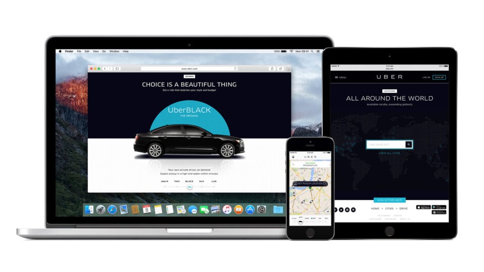
Your website needs to be optimised to cater to every type of device and screen size as well as rotating screen views and multiple tabs open at the same time. This will give you access to the largest possible audience.
There are a number of ways you can build device flexibility into your website design and get a tick of approval from Google:
- Responsive website design – Google’s preference: All devices use the same set of URLs and same HTML with CSS media queries applying rules to page configuration for the device in question
- Dynamic website design – all devices use the same URLs but different HTML and/or CSS to fit the user’s device
- Independent website design – there are different, individual URLs for mobile pages and desktop pages.
To understand these options in more detail and know which will work best for your site and your budget, discuss device flexibility with your web developer.
All the remaining web design mistakes below need to be addressed over all devices as well, so for example mobile loading times, Call to Action buttons and analytics. Make sure these are applied to cover every device option, not just desktops. Remember to make sure that your website is easy to navigate across every device as well.
2. It’s overly complex

A lot of website mistakes come from trying to be all things to all people and bombarding users with too much information in a small space.
The best website designs are clear, simple and have a clearly defined direction. A big part of getting this right is knowing your audience, what their goals are as well as incorporating your goals into the website design structure as well.
Every website will have a different aim which might be to
- Sell products
- Get subscriptions
- Take bookings
- Sell tickets
- Interact through comments, join, like, or share
- Stay longer, read more
- Buy from sponsors
Knowing what users want and what you want will enable you to create a clear and well-structured path from A to B.
If it’s not part of your (or their) mission or goal, get rid of it. Trying to cover too many audiences, too many goals and too much content leads to overcrowding, confusion and users clicking to another provider.
This was the case with spiritual practitioner Jovinna Chan. Her existing website was all over the place and wasn’t meeting her goals of being clear, clean, feminine, spiritual or inviting. The platform she was using wasn’t flexible enough to meet any of her goals so we moved her over to WordPress and gave her a complete website redesign that took her goals into account as well as embraced her target market.
Once we worked with Jovinna to get her goals on paper, it was a simple matter of creating the rest of her design to fit. You can see the specifics of Jovinna’s case study here.
As well as keeping your web design clean and clear, make sure you follow standard formatting procedures for everything from fonts to action buttons so there aren’t any confusing surprises.
Navigation bars need to be placed where users expect, ads and sidebars should be out of the way of content and make use of white space to give your content even more clarity and readability.
The easier it is for users to read the faster they can take steps to reach their goal and feel rewarded by your services.
3. Slow loading times

A website that drags is not just off-putting to users, it also gets the thumbs down with Google search algorithms, making it harder for you to get a great slot in search engine results.
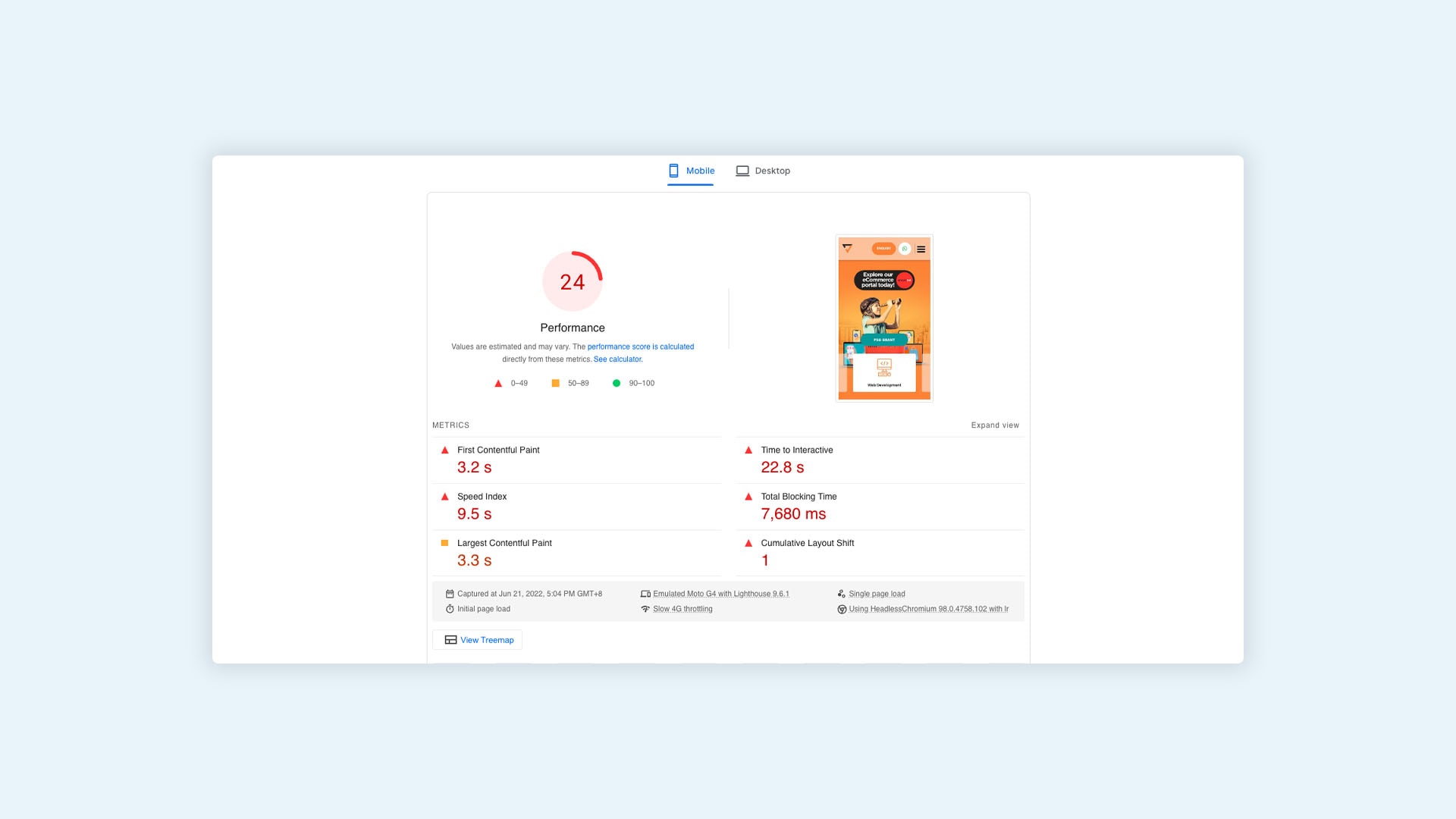
When we say ‘slow website’, we don’t mean it takes ages to load, even five seconds load time is considered too long. You have mere seconds to grab and maintain attention or lose your visitor for good.
Your website should load from link click to fully ready in four seconds or less, with three seconds being ideal. Make a habit of running a website speed test on your website each month, to make sure everything is up to speed and performing to a high standard.
Even though this is proven to be the magic number for retaining users, decreasing bounce rate and getting a tick of approval on at least one of Google’s many specifications, almost every website gets this wrong.
Google reports that of the websites they surveyed 70% took seven seconds or more to load.
You can avoid this website mistake and gain lightning-fast loading speeds by optimising your images, videos, and scripts as well as minimising clutter. It will give users a chance to get exploring on your website faster as well as show you are ahead of the competition.
NOTE: If you have already optimised your web pages for speed but your loading time is still slow it is probably due to your server response time. Contact us to have a chat about the steps you can take to help change this.
4. No clear Call to Action

A call to action is not just a marketing button, it’s a stepping stone that allows your user to reach their goal rapidly.
If your website has been designed with your business goals and the user’s end goal in mind, putting in the action steps will feel natural and easy and lead to a prospect experience design that gains more conversions.
Giving users a reason to progress is as easy as presenting them with the right link or button that shows them where to go. Rather than letting them wander around in the woods on their own, use your Call to Action (CTA) as road markers and arrows offering directions relevant to their goal.
Think about what experience you are looking to provide to your user and how your CTA can get a marker for what to do, where to go or how to feel. When you put this front and centre you will get your visitor focused on taking their next step with you.
As with the rest of your website, you don’t need to get creative or add something unique for a CTA to be successful, just give them what they need in the clearest possible way.
We see real results by offering a primary and secondary CTA. For those who are ready to jump on board, they can click to sign up, add to cart or make a booking. For those who are not ready yet, they can be directed to read a review, click on a testimonial or read an article to learn more.
5. There’s no way to measure performance

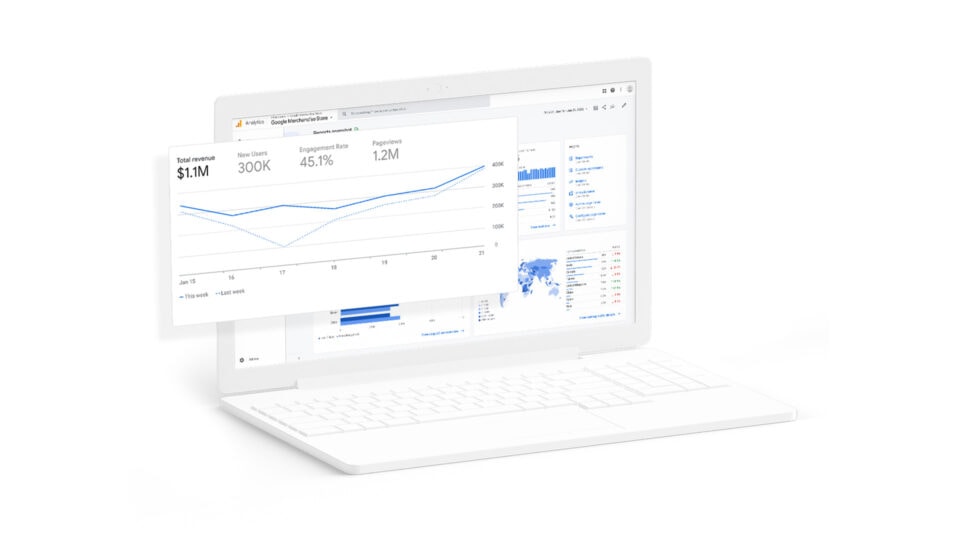
Analytics are a small business owner’s best friend. It’s one of the most accurate ways to understand if your website is or isn’t working.
You need to see your data to know your results, your weaknesses and your best features. Without this feedback, you are flying blind when it comes to changing and improving your website.
Website data analytic tools are easy to use, low cost or free and you get real-time statistics on how your website is performing and what your customers like.
You can easily compare new standings against previous numbers and even against your competition. It’s perfect for testing new content and even running a new website before you replace an existing one.
Even basic analytics will give you a read on:
- Visitor numbers
- User interaction
- Where visitors are arriving from
- What they are clicking on
- Goal tracking
Yet, staggeringly, 75% of small business websites do not track their performance with analytics.
With Google Analytics on hand for all users and additional plug-ins for WordPress websites like the free-to-use MonsterInsights, there is no excuse to not get to know and love your business website analytics.
Not taking into account your business values
Business values are the backbone of your company. They are the building blocks that had you create your business, invest in it, nurture it and back it so far. Usually though, values are in the background and they can become easily lost when you start to look at business numbers like return on investment, sales figures and traffic numbers.
When you pull your values up to be front and centre you give a reason for your company to exist. This is your connection point to your customers and what will keep them coming back. This is your WHY. Whether you’re running a financial services firm (where website trust signals are crucial), or any other business, the story of your why needs to be present in your website design in some way or form. A good website designer will know how to ask the right questions and get to the heart of your why, as well as how to build this into your website so it shows.
This can clearly be seen in this website design case study for Woh Hup, a construction company in Singapore: Their new site needed to reflect the company’s core values:
- Safety
- Integrity
- Quality
- Teamwork
- Innovation
- Growth
ChillyBin’s sole goal for his website redesign was to accurately reflect who the people of Woh Hup are. This is what sets them apart and makes them such a high-quality and trusted brand.
Basically, your values and mission give your business a higher purpose and transform your sales from interactions to a journey of engagement with your customers and clients. It’s greatly underestimated and widely overlooked in business, leaving users feeling used, bullied or ambushed into making purchases solely to increase your profits.
6. Going live, then leaving the website to ‘look after itself’

No, your website is not able to look after itself, you’ll need some type of hands-on assistance to maintain it and keep it current. If not you’ll be needing another complete website design within three to five years’ time.
Maintenance and changes are most critical immediately after your new design launch. This will be the critical time to catch issues and make changes before they cause damage to your brand.
Another problem we see a lot with our clients is they don’t complete any testing. We always send test links and ask for feedback but many clients find this overwhelming or unnecessary. Skipping a test-run means you go live with anything you aren’t happy with, or delay your launch while we wait for your sign-off.
Being proactive around the way your website functions, feels and performs is essential for great results as well as keeping it looking great for years to come.
As part of your website build it’s important to discuss what happens after the website is completed in terms of maintenance and ongoing changes, especially around keeping in touch with the latest SEO criteria and keywords.
Usually, you can leave content updates to your in-house team with the technical aspects outsourced to a developer or WordPress host. Knowing who is responsible and what the costs will be as part of your website development planning process will help your developer in Singapore create the right website for easy ongoing use and maintenance.
In order to keep a website performing at the highest level and attuned to user needs, you’ll need to take steps to undergo regular maintenance. If you have gone with a cheaper design service in the past your website will be more prone to technical problems. You also need to be aware of your server capacity to make sure your site can handle additional traffic once your new website takes off.
In summary
An outdated or poorly designed business website will hurt your rankings and see less traffic coming to your site. Switching to a new web design can help to increase your business visibility and see better traffic numbers. The right website design will keep those clicks on your page for longer and see more conversions.
Make sure your web designer has proven web development skills themselves or in-house developers who can assist with the technical design and programming. They need to be able to go further than just visual design work to take your website to the next level.
A great website design demonstrates that your business is legitimate and trustworthy. It also improves consumer satisfaction and boosts sales by providing a user experience in line with their needs and expectations.
While going ahead with a more expensive web designer team in Singapore can be daunting, it offers the highest quality service that will address the bigger picture including your analytics and SEO needs that defines and supports new client relationships.
If your current website is underperforming we can assist by finding and correcting issues or sitting down with you to pinpoint your company values and website marketing goals so we can create a new website that represents your business accurately.
Contact us today and let’s get you moving towards your website development goals with confidence!


